
Recommended
More Related Content
What's hot
What's hot (20)
Similar to Specific genre deconstruction
Similar to Specific genre deconstruction (20)
More from charlienorris98
Recently uploaded
Recently uploaded (20)
Specific genre deconstruction
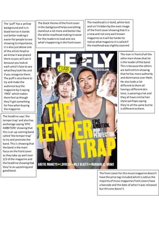
- 1. The mastheadisin bold,white text and isn’thiddenbythe mainimage of the frontcovershowingthatit is a new and not verywell known magazine soit will be harderto notice whatmagazine itiscalledif the mastheadwasslightlycovered. The black theme of the frontcover inthe backgroundhelpseverything standout a lot more and betterlike the white mastheadmakingiteasier for the readerstoread and see what’shappeninginthe frontcover. The ‘puff’hasa yellow backgroundand isin blacktextso itstands out bettermakingit easierforpeople tosee showingitsimportance, it isalsojustabove one of the artistsheadso we knowit wasplaced there soyou will see it because youlookat each artist’sface to see whattheylooklike and if you recognize them. The puff is alsothere to try and make the audience buythe magazine byitsaying ‘FREE’ whichmakes themfeel asthough they’ll getsomething for free whenbuying the magazine. The man in frontof all the othermenshowsthat he isthe leaderof the band. Thisis because the others are behindhimshowing that he has more authority and dominance overthem. He alsolooksa lot differenttothemall havinga differentskin tone,iswearinga hat and theyall have similarhair stylesperhapssaying they’re all the same buthe isdifferenttothem. The headline says‘the tempertrap’and alsohas anchorage saying‘EPIC AMBITION’showingthat thisisan up-comingband called‘the tempertrap’ to try and promote the band.Thisis showingthat the band isthe main focuson the frontcover as they take up well over 2/3 of the magazine and the headline showingthat they’re anupcomingand goodband. The front coverfor thismusicmagazine doesn’t have the price tag includedwhichisoddas the majorityof musicmagazinesfrontcovershave a barcode and the date of whenitwas released but thisone doesn’t.
- 2. The female artististhe mainimage of this double page spreadandyoucan tell immediatelybecause she isthe onlypersonin the image and at the top lefthandside of the double page spreadbeingthe firstthingwe see whenwe lookat thisdouble page spread showingthatthe article that iswritten isbased uponher andno one else,Inthe backgroundwe have ‘USA’writtenshowingthatthatis also linkedtothe article. She looksdirectlyintothe camera givingdirectamode addresswith the audience sowe feel more comfortable andattachedto heras we read the article thatis based uponher makingusfeel asthough we know herbetter. The artist seemstoshow a lot of skinand legsherat the angle she isposingshowing that itis aimedtowardsa male gaze,the redand white alsocatchesthe readerseye lookingtowardsherlegsasthe red isthe onlybrightcolourinthe double page being aroundthisarea makingitveryeasy for anyone tolookin that directionof the double page spread. ‘She’s2009’s biggestsuccessstory’ tagline makesthe audience into wantingtoread the article because it makesoutthat it isthe biggest storyin 2009 whichmakesuswant to readit because itwill be one of the most actionpackedand interestingthingswe mayeverread.
- 3. The blue headingtothe contents page saying‘January2013’ shows importance asit’sthe brightest colourin the contentspage making the audience well aware of when the magazine wasreleased. The three ‘lads’are hangingontoto somethingdangling all doingdifferent thingsandsmilinglookinglikethey’re enjoyingthemselves.Thistellsthe readersthatthey enjoywhattheydoas theirjobswhichiscreatingand playingmusicforus tohear tellingushowpassionate and fundthey’re of whattheydo,it showsusthat they lookat it as more of havingfunandhangingouttogether than workingandbeingboredwhichjobsare representedasbeing. The personwholooksto be a womanon the far rightside of the contentspage doesn’tshowanyof herface,thiscould be to showher importance tothe band butthat it isn’treallyshownornoticedby anybodymakingherfeel excluded and notas respectedasthe other membersinthe band.The guy inthe middle withblack jeansisshownto be the leaderof the band as he openhislegsto coverstwo other of the members makinghimmore noticeable and standout better, he is alsogiving directmode as addresswiththe camera makingthe readersfeel more connectedand devotedtohim that the others whoaren’t properlylookingat the camera showinghis importance tothe band. On the mainimage the page numberdoesn’thave anytext underneathitsayingwhatthe band iscalledor knownas,thisshowsas that they’re awell-knownindie musicband andthat we should alreadyknow whatthey’re called, we alsoget the impressionthat they’re the mostimportantandwell knownbandwrittenaboutinthe magazine asthey’re the mainimage of the contentspage. The red/ orange textinthe contents saying“Onesto watchband of 2013” is to grasp and gainthe reader’sattention so they’re more likelytolookintothese bandsand artistsand enjoytheirmusic. The page numbersare ina boldand large fontto get graspthe reader’s attentionsothat theyreadwhatis writtenbelowtohelptell the reader that itis importantandwill catch theirattention.