1. Hot press magazine is released on a fortnightly basis, it
bases its articles mainly on music and politics. Its located
in Dublin, Ireland and was founded in June 1977. The
magazine title “Hot press” is the clever pun used which is
normally referred to as an Irish airing cupboard. The title
also suggests it has everything you need to know about
music because a traditional Irish airing cupboard holds
almost everything. This mkaes the magazine relatable
and friendly.
The magazine has a circulation 17,179 (ABC, january-december
2012) the magazine is directed at adults
ranging from 18-35 which is 90% of their readership. The
magazine is available throughout all of northern and the
republic of Ireland, giving them a wider target audience.
The magazine is equally based towards males and
females, males at 52% and females 48%.
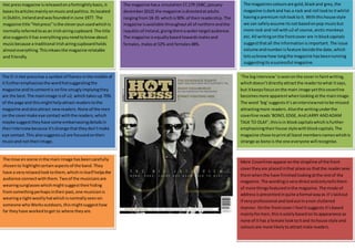
The magazines colours are gold, black and grey, the
magazine is dark and has a rock and roll look to it whilst
having a premium rich look to it. With this house style
we can safely assume its not based on pop music but
more rock and roll with u2 of course, arctic monkeys
etc. All writing on the front cover are in block capitals
suggest that all the information is important. The issue
volume and number is feature beside the date, which
lets us know how long the magazine has been running
suggesting its a successful magazine.
The O in Hot press has a symbol of flames in the middle of
it further emphasises the word hot suggesting the
magazine and its content is on fire smugly implying they
are the best. The main image is of u2, which takes up 70%
of the page and this might help attract readers to the
magazine and also attract new readers. None of the men
on the cover make eye contact with the readers, which
maybe suggest they have some embarrassing details in
their interview because it’s strange that they don’t make
eye contact. This also suggests u2 are focused on their
music and not their image.
The mise en scene in the main image has been carefully
chosen to highlight certain aspects of the band. They
have a very relaxed look to them, which in itself helps the
audience connect with them. Two of the musicians are
wearing sunglasses which might suggest their hiding
from something perhaps in their past, one musician is
wearing a tight woolly hat which is normally seen on
someone who Works outdoors, this might suggest how
far they have worked to get to where they are.
‘The big interview’ is seen on the cover in faint writing,
which doesn’t directly attract the reader to what it says,
but it keeps focus on the main image yet this coverline
becomes more apparent when looking at the main image.
The word ‘big’ suggests it’s an interview not to be missed
attracting more readers. Also the writing under the
coverline reads ‘BONO, EDGE, And LARRY AND ADAM
TALK TO OLAF’, this is in block capitals which is further
emphasising their house style with block capitals. The
magazine chose to print all band members names which is
strange as bono is the one everyone will recognise.
More Coverlines appear on the strapline of the front
cover they are placed in that place so that the reader sees
them when the have finished looking at the rest of the
magazine. The wording is very direct and only tells them
of more things featured in the magazine. The mode of
address is presented in quite a formal way as it’s laid out
if very professional and laid out in a non cluttered
manner. On the front cover I feel it suggests it’s based
mainly for men, this is solely based on its appearance as
none of it has a female look to it and its house style and
colours are more likely to attract male readers.
2. Hot Press is a music magazine produced by Niall stokes
from Dublin, Ireland. It was founded in 1977 and has
become one of Ireland most popular music magazines to
buy. At first glance at the contents page its very strange in
its layout and design and doesn’t stick to the conventional
contents page layout, yet it’s still a very effective in helping
people navigate to their desired pages but I would say it’s
very dull in its colour with its white background ad plain
font I can’t help but feel they could have made it more
attractive with a more bold choice of colours and font style.
The first thing that does jump out is the multi coloured fire
symbol which related back to the symbol front the cover
page making it known to be a Hot press magazine, which is
widely recognised
Some contents pages can be hard to read and understand but
the author has clearly laid this out in a way which makes it
very easy and clear to navigate, which makes it more
attractive and enticing to its audience, with its block capitals
to its simplistic layout o with everything in boxes with the
page numbers underneath in a small bubble. The masthead
says “Contents” which is easily understood with a sub-title
saying “HOT PRESS 3820”, however the title along with all
the green dots take up at least half the page which leaves a
black and white image of 3 band men each standing on a
different step of the escalator, this image suggests to the
audience that they are still pursuing a career and gigging.
Along the image there is a number 28 anchoring the phrase
‘HIGH FLYING WORDS’ this is used because the
interview is done on a plane. Below this is another
appearance for john lydon which will take place on page 36
saying ‘THE GOSPEL ACCORDING TO JOHN’ this is
humour used to encourage more readers.
The second Contents page has a lot more in it, with more
pictures, no dots, and more information and laid out in a
more attractive way because the first page was taken up
a lot by the masthead in large block capitals. This
magazine is slit u pinto 5 topics upfront, features,
wildlife, critical mass and what’s going on, this makes it
easier for the readers to navigate without having to go
through pages to find what they want. This makes it
more interesting the title ‘wildlife’ might suggest that
there is more than just music in the magazine gaining a
wider range of audience. There i also page numbers
along Side these so people can navigate with ease.
I noticed that the artists names are in capital letters on the
page to make them stand out ‘jimmy Chamberlin’ is one
of the head headliners because he was on the news lately
become the new liveone music company. The contents
page is very strange in comparison the conventional
contents page we are all used to seeing normally
everything goes down the side but they have decided to
put everything in boxes with a small circle that has the
page number in it. One box is larger than the others which
clearly means its a more important story than the others
which was u2 who got 100m from apple to release the
new album onto iTunes for free, I can see why they took
apple up on their offer than have definitely made more
this way rather than selling their album the normal way.
I enjoyed analysing this contents page as its has a very
different house style compared to other magazines, which
made it more interesting for me to read and analyze. But
other magazines such as ‘Q’ are better known than Hot
press and also it has a more colourful and attractive house
style in comparison to this magazine, which could lose
them readership but Hot Press is cheaper than Q which
might gain then readers.