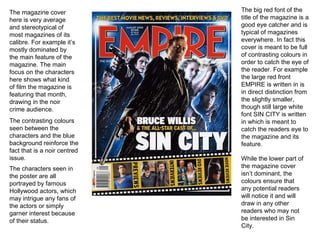
1. The magazine cover The big red font of the
here is very average title of the magazine is a
and stereotypical of good eye catcher and is
most magazines of its typical of magazines
calibre. For example it’s everywhere. In fact this
mostly dominated by cover is meant to be full
the main feature of the of contrasting colours in
magazine. The main order to catch the eye of
focus on the characters the reader. For example
here shows what kind the large red front
of film the magazine is EMPIRE is written in is
featuring that month, in direct distinction from
drawing in the noir the slightly smaller,
crime audience. though still large white
font SIN CITY is written
The contrasting colours in which is meant to
seen between the catch the readers eye to
characters and the blue the magazine and its
background reinforce the feature.
fact that is a noir centred
issue. While the lower part of
The characters seen in the magazine cover
the poster are all isn’t dominant, the
portrayed by famous colours ensure that
Hollywood actors, which any potential readers
may intrigue any fans of will notice it and will
the actors or simply draw in any other
garner interest because readers who may not
of their status. be interested in Sin
City.