SlideShare a Scribd company logo
1 of 4
The Q magazine gives a medium close
                         up of Adele, to allow the front cover to
                                                                    Front Covers
                         focus on her. She is placed to the right
                         hand side of the page, with a white
                         background behind her, to make her
                         stand out. Adele stands to the side with
                         her face turned towards the camera,
                         with her hair flowing in a light breeze;
                         this adds an effect of making her stand
                         out. The shot has her placing her hand
                         to her face to add attitude to the
                         image, with the her nails and
                         top both being a shade of purple,
                         to add continuity.


The Cheryl Cole magazine front cover for ELLE is similar
to the other, but has a colour theme of black and white,
allowing the masthead to stand out in front of the image
at the top of the page. It also adds class and simplicity to
the front cover. Cheryl's hair is also being blown behind
her, to make her look imperfect and she places both of
her arms around her face to add character to the image.
Front Covers


This Elle magazine front cover
dresses Blake Lively in a simplistic
white dress to make it blend in with
the background slightly, with her
face standing out amongst it all.
She is turned to a 90 degree angle
with her face turning towards the
camera, this creates a different
effect and image to others. The
simplistic white colour theme also
allows the cover lines around her to
stand out. The only bold piece of
colour placed on Blake are her two
rings she wears and her nail
varnish, she was placed to turn that
way to allow that arm to be central
and show off these bold colours
which add colour to the cover.
Contents

This contents page has the
main image of Cheryl Cole in
black and white to allow the
red text to stand out around
it. It also includes to other
images, one of them being
placed as if a
DPS, overlapping onto the
image of Cheryl. There is
another image which is
placed above the row of text
and is sized to fit in.
DPS


This DPS shows an image of Florence that
is shown as the whole background. She is
shown perched on a table that is covered
in a striped red and white cloth, this
stands out against the black text and the
black clothes and shoes she wears, it also
matches her hair colour.

More Related Content

More from catereidy

Media Evaluation Question Two
Media Evaluation Question TwoMedia Evaluation Question Two
Media Evaluation Question Twocatereidy
 
Poster and Magazine Cover Drafts
Poster and Magazine Cover DraftsPoster and Magazine Cover Drafts
Poster and Magazine Cover Draftscatereidy
 
Film poster and magazine draft layouts
Film poster and magazine draft layoutsFilm poster and magazine draft layouts
Film poster and magazine draft layoutscatereidy
 
Trailer Editing and Sound
Trailer Editing and SoundTrailer Editing and Sound
Trailer Editing and Soundcatereidy
 
Media evaluation
Media evaluationMedia evaluation
Media evaluationcatereidy
 
Poster and Magazine Dafts
Poster and Magazine DaftsPoster and Magazine Dafts
Poster and Magazine Daftscatereidy
 
Poster and Magazine Drafts
Poster and Magazine DraftsPoster and Magazine Drafts
Poster and Magazine Draftscatereidy
 
Image Manipulation
Image ManipulationImage Manipulation
Image Manipulationcatereidy
 
Image Manipulation
Image ManipulationImage Manipulation
Image Manipulationcatereidy
 
Film Magazine Analysis
Film Magazine AnalysisFilm Magazine Analysis
Film Magazine Analysiscatereidy
 
Film Magazine Analysis
Film Magazine AnalysisFilm Magazine Analysis
Film Magazine Analysiscatereidy
 
Media Poster Analysis
Media Poster AnalysisMedia Poster Analysis
Media Poster Analysiscatereidy
 
Film posters
Film postersFilm posters
Film posterscatereidy
 
Horror Films; Research
Horror Films; ResearchHorror Films; Research
Horror Films; Researchcatereidy
 
Front Covers
Front CoversFront Covers
Front Coverscatereidy
 

More from catereidy (20)

Media Evaluation Question Two
Media Evaluation Question TwoMedia Evaluation Question Two
Media Evaluation Question Two
 
Poster and Magazine Cover Drafts
Poster and Magazine Cover DraftsPoster and Magazine Cover Drafts
Poster and Magazine Cover Drafts
 
Film poster and magazine draft layouts
Film poster and magazine draft layoutsFilm poster and magazine draft layouts
Film poster and magazine draft layouts
 
Trailer Editing and Sound
Trailer Editing and SoundTrailer Editing and Sound
Trailer Editing and Sound
 
Media evaluation
Media evaluationMedia evaluation
Media evaluation
 
Poster and Magazine Dafts
Poster and Magazine DaftsPoster and Magazine Dafts
Poster and Magazine Dafts
 
Poster and Magazine Drafts
Poster and Magazine DraftsPoster and Magazine Drafts
Poster and Magazine Drafts
 
Image Manipulation
Image ManipulationImage Manipulation
Image Manipulation
 
Image Manipulation
Image ManipulationImage Manipulation
Image Manipulation
 
Film Magazine Analysis
Film Magazine AnalysisFilm Magazine Analysis
Film Magazine Analysis
 
Film Magazine Analysis
Film Magazine AnalysisFilm Magazine Analysis
Film Magazine Analysis
 
Media Poster Analysis
Media Poster AnalysisMedia Poster Analysis
Media Poster Analysis
 
Film posters
Film postersFilm posters
Film posters
 
Horror
HorrorHorror
Horror
 
Horror Films; Research
Horror Films; ResearchHorror Films; Research
Horror Films; Research
 
Contents
ContentsContents
Contents
 
Evaluation
EvaluationEvaluation
Evaluation
 
Dps
DpsDps
Dps
 
Front Covers
Front CoversFront Covers
Front Covers
 
Dps
DpsDps
Dps
 

Powerpoint

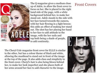
  • 1. The Q magazine gives a medium close up of Adele, to allow the front cover to Front Covers focus on her. She is placed to the right hand side of the page, with a white background behind her, to make her stand out. Adele stands to the side with her face turned towards the camera, with her hair flowing in a light breeze; this adds an effect of making her stand out. The shot has her placing her hand to her face to add attitude to the image, with the her nails and top both being a shade of purple, to add continuity. The Cheryl Cole magazine front cover for ELLE is similar to the other, but has a colour theme of black and white, allowing the masthead to stand out in front of the image at the top of the page. It also adds class and simplicity to the front cover. Cheryl's hair is also being blown behind her, to make her look imperfect and she places both of her arms around her face to add character to the image.
  • 2. Front Covers This Elle magazine front cover dresses Blake Lively in a simplistic white dress to make it blend in with the background slightly, with her face standing out amongst it all. She is turned to a 90 degree angle with her face turning towards the camera, this creates a different effect and image to others. The simplistic white colour theme also allows the cover lines around her to stand out. The only bold piece of colour placed on Blake are her two rings she wears and her nail varnish, she was placed to turn that way to allow that arm to be central and show off these bold colours which add colour to the cover.
  • 3. Contents This contents page has the main image of Cheryl Cole in black and white to allow the red text to stand out around it. It also includes to other images, one of them being placed as if a DPS, overlapping onto the image of Cheryl. There is another image which is placed above the row of text and is sized to fit in.
  • 4. DPS This DPS shows an image of Florence that is shown as the whole background. She is shown perched on a table that is covered in a striped red and white cloth, this stands out against the black text and the black clothes and shoes she wears, it also matches her hair colour.