Fun Call Girls In Goa 7028418221 Call Girl Service In Panaji Escorts
Front Page analysis
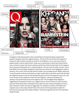
1. Cover line
Primary Optical Area Positive focal Primary Optical Area Positive focal
Masthead
Masthead
Model Credit
Cover line
Niche band
Main stream star/ Freebie Terminal Area
Terminal Area
Main focus Model Credit
Q magazine is themed around the colours red and black; the powerful colours represent the
powerful rock genre which the magazine features. The font of the serif Q shows the magazine is
aimed at an older audience, the play on words for ‘Q’ symbolises a cue in music and a queue of
people outside a concert ready to enter. Using a star as well known as Cheryl Cole shows that this
issue is aimed at a larger main stream audience and that she will be the focal point to the magazine,
due to everyone knowing who she is raising sale figures. The main cover line reads ‘3 words.. Cheryl
Cole ROCKS’ the text enlarges throughout to show the main points her name highlighted in white to
stand out. This is so her name will also catch the reader’s eye, just below we see ‘ROCKS’ spaced out
in red and capital so that the word stands out. Again another play on words the word rocks describes
the magazines opinion on the star also describes the genre of music the magazine focuses one, rock
music. We also see the selling line at the top of the magazine, in the primary optical area
starting in the top left hand corner of the magazine cover ‘The UKs Biggest Music Magazine’.
Suggesting that Q would be the best music magazine choice. The stars make up is dull around the
eyes and a bold red lip colour matching the house style and colour scheme of magazine, he hair is
down and wet to suit the rock and roll rugged look. The celebrity is centred in the middle of the
magazine cover so that views will look firstly at the master head then gaze down towards the
terminal area, focussing on the image in between. The theory originally came from the Guttenberg
Design Principle.
2. The KERRANG magazine cover is very busy compared to the Q magazine however they both follow
the same house style and theme colours, red and black. Unlike Q this magazine cover is aimed at a
younger niche audience due to the big bold san serif masthead, with the niche rock band image
Rammstein being the main focal point of the cover. The Masthead KERRANG is hidden by the image
of the band, showing this magazine is well known by people so they don’t have to show the whole
masthead. This magazine cover also follows the Guttenberg Design Principle due to the selling line is
the first thing we see in the top left hand corner, promoting a festival where more niche rock bands
would perform . ‘DOWNLOAD IS GO!’ in a white bold san serif font to make the statement stand out
to advertise the festival, a couple of confirmed acts are then named to give the reader an insight of
who will be performing. This magazine also advertise freebies that come with the magazine when
purchased, these freebies would also attract the niche audience as merchandise for these bands
would be hard to find. The freebie adverts are in the dead area to the bottom left of the page. So
that once the reader has focussed on all the other areas such as the Primary Optical Area and
Terminal Area it would leave the reader thinking positive about purchasing the machine since it’ll be
the last area they look. In the band image we see the band members positioned well so that the
reader can recognise each member, however the leader is placed in the middle of the row at the
front. The band leaders face seems as though he is look right into the reader’s eyes with a powerful
intimidating relating to the slogan placed under the band names ‘be afraid be very affraid . Without
this good use of rules of thirds we would not be identify the leader , as many wouldn’t of heard of
this niche band.