
Recommended
More Related Content
What's hot
What's hot (19)
Viewers also liked
Similar to Music Magazine Color Palette Analysis
Similar to Music Magazine Color Palette Analysis (20)
More from Msiscar76
Recently uploaded
Recently uploaded (20)
Music Magazine Color Palette Analysis
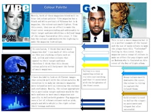
- 1. Mostly, both of these magazines blend well in blue-ish colour palette- Vibe magazine has a black and white portrait of Rihanna but in Q magazine, the colours are much lighter. From this cover, they use an effect to make the front cover seem protruding and addressable to their target audience which has a defined image of the singer featured on this cover. I like how the colours combined with the lighting to make the magazine look unique. I have decided to look at different images that coincide well with the colour palette. My intention is to make my own music magazine more relaxed as well as conveying the coolness and confidence. Mostly, the colour appropriate for a particular target audience would be the male audience as most music magazines use specific to define both genders- Pop magazine uses a lot of vibrant colours such as pink, purple and white which is the right colour their teenage audience. This is not a music magazine but it is a perfect example of the layout and the use of warm colours to make the singer have this “refreshed” feeling in this cover. A music magazine uses a range of colours to make an effect for pop singers such as Madonna who is featured on this cover of the Ray of Light album. In conclusion, I think that most music magazines don’t use much of this colour as they use clashing colours such as red, yellow and other colours that appeal to their target audience therefore I think that this chosen colour palette will help meet the favour of music magazines. Yellow is a very appealing colour as its very eye catching and that it associates with the brightness of the front cover. Ocean colours mostly dominates the cover; the colour is trying to capture the relaxed theme. Gold colours is used to define the singer: as passionate and elegant but also successful.
- 2. This double page spread uses 3 symbolic colours: the colour red is used to symbolize danger and by the word highlighted in red “dinosaur” this is also used to suggest that this page describes the singer’s life as wild. The black colour is cleverly used to make this article mysterious as we have no idea about the singer’s personal life which makes it exclusive. The grey colour is included in this colour palette in order to define the double page’s neutral, balanced theme.