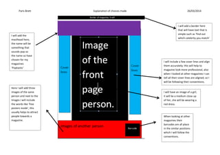
The layout for my front page will follow the conventions of a pop magazine
1. Paris Brett Explanation of choices made 26/03/2014
I will add a border here
that will have text that is
simple such as ‘find out
which celebrity you match’
I will include a few cover lines and align
them accurately; this will help to
magazine look more professional, also
when I looked at other magazines I can
tell all their cover lines are aligned, so I
will be following their conventions.
When looking at other
magazines their
barcodes are all place
in the similar positions
which I will follow the
conventions.
Here I will add three
images of the same
person and next to the
Images I will include
the words like ‘free
posters inside’, this
usually helps to attract
people towards a
magazine.
I will add the
masthead here,
the name will be
something that
sounds pop so
the name so have
chosen for my
magazines
‘Poptastic’
I will have an image of a girl,
it will be a medium close up
of her, she will be wearing a
red dress.
2. Paris Brett Explanation of choices made 26/03/2014
The layout for my front page will follow the conventions of a pop magazine ’We love Pop’, the magazine will follow the same way that ‘we love
pop’ has place certain stuff. This will help to attract people towards the magazine and make it popular. The font for the magazines will be clear
and big, so I say the font will be around the size of 70. The cover line swill be all aligned and I will add the same amount of cover lines the
magazine I am following, the font will be different that the masthead, also the size of the font will decrease to 12. The cover lines will be
formal but always will be suitable for the target audience for my magazine, which is tweens.
3. Paris Brett Explanation of choices made 26/03/2014
On my contents page I will
an image of my front-page
magazine, which I will
minimise it. The cover lines
will have the pages next to
them for the audience to
find the pages easier.
I will add three different
contents pages, with
the number directing
people towards them. I
have done this because
it separates
I will an image in the corner of the
magazine, as this helps to make
the magazine more attractive.
The colour scheme
will be the same
as the front page.
Which is pink and
mint green.
4. Paris Brett Explanation of choices made 26/03/2014
The layout for my double page spread will follow the conventions of the magazine ‘Top of the pop’s’. The colour scheme will be the same as
the front page; the colours will be pink and mint green. The contents page will be separated into three different sections, which will be
informing the audience different topics that are involved. The text will be aligned to make it look appropriate for the audience. However, I will
change the font to a different one, this will make the magazine more interesting.
5. Paris Brett Explanation of choices made 26/03/2014
A smaller image will
be placed here.
I will place a big image of
the person that has been
interviewed. This is will
inform the audience who
is being interviewed.
I will place the
interview here, they
will be around the
image and they will
be aligned to look
neater.
A title will be placed
here. It will be in big
font, in order to
attract the audience
attention.
6. Paris Brett Explanation of choices made 26/03/2014
The layout of the double page spread wills the conventions of the magazine ‘top of the pops’. The magazine attracted me towards the double page spread
which made me deicide to follow the way that magazine is structured. The colours will be the same which is pink and mint green, but I will use the colour
black to add a more of an effect. The person on my front page will be on my double page spread. The main image will be the similar as the front page
because it links the pages together. The text will be aligned, so it can be clear and neater for the audience. The font size will be increased a lot so it stands
out to the audience.