Muzaffarpur Escorts Service Girl ^ 9332606886, WhatsApp Anytime Muzaffarpur
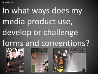
Question 1 evaluation
1. In what ways does my
media product use,
develop or challenge
forms and conventions?
Question 1.
2. A convention for magazines, no matter what genre,
is to have a masthead, this introduces the magazine
and makes it memorable. Therefore it needs to be
big, bold but short.
The issue number, date
and price is important,
especially on a first
issue, usually this
information would be
very little and hidden
with the barcode but I
have challenged it and
made it quite big, next
to the masthead. I
wanted it noticed
because it’s the first
issue and I want people
to clearly see this
information…and the
cheap price.
The main image is a mid
shot on both magazines.
This is challenging forms
and conventions because
the main image would
usually be a medium
close up or close up to
show facial details but I
wanted to clearly use
mise-en-scene showing
outfit details and props in
to clearly represent the
genre.
3. Main cover lines are a
convention which needs to be
noticed in every magazine. I
made sure it stood out from
the other cover lines by
anchoring it with the
masthead as it should be and
by using a slightly bigger font
size.
An important convention is to
brand the magazine so that the
reader notices it every time. In my
magazine the lightening effect on
the masthead brands my
magazine as its unique and
memorable as its got a lot of detail
and colour involved. The effects
link with the name. similarly to the
little stars next to classic on the
magazine on the right.
Usually magazines tend to cover their masthead slightly with the main image. I challenged this as my magazine is the first issue
therefore I wanted to masthead to be seen and remembered. The magazine I’m comparing to is an example of covering the
masthead. You can still clearly see what it says but it shows that the masthead has less importance now as its not a first issue.
I decided to keep my background
white so that the masthead and
main image really stood out and so
that the page didn’t look like there
was too much going on. I think
white (although a bright colour)
represents my genre well.
A common convention is to include news
about other popular bands of the same
genre to grab the readers attention as they
will want to find out about their favourite
bands.
4. Another convention used which
helps attract the reader is buzz
words. I have used these to make
certain cover lines stand out and
to let the reader know its
something interesting.
I used rule of thirds so make
the main member of the
band stand out from the
others. Even if you don’t
know the band by using rule
of thirds and making him the
main focal point it becomes
clear. The classic rock
magazine has also done this
but with his main headline.
I have used a puff for one of my
cover lines advertising a
competition. A puff makes certain
cover lines stand out off the page
and I think it separates the cover
line from the others.
5. A convention of contents pages are
ensuring the masthead is on it, usually
just in a smaller form. They will also
put the word contents on the page so
that everyone knows what it is. I have
kept the same font for the word
contents as I think it looked better
matching, this is not a convention as
not all magazines do it.
I included an editors note in my magazine
so that the reader knew it was me. This is
a common convention but it does not
have to be used. I made sure it stood out
and didn’t take up too much space. I
wrote about what I wanted from the
magazine and what the reader should
expect.
I anchored my images to the page number
they were related to, I made sure they
were close and had the writing or the page
number related slightly overlapping them
so that the reader could tell what the
image was about. This is a convention that
is used in most magazines so that the
reader does not get confused and are more
tempted to read that story.
I challenged forms and conventions by not
putting subheadings and not really giving my
page much structure. Like in the magazine
on the right the page numbers and cover
lines are in columns, I tried to avoid doing
this and make my page look a bit more
mixed up and messy to represent my TA but
I still made sure it wasn’t too jumbled so that
it was confusing.
6. A convention for double page spreads
is having a large image on the one
side and the other filled with the
article or Q&A. this is not the same
for every magazine but I felt it looked
best and filled the most space.
Double page spreads usually have
their articles in columns, most
commonly in columns of 3 especially
if they’re set out in a similar style to
these 2 magazines. I felt fitting my
article into columns of 3 ensured that
there wasn’t too much writing and it
didn’t look boring because of being
filled with text.
7. Using a pull quote to grab the readers attention and let them
know what the article may be about is a common convention. I
have mixed 2 conventions and made my pull quote the headline.
This is used in the example magazine too and by having it big
and noticeable it really makes the whole article stand out.
Most magazines also have a subheading
underneath the headline to give more detail on
what the article is about. It is usually smaller
than the headline but bigger than the article
text.
Articles conventionally use drop caps. This is the first letter
of the article being bigger than the rest of the article text
and usually in a different colour or font too. This introduces
the article.
Page numbers run all the way through the magazine
therefore will inevitably be on the double page
spread. They must match with the page numbers on
the contents page ad are usually on the bottom
corners of the page. On my magazine they’re quite
large and noticeable, on the kerrang magazine
they’re very small
8. Magazines usually have a by line so that
the writer of the article is recognised. It
will be slightly larger than the articles text
in most cases. There should also be
picture credit for any of the images
included on the page.
Magazines include a larger quote in the middle of their article
somehow. This is to bring attention to that specific piece of
information being said by the person in the article. This is larger
than the rest of the text, will usually have larger gaps in
between the lines and in some cases be a different colour. I
challenged the convention by not changing the colour as I
thought it looked better without it.
Carrying along the masthead on to the double page
spread is a convention but is not always used by every
magazine or is very small to an un noticeable point. This
carry's on the branding of the magazine throughout.
Some magazines include a puff,
this advertises certain
information, I used mine to
advertise the website for the
magazine .