SlideShare a Scribd company logo
1 of 8
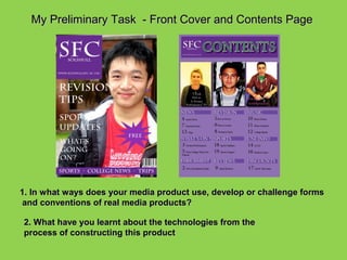
My Preliminary Task - Front Cover and Contents Page


1. In what ways does your media product use, develop or challenge forms
 and conventions of real media products?

2. What have you learnt about the technologies from the
process of constructing this product
In what ways does your media product use, develop or challenge forms and conventions of real media
                                            products?


                                 Front Cover - Similarities

                                          Masthead


                                        Main cover lines


                                          Main Image


                                               Price


                                          Consistent
                                           Colour
                                           Theme
Front cover - Differences
The main image used on both of these front covers are              The positioning of the masthead is both different on Vogue and
from a different angle and shot size. The image on my              my college magazine. The Vogue masthead fills a quarter of the
magazine is a front image whereas the image on Vogue is            page and fills the top quarter of the magazine. My masthead is
a sided body view.                                                 positioned in the top left hand corner of the page.

                                          The position of the two images are
                                          different too – the female on Vogue is
                                          centred in the middle of the front cover
                                          page. Whereas the image of the lad on
                                          the front cover of my magazine is
                                          positioned to the right of the image to
                                          keep in line with the rules of third.


                                          The pricing of the magazine are different
                                          on both the magazines – my magazine is
                                          shown as free in the starred bubble,
                                          whereas Vogue is £4.00.


                                          The positioning of the cover lines are both
                                          different on my college magazine and the
                                          Vogue magazine. Vogue has more cover
                                          lines and sell lines than my magazine.
                                          The college magazine that I have made
                                          are short and snappy and there is less of
                                          compared to Vogue.

The colour scheme on the magazines are both different.                  My college magazine contains a footer at the bottom of the
The colour scheme of my magazine is purple and white.                   front cover, whereas the front cover of Vogue does not
Vogue’s colour scheme is pink, orange and white. This can
be shown through the colour of cover lines and masthead.
In what ways does your media product use, develop or challenge forms and
           conventions of real media products? contents page
                             Initial of
                             magazine
                             masthead
                             Highlights
                             front cover
                             features.
                             Text layout
                             of ‘contents
                             Uses sub
                             headings to
                             help reader’
                             Layout out
                             of columns
                             for features
                             within the
                             magazine
                             and
                             categorised.
DIFFERENCES WITH CONTENTS PAGE

                          Vs                 VIBE
COLLEGE GUIDE
                    The choice of
                    contents within
                    the magazine,
                    adding a wider
                    range.
                   Using more then 1
                   image- my images
                   aren’t very good and
                   seem random. Vibe’s
                   1 main image looks
                   sexy and
                   professional. It also
                   looks more
                   sophisticated with the
                   subtle use of colour in
                   Vibe. The use of black
                   and white looks
                   elegant
What have you learnt about the technologies from the process of constructing this
                                          product
                                                                             ouble
                   o get                             a tures        nts and d
          Moodle t                           g the fe eate my conte
    Using es.                     Learnin               r
                                               ign to c
    resou
         rc                       o f I n D es d .
                                              r ea
                                   page sp


.


                                                                                         se o      s.
                                                                                    t o u op, t age
                                                                                 ow tosh te im
                                                                                H o
                    cameras                                                               la
          g digital                                                              Ph nipu
     Usin            nd type
           , angle a                                                              ma
     (shot
      of shot).
Using the digital camera, i could ensure that My
image was an MCU which dominated the frame. I
also left space at the top for the masthead and I
observed the rule of thirds. Really I should have
moved the image more to the right so that the left
third had more space for cover lines. I told the
model to smile and look happy!

                               I use Adobe Photoshop
                               to make an ordinary
                               student into a “model”
                               for a college magazine.
                       This shows how I used Adobe to manipulate
                       my images, and one of my stages of
                       development. As you can see:
                       • I changed the levels of the colours, to add
                       more emphasis on the student. Originally she
                       had red eye which I corrected with the red eye
                       tool. I made sure everything looked perfect.
                       •I also added font with drop shadow and
                       effects to make the magazine more eye
                       catching. I added the blue flash to attract the
                       audience even more. I used the shape tool
                       option for this.
Using In-design For my Contents page
I had a main text box at the top
with the main title and I made
sure I used the same colours as I did think about layout, but I should have
on the front cover               manipulated the images first of all in Photoshop. I
                                 think it looks like a contents page but it would have
                                 helped if I’d used the word “Contents”. I put picture
                                 boxes in first all and then just placed my images.
                                 Most of them didn’t fit so I had to resize them to the
                                 frame. I think it looks a bit boring for my student
                                 audience and I should have had different shape
                                 boxes or at least rotated them or used some effects
                                 (but I didn’t have time and I didn’t know how!)

                                  I did use columns and I think I used text quite well. I
                                  also experimented with colour to add variation. I
                                  think Indesign was quite hard to use because I’ve
                                  never thought about the design/layout of a page
                                  before and this has helped me to understand how
                                  important this is

More Related Content

What's hot

Rajeda rahman media evaluation
Rajeda rahman media evaluationRajeda rahman media evaluation
Rajeda rahman media evaluationmillie_8
 
Evaluation Question 1
Evaluation Question 1Evaluation Question 1
Evaluation Question 1asmediag12
 
Music magazine double page spread comparison
Music magazine double page spread comparisonMusic magazine double page spread comparison
Music magazine double page spread comparisonBeth Wilcock
 
My music magazine
My music magazineMy music magazine
My music magazinerahulyadev
 
Pulse evaluation completed 27032013
Pulse evaluation completed 27032013Pulse evaluation completed 27032013
Pulse evaluation completed 27032013Danielleannenberg
 
Final media evalutiatio
Final media evalutiatioFinal media evalutiatio
Final media evalutiationiamhreilly23
 
Question 1 evaluation
Question 1   evaluationQuestion 1   evaluation
Question 1 evaluationasmedia
 
As media unit g321 evaluation
As media unit g321 evaluationAs media unit g321 evaluation
As media unit g321 evaluationasmediac12
 
Pulse evaluation completed 27032013
Pulse evaluation completed 27032013Pulse evaluation completed 27032013
Pulse evaluation completed 27032013Danielleannenberg
 
Foundation Portfolio in Media : Evaluation
Foundation Portfolio in Media : EvaluationFoundation Portfolio in Media : Evaluation
Foundation Portfolio in Media : Evaluationsarahaljourani93
 
Contents Page Analysis
Contents Page AnalysisContents Page Analysis
Contents Page Analysislydiaplatts
 

What's hot (18)

Rajeda rahman media evaluation
Rajeda rahman media evaluationRajeda rahman media evaluation
Rajeda rahman media evaluation
 
Evaluation
EvaluationEvaluation
Evaluation
 
Evaluation Question 1
Evaluation Question 1Evaluation Question 1
Evaluation Question 1
 
Music magazine double page spread comparison
Music magazine double page spread comparisonMusic magazine double page spread comparison
Music magazine double page spread comparison
 
My music magazine
My music magazineMy music magazine
My music magazine
 
Media evaluation
Media evaluationMedia evaluation
Media evaluation
 
Evaluation
EvaluationEvaluation
Evaluation
 
Pulse evaluation completed 27032013
Pulse evaluation completed 27032013Pulse evaluation completed 27032013
Pulse evaluation completed 27032013
 
Media project evaluation
Media project evaluation Media project evaluation
Media project evaluation
 
Jack Lloyd
Jack LloydJack Lloyd
Jack Lloyd
 
Final media evalutiatio
Final media evalutiatioFinal media evalutiatio
Final media evalutiatio
 
Question 1 evaluation
Question 1   evaluationQuestion 1   evaluation
Question 1 evaluation
 
As media unit g321 evaluation
As media unit g321 evaluationAs media unit g321 evaluation
As media unit g321 evaluation
 
Pulse evaluation completed 27032013
Pulse evaluation completed 27032013Pulse evaluation completed 27032013
Pulse evaluation completed 27032013
 
Questiion 1
Questiion 1Questiion 1
Questiion 1
 
Conventions
ConventionsConventions
Conventions
 
Foundation Portfolio in Media : Evaluation
Foundation Portfolio in Media : EvaluationFoundation Portfolio in Media : Evaluation
Foundation Portfolio in Media : Evaluation
 
Contents Page Analysis
Contents Page AnalysisContents Page Analysis
Contents Page Analysis
 

Viewers also liked

Meeting the needs_of_children_and_families_-_part_1
Meeting the needs_of_children_and_families_-_part_1Meeting the needs_of_children_and_families_-_part_1
Meeting the needs_of_children_and_families_-_part_1lekharajiv2007
 
Getting started
Getting startedGetting started
Getting startedzojadl
 
Jazz and Blues Festival CV 2013
Jazz and Blues Festival CV 2013Jazz and Blues Festival CV 2013
Jazz and Blues Festival CV 2013Jennifer Smiga
 

Viewers also liked (6)

Image enhancement
Image enhancementImage enhancement
Image enhancement
 
Meeting the needs_of_children_and_families_-_part_1
Meeting the needs_of_children_and_families_-_part_1Meeting the needs_of_children_and_families_-_part_1
Meeting the needs_of_children_and_families_-_part_1
 
Getting started
Getting startedGetting started
Getting started
 
Fcra
FcraFcra
Fcra
 
Evaluation 4
Evaluation 4Evaluation 4
Evaluation 4
 
Jazz and Blues Festival CV 2013
Jazz and Blues Festival CV 2013Jazz and Blues Festival CV 2013
Jazz and Blues Festival CV 2013
 

Similar to My Preliminary Task - Front Cover and Contents Page

Preliminary evaluation example_ppt
Preliminary evaluation example_pptPreliminary evaluation example_ppt
Preliminary evaluation example_pptasmediag12
 
Evaluation of preliminary task
Evaluation of preliminary taskEvaluation of preliminary task
Evaluation of preliminary tasktaylorz1
 
Evaluation of prelimnary task
Evaluation of prelimnary taskEvaluation of prelimnary task
Evaluation of prelimnary tasktaylorz1
 
Magazine evaluation
Magazine evaluationMagazine evaluation
Magazine evaluationasmediag12
 
Powerpoint compressed- evaluation media
Powerpoint compressed- evaluation mediaPowerpoint compressed- evaluation media
Powerpoint compressed- evaluation mediaasmediag12
 
Evaluation Preliminary powerpoint media magazine
Evaluation Preliminary powerpoint media magazineEvaluation Preliminary powerpoint media magazine
Evaluation Preliminary powerpoint media magazineasmediag12
 
Magazine evaluation
Magazine evaluationMagazine evaluation
Magazine evaluationasmediag12
 
As media unit Stephanie Byrane
As media unit Stephanie ByraneAs media unit Stephanie Byrane
As media unit Stephanie Byraneasmediae12
 
As media unit g321
As media unit g321As media unit g321
As media unit g321asmediag12
 
As media unit g321
As media unit g321As media unit g321
As media unit g321asmediag12
 
Final media presentation PDF
Final media presentation PDFFinal media presentation PDF
Final media presentation PDFoksanatorhan
 
Evaluation of pt
Evaluation of ptEvaluation of pt
Evaluation of ptrdowell1
 
As media preliminary task
As media preliminary taskAs media preliminary task
As media preliminary taskPotterM2
 
Evaluation for Preliminary Task
Evaluation for Preliminary TaskEvaluation for Preliminary Task
Evaluation for Preliminary Taskasmediac12
 
As media preliminary task
As media preliminary taskAs media preliminary task
As media preliminary taskPotterM2
 
Preliminary task evaluation
Preliminary task evaluationPreliminary task evaluation
Preliminary task evaluationasmediag12
 
Preliminary task evaluation
Preliminary task evaluationPreliminary task evaluation
Preliminary task evaluationasmediag12
 
As media – preliminary task – unit g321
As media – preliminary task – unit g321As media – preliminary task – unit g321
As media – preliminary task – unit g321asmediaf12
 
Media evaluation
Media   evaluationMedia   evaluation
Media evaluationSarah_95
 
Evaluation of Preliminary Task
Evaluation of Preliminary TaskEvaluation of Preliminary Task
Evaluation of Preliminary Taskasmediaf12
 

Similar to My Preliminary Task - Front Cover and Contents Page (20)

Preliminary evaluation example_ppt
Preliminary evaluation example_pptPreliminary evaluation example_ppt
Preliminary evaluation example_ppt
 
Evaluation of preliminary task
Evaluation of preliminary taskEvaluation of preliminary task
Evaluation of preliminary task
 
Evaluation of prelimnary task
Evaluation of prelimnary taskEvaluation of prelimnary task
Evaluation of prelimnary task
 
Magazine evaluation
Magazine evaluationMagazine evaluation
Magazine evaluation
 
Powerpoint compressed- evaluation media
Powerpoint compressed- evaluation mediaPowerpoint compressed- evaluation media
Powerpoint compressed- evaluation media
 
Evaluation Preliminary powerpoint media magazine
Evaluation Preliminary powerpoint media magazineEvaluation Preliminary powerpoint media magazine
Evaluation Preliminary powerpoint media magazine
 
Magazine evaluation
Magazine evaluationMagazine evaluation
Magazine evaluation
 
As media unit Stephanie Byrane
As media unit Stephanie ByraneAs media unit Stephanie Byrane
As media unit Stephanie Byrane
 
As media unit g321
As media unit g321As media unit g321
As media unit g321
 
As media unit g321
As media unit g321As media unit g321
As media unit g321
 
Final media presentation PDF
Final media presentation PDFFinal media presentation PDF
Final media presentation PDF
 
Evaluation of pt
Evaluation of ptEvaluation of pt
Evaluation of pt
 
As media preliminary task
As media preliminary taskAs media preliminary task
As media preliminary task
 
Evaluation for Preliminary Task
Evaluation for Preliminary TaskEvaluation for Preliminary Task
Evaluation for Preliminary Task
 
As media preliminary task
As media preliminary taskAs media preliminary task
As media preliminary task
 
Preliminary task evaluation
Preliminary task evaluationPreliminary task evaluation
Preliminary task evaluation
 
Preliminary task evaluation
Preliminary task evaluationPreliminary task evaluation
Preliminary task evaluation
 
As media – preliminary task – unit g321
As media – preliminary task – unit g321As media – preliminary task – unit g321
As media – preliminary task – unit g321
 
Media evaluation
Media   evaluationMedia   evaluation
Media evaluation
 
Evaluation of Preliminary Task
Evaluation of Preliminary TaskEvaluation of Preliminary Task
Evaluation of Preliminary Task
 

My Preliminary Task - Front Cover and Contents Page

  • 1. My Preliminary Task - Front Cover and Contents Page 1. In what ways does your media product use, develop or challenge forms and conventions of real media products? 2. What have you learnt about the technologies from the process of constructing this product
  • 2. In what ways does your media product use, develop or challenge forms and conventions of real media products? Front Cover - Similarities Masthead Main cover lines Main Image Price Consistent Colour Theme
  • 3. Front cover - Differences The main image used on both of these front covers are The positioning of the masthead is both different on Vogue and from a different angle and shot size. The image on my my college magazine. The Vogue masthead fills a quarter of the magazine is a front image whereas the image on Vogue is page and fills the top quarter of the magazine. My masthead is a sided body view. positioned in the top left hand corner of the page. The position of the two images are different too – the female on Vogue is centred in the middle of the front cover page. Whereas the image of the lad on the front cover of my magazine is positioned to the right of the image to keep in line with the rules of third. The pricing of the magazine are different on both the magazines – my magazine is shown as free in the starred bubble, whereas Vogue is £4.00. The positioning of the cover lines are both different on my college magazine and the Vogue magazine. Vogue has more cover lines and sell lines than my magazine. The college magazine that I have made are short and snappy and there is less of compared to Vogue. The colour scheme on the magazines are both different. My college magazine contains a footer at the bottom of the The colour scheme of my magazine is purple and white. front cover, whereas the front cover of Vogue does not Vogue’s colour scheme is pink, orange and white. This can be shown through the colour of cover lines and masthead.
  • 4. In what ways does your media product use, develop or challenge forms and conventions of real media products? contents page Initial of magazine masthead Highlights front cover features. Text layout of ‘contents Uses sub headings to help reader’ Layout out of columns for features within the magazine and categorised.
  • 5. DIFFERENCES WITH CONTENTS PAGE Vs VIBE COLLEGE GUIDE The choice of contents within the magazine, adding a wider range. Using more then 1 image- my images aren’t very good and seem random. Vibe’s 1 main image looks sexy and professional. It also looks more sophisticated with the subtle use of colour in Vibe. The use of black and white looks elegant
  • 6. What have you learnt about the technologies from the process of constructing this product ouble o get a tures nts and d Moodle t g the fe eate my conte Using es. Learnin r ign to c resou rc o f I n D es d . r ea page sp . se o s. t o u op, t age ow tosh te im H o cameras la g digital Ph nipu Usin nd type , angle a ma (shot of shot).
  • 7. Using the digital camera, i could ensure that My image was an MCU which dominated the frame. I also left space at the top for the masthead and I observed the rule of thirds. Really I should have moved the image more to the right so that the left third had more space for cover lines. I told the model to smile and look happy! I use Adobe Photoshop to make an ordinary student into a “model” for a college magazine. This shows how I used Adobe to manipulate my images, and one of my stages of development. As you can see: • I changed the levels of the colours, to add more emphasis on the student. Originally she had red eye which I corrected with the red eye tool. I made sure everything looked perfect. •I also added font with drop shadow and effects to make the magazine more eye catching. I added the blue flash to attract the audience even more. I used the shape tool option for this.
  • 8. Using In-design For my Contents page I had a main text box at the top with the main title and I made sure I used the same colours as I did think about layout, but I should have on the front cover manipulated the images first of all in Photoshop. I think it looks like a contents page but it would have helped if I’d used the word “Contents”. I put picture boxes in first all and then just placed my images. Most of them didn’t fit so I had to resize them to the frame. I think it looks a bit boring for my student audience and I should have had different shape boxes or at least rotated them or used some effects (but I didn’t have time and I didn’t know how!) I did use columns and I think I used text quite well. I also experimented with colour to add variation. I think Indesign was quite hard to use because I’ve never thought about the design/layout of a page before and this has helped me to understand how important this is