SlideShare a Scribd company logo
1 of 13
Cover and contents of my college magazine!
   Evaluation.


AS MEDIA PRELIMINARY TASK
IN WHAT WAY DOES YOUR MEDIA PRODUCT USE,
DEVELOP OR CHALLENGE FORMS AND CONVENTIONS
OF MEDIA PRODUCTS? COVER PAGE.
SIMILARITIES:
                     Masthead


                     Cover lines
                     around the
                     main image


                      “C” used
                      to display
                      images
                      and text.


                      Rule of thirds
                   Eye contact with both
                   people on cover
IN WHAT WAY DOES YOUR MEDIA PRODUCT USE, DEVELOP
OR CHALLENGE FORMS AND CONVENTIONS OF MEDIA
PRODUCTS? COVER PAGE
DIFFERENCES:
                 A medium shot used in “fashion” whereas
                 a medium close up is used on “sfcs
                 student.” A model is used on the front
                 cover. The pose of the model on “fashion”
                 could have connotations of being sexy, a
                 confident pose is portrayed with
                 connotations of glamour and style.
                 Whereas on “sfcs student” the facial
                 expression is a smile, it is a real life
                 student which the students would relate
                 to and she looks welcoming and friendly
                 inviting the reader to read on.


                  Another difference was the
                  background
                  “sfcs student” has a background
                  whereas fashion has a plain
                  background.


                 Lastly “sfcs student” has a barcode
                 which I feel makes it look
                 professional and like a proper
                 magazine whereas “fashion”
                 doesn’t.
STRENGTHS AND WEAKNESSES OF THE
FRONT COVER OF MY STUDENT MAGAZINE


 Strengths:
     I think that I followed the idea of a “c” shape as a magazine would do which
 made it look professional.
     I think that the background emphasised the idea of college life as it represented a
 student at college.
     Lastly I think that my image was clear and worked quite well.

 Weaknesses:
    I think there was some dead space which I could have filled more effectively.
    I could have used a range of fonts to make it more interesting
    Lastly I think that my image had too much headspace which could have been improved
     by taking the image from a better angle.
AUDIENCE FEEDBACK ON MY FRONT COVER.
I gained feedback from my audience so that I now know what would need improving
next time. My audience thought that my strengths included:
    That they liked my font.


   They also thought that my main image brought out the text- ensuring it was
easily legible and eye-catching.


My audience thought that my weaknesses include:
   That there was slightly too much space.
   They also believed that I could have had a few more Coverlines to grasp the
    readers attention.
IN WHAT WAY DOES YOUR MEDIA PRODUCT USE, DEVELOP
OR CHALLENGE FORMS AND CONVENTIONS OF MEDIA
PRODUCTS?   CONTENTS PAGE.
SIMILARITIES

                 Both contents pages have initial
                 magazine masthead on their
                 contents pages.

                 Information backs up the
                 coverlines on the front cover.

                 Simple layout of columns with
                 sub headings headings so the
                 readers can simply read the
                 information (columns divided
                 into 3). This makes the
                 information clear.

                 Use of images to provide a
                 visual representation for the
                 readers and to make it more
                 interesting.
IN WHAT WAY DOES YOUR MEDIA PRODUCT USE, DEVELOP
OR CHALLENGE FORMS AND CONVENTIONS OF MEDIA
PRODUCTS? CONTENTS PAGE.
DIFFERENCES.   “Drummer” uses a number on
                    their images which is
                    professional; it allows the reader
                    to know exactly where to find
                    this section; whereas on my
                    magazine I didn’t do this- I think
                    next time I could to make it more
                    professional.

                    On my student magazine I
                    added an email address and
                    number to make it seem more
                    professional; this isn’t on
                    “drummer”.

                    Drummer has a clear
                    professional colour scheme
                    whereas my magazine uses a
                    range over colours. I think using
                    a colour scheme makes the
                    magazine look professional
STRENGTHS AND WEAKNESSES OF THE
CONTENTS PAGE OF MY STUDENT MAGAZINE


Strengths:
     I think that I put a reasonable amount of images on my contents to ensure the interest of
the reader.
    I also used subheadings to make sure that the information was clear and legible this
ensured my magazine would be easy to navigate around.
     Lastly I used three columns to ensure my magazine gave quite a professional
approach.


Weaknesses:
   I think that my images weren’t very clear and could have been made more able to see, by
    making them bigger.
   I think I could have had more text and information.
   Lastly I think I could have showed the fact I was aiming to use 3 columns more clearly.
AUDIENCE FEEDBACK ON MY CONTENTS
 PAGE.
   I gained feedback from my audience so that I now know what would need
    improving next time. My audience thought that my strengths included:
     That my layout was good and easy to gather information from.
      Also that I used a good amount of pictures which made it more interesting.


My audience thought that my weaknesses include:
   That I could have used a background colour this would have made it more
    interesting and overall made my contents page more effective.
WHAT HAVE YOU LEARNT ABOUT THE
TECHNOLOGIES FROM THE PROCESS
OF CONSTRUCTING THIS PRODUCT?
By Laura Boucher
I used a digital camera to take my main image- I learnt about a range of different angles and use a medium
close up on my front cover.
I had to ensure that the model dominated the frame however there was room for coverlines. I think I could
have angled the camera better to ensure that there was less headspace.
I then used adobe photoshop. This is an image based, industry standard package. I learnt to do many
things such as:
add an image; add text; add colour and to use the range of tools available.


                                                          I began by simply adding my image;
                                                          this set the background for my
                                                          magazine. I simply did this by
                                                          placing my image.


                                                           I then added my masthead; to do
                                                           this is used the text tool and then I
                                                           simply changed both the colour and
                                                           font. I want to made my masthead
                                                           stand out so I used fx and added a
                                                           stroke and drop shadow.
ADOBE PHOTOSHOP

             Here I was able to add some key
             coverlines, including my main one
             “exclusive” here I used the text tool,
             font and colour, I was also able to
             position my text wherever I wanted it.


             Here I added a barcode and I used a strip
             at the bottom, to do this I added a
             rectangle and then simply added text to it.
CONTENTS PAGE USING INDESIGN.
   I created my contents page using InDesign. This is an industry standard package. It allowed me to “place”
   my images in and also my masthead. It allowed me to add text with a range of fonts, colours ext. I found
   indesign fairly simple to use and easily became familiar with the toolbar.

                                                                    This shows my contents page in
                                                                    indesign.


Indesign allowed me to think about the importance of layout. I helped me to try and achieve the three
columns I was aiming for. The only thing I found difficult about indesign was drawing the picture boxes
first as often the sizing was wrong and the image didn’t fit. I don’t think that my contents page looked
very professional I think that I could have improved this by ensuring the images were resized and more
clear and maybe having a background colour to make the text and images stand out more. Overall
indesign enabled me to add the features of my contents page and mainly enabled me to think about the
importance of a good layout; which I have now realised I can improve upon next time.

More Related Content

What's hot

Media as evaluation
Media as evaluationMedia as evaluation
Media as evaluationleanne24
 
Media as evaluation
Media as evaluationMedia as evaluation
Media as evaluationyahong24
 
Media as evaluation
Media as evaluationMedia as evaluation
Media as evaluationyahong24
 
Media as evaluation
Media as evaluationMedia as evaluation
Media as evaluationyahong24
 
Media as evaluation
Media as evaluationMedia as evaluation
Media as evaluationyahong24
 
Music magazine evaluation11 15
Music magazine evaluation11 15Music magazine evaluation11 15
Music magazine evaluation11 15maheshii
 
Media evaluation q 1
Media evaluation q 1Media evaluation q 1
Media evaluation q 1katejaab
 
QUESTION ONE
QUESTION ONEQUESTION ONE
QUESTION ONEwaheda96
 
QUESTION ONE
QUESTION ONEQUESTION ONE
QUESTION ONEwaheda96
 
Preliminary Evaluation
Preliminary EvaluationPreliminary Evaluation
Preliminary Evaluationasmediaf12
 
Evaluation of college magazine
Evaluation of college magazineEvaluation of college magazine
Evaluation of college magazineleahismeokaii
 
Evaluation - College Magazine
Evaluation - College MagazineEvaluation - College Magazine
Evaluation - College MagazineChloe Scott
 
Production of front cover
Production of front coverProduction of front cover
Production of front coverrhiannonbescoby
 
Preliminary task evaluation
Preliminary task evaluationPreliminary task evaluation
Preliminary task evaluationasmediaf12
 
Xm magazine evaluation
Xm magazine evaluationXm magazine evaluation
Xm magazine evaluationKieran Raza
 
Bhangra Music Magazine Evaluation
Bhangra Music Magazine EvaluationBhangra Music Magazine Evaluation
Bhangra Music Magazine Evaluationkomalvekaria
 

What's hot (20)

Media as evaluation
Media as evaluationMedia as evaluation
Media as evaluation
 
Media as evaluation
Media as evaluationMedia as evaluation
Media as evaluation
 
Media as evaluation
Media as evaluationMedia as evaluation
Media as evaluation
 
Media as evaluation
Media as evaluationMedia as evaluation
Media as evaluation
 
Media as evaluation
Media as evaluationMedia as evaluation
Media as evaluation
 
Music magazine evaluation11 15
Music magazine evaluation11 15Music magazine evaluation11 15
Music magazine evaluation11 15
 
Media evaluation q 1
Media evaluation q 1Media evaluation q 1
Media evaluation q 1
 
Question 7
Question 7 Question 7
Question 7
 
presentation slides
presentation slidespresentation slides
presentation slides
 
QUESTION ONE
QUESTION ONEQUESTION ONE
QUESTION ONE
 
Evaluation Question 6
Evaluation Question 6Evaluation Question 6
Evaluation Question 6
 
Evaluationnnnn
EvaluationnnnnEvaluationnnnn
Evaluationnnnn
 
QUESTION ONE
QUESTION ONEQUESTION ONE
QUESTION ONE
 
Preliminary Evaluation
Preliminary EvaluationPreliminary Evaluation
Preliminary Evaluation
 
Evaluation of college magazine
Evaluation of college magazineEvaluation of college magazine
Evaluation of college magazine
 
Evaluation - College Magazine
Evaluation - College MagazineEvaluation - College Magazine
Evaluation - College Magazine
 
Production of front cover
Production of front coverProduction of front cover
Production of front cover
 
Preliminary task evaluation
Preliminary task evaluationPreliminary task evaluation
Preliminary task evaluation
 
Xm magazine evaluation
Xm magazine evaluationXm magazine evaluation
Xm magazine evaluation
 
Bhangra Music Magazine Evaluation
Bhangra Music Magazine EvaluationBhangra Music Magazine Evaluation
Bhangra Music Magazine Evaluation
 

Viewers also liked (20)

Tci
TciTci
Tci
 
Ingles
InglesIngles
Ingles
 
Screenshots2
Screenshots2Screenshots2
Screenshots2
 
Photos for my magazine
Photos for my magazinePhotos for my magazine
Photos for my magazine
 
การเปลี่ยนสีวัตถุ
การเปลี่ยนสีวัตถุการเปลี่ยนสีวัตถุ
การเปลี่ยนสีวัตถุ
 
Nice 3
Nice 3Nice 3
Nice 3
 
Dna
DnaDna
Dna
 
Cacau e babosa
Cacau e babosaCacau e babosa
Cacau e babosa
 
การวาด Flare
การวาด Flareการวาด Flare
การวาด Flare
 
Example magazines
Example magazinesExample magazines
Example magazines
 
Lbumdefotografias 131016115935-phpapp02
Lbumdefotografias 131016115935-phpapp02Lbumdefotografias 131016115935-phpapp02
Lbumdefotografias 131016115935-phpapp02
 
Questionsevenn
QuestionsevennQuestionsevenn
Questionsevenn
 
Nice 1
Nice 1Nice 1
Nice 1
 
Dna
DnaDna
Dna
 
Celulas
CelulasCelulas
Celulas
 
Arte
ArteArte
Arte
 
การสร้างตัว Preload
การสร้างตัว Preloadการสร้างตัว Preload
การสร้างตัว Preload
 
Sapo
SapoSapo
Sapo
 
การส่ง Mail จาก flash
การส่ง Mail จาก flashการส่ง Mail จาก flash
การส่ง Mail จาก flash
 
Question one
Question oneQuestion one
Question one
 

Similar to Evaluation

Evaluation of the preliminary task
Evaluation of the preliminary taskEvaluation of the preliminary task
Evaluation of the preliminary taskasmediaf12
 
Preliminary task evaluation
Preliminary task evaluationPreliminary task evaluation
Preliminary task evaluationasmediag12
 
Preliminary task evaluation
Preliminary task evaluationPreliminary task evaluation
Preliminary task evaluationasmediag12
 
Question 6 as media evaluation
Question 6  as media evaluationQuestion 6  as media evaluation
Question 6 as media evaluationitsbritss
 
Preliminary evaluation
Preliminary evaluationPreliminary evaluation
Preliminary evaluationasmediag12
 
My evaluation
My evaluationMy evaluation
My evaluationtaylerday
 
What do you feel you have learnt in the progression of your magazine.
What do you feel you have learnt in the progression of your magazine.What do you feel you have learnt in the progression of your magazine.
What do you feel you have learnt in the progression of your magazine.liamjamesvernon16
 
Question 1 evaluation
Question 1 evaluationQuestion 1 evaluation
Question 1 evaluationkanemcmahon
 

Similar to Evaluation (20)

Evaluation of the preliminary task
Evaluation of the preliminary taskEvaluation of the preliminary task
Evaluation of the preliminary task
 
Preliminary task evaluation
Preliminary task evaluationPreliminary task evaluation
Preliminary task evaluation
 
Preliminary task evaluation
Preliminary task evaluationPreliminary task evaluation
Preliminary task evaluation
 
Question 6 as media evaluation
Question 6  as media evaluationQuestion 6  as media evaluation
Question 6 as media evaluation
 
Magazine Evaluation
Magazine EvaluationMagazine Evaluation
Magazine Evaluation
 
Magazine Evaluation
Magazine EvaluationMagazine Evaluation
Magazine Evaluation
 
Evaluation
EvaluationEvaluation
Evaluation
 
Preliminary evaluation
Preliminary evaluationPreliminary evaluation
Preliminary evaluation
 
Magazine evaluation 7
Magazine evaluation 7Magazine evaluation 7
Magazine evaluation 7
 
Evaluation of col mag
Evaluation of col magEvaluation of col mag
Evaluation of col mag
 
Evaluation of school magazine
Evaluation of school magazineEvaluation of school magazine
Evaluation of school magazine
 
My evaluation
My evaluationMy evaluation
My evaluation
 
What do you feel you have learnt in the progression of your magazine.
What do you feel you have learnt in the progression of your magazine.What do you feel you have learnt in the progression of your magazine.
What do you feel you have learnt in the progression of your magazine.
 
Question 7
Question 7Question 7
Question 7
 
Evaluation
EvaluationEvaluation
Evaluation
 
Question 6
Question 6Question 6
Question 6
 
Evaluation
Evaluation Evaluation
Evaluation
 
Question 7)
Question 7)Question 7)
Question 7)
 
Question 1 evaluation
Question 1 evaluationQuestion 1 evaluation
Question 1 evaluation
 
Evaluation
EvaluationEvaluation
Evaluation
 

More from asmediaf12

Evaluation Question 1
Evaluation Question 1Evaluation Question 1
Evaluation Question 1asmediaf12
 
Evaluation Question 3
Evaluation Question 3Evaluation Question 3
Evaluation Question 3asmediaf12
 
Evaluation Question 3
Evaluation Question 3Evaluation Question 3
Evaluation Question 3asmediaf12
 
Evaluation Question 3
Evaluation Question 3Evaluation Question 3
Evaluation Question 3asmediaf12
 
Professional interviews and why we chose them
Professional interviews and why we chose themProfessional interviews and why we chose them
Professional interviews and why we chose themasmediaf12
 
Professional interviews and why we chose them
Professional interviews and why we chose themProfessional interviews and why we chose them
Professional interviews and why we chose themasmediaf12
 
Questionnaire Results
Questionnaire Results Questionnaire Results
Questionnaire Results asmediaf12
 
Email research
Email researchEmail research
Email researchasmediaf12
 
Analysis of Double Page Spread-Radio Times
Analysis of Double Page Spread-Radio TimesAnalysis of Double Page Spread-Radio Times
Analysis of Double Page Spread-Radio Timesasmediaf12
 
Target audience
Target audienceTarget audience
Target audienceasmediaf12
 
Catfish, Too Poor for Posh School and MBFRGW
Catfish, Too Poor for Posh School and MBFRGWCatfish, Too Poor for Posh School and MBFRGW
Catfish, Too Poor for Posh School and MBFRGWasmediaf12
 
How has our research helped us towards our documentary
How has our research helped us towards our documentaryHow has our research helped us towards our documentary
How has our research helped us towards our documentaryasmediaf12
 
Final proposal
Final proposalFinal proposal
Final proposalasmediaf12
 
Questionnaire Results
Questionnaire ResultsQuestionnaire Results
Questionnaire Resultsasmediaf12
 
What is social networking
What is social networkingWhat is social networking
What is social networkingasmediaf12
 
Evalutation Q1
Evalutation Q1Evalutation Q1
Evalutation Q1asmediaf12
 

More from asmediaf12 (20)

Evaluation Question 1
Evaluation Question 1Evaluation Question 1
Evaluation Question 1
 
Evaluation Question 3
Evaluation Question 3Evaluation Question 3
Evaluation Question 3
 
Evaluation Question 3
Evaluation Question 3Evaluation Question 3
Evaluation Question 3
 
Evaluation Question 3
Evaluation Question 3Evaluation Question 3
Evaluation Question 3
 
Professional interviews and why we chose them
Professional interviews and why we chose themProfessional interviews and why we chose them
Professional interviews and why we chose them
 
Professional interviews and why we chose them
Professional interviews and why we chose themProfessional interviews and why we chose them
Professional interviews and why we chose them
 
Questionnaire Results
Questionnaire Results Questionnaire Results
Questionnaire Results
 
Email research
Email researchEmail research
Email research
 
Analysis of Double Page Spread-Radio Times
Analysis of Double Page Spread-Radio TimesAnalysis of Double Page Spread-Radio Times
Analysis of Double Page Spread-Radio Times
 
Target audience
Target audienceTarget audience
Target audience
 
Catfish, Too Poor for Posh School and MBFRGW
Catfish, Too Poor for Posh School and MBFRGWCatfish, Too Poor for Posh School and MBFRGW
Catfish, Too Poor for Posh School and MBFRGW
 
How has our research helped us towards our documentary
How has our research helped us towards our documentaryHow has our research helped us towards our documentary
How has our research helped us towards our documentary
 
Final proposal
Final proposalFinal proposal
Final proposal
 
Questionnaire Results
Questionnaire ResultsQuestionnaire Results
Questionnaire Results
 
What is social networking
What is social networkingWhat is social networking
What is social networking
 
Question five
Question fiveQuestion five
Question five
 
Task 2
Task 2Task 2
Task 2
 
Evaluation Q1
Evaluation Q1Evaluation Q1
Evaluation Q1
 
Evaluation Q6
Evaluation Q6Evaluation Q6
Evaluation Q6
 
Evalutation Q1
Evalutation Q1Evalutation Q1
Evalutation Q1
 

Evaluation

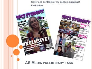
  • 1. Cover and contents of my college magazine! Evaluation. AS MEDIA PRELIMINARY TASK
  • 2. IN WHAT WAY DOES YOUR MEDIA PRODUCT USE, DEVELOP OR CHALLENGE FORMS AND CONVENTIONS OF MEDIA PRODUCTS? COVER PAGE. SIMILARITIES: Masthead Cover lines around the main image “C” used to display images and text. Rule of thirds Eye contact with both people on cover
  • 3. IN WHAT WAY DOES YOUR MEDIA PRODUCT USE, DEVELOP OR CHALLENGE FORMS AND CONVENTIONS OF MEDIA PRODUCTS? COVER PAGE DIFFERENCES: A medium shot used in “fashion” whereas a medium close up is used on “sfcs student.” A model is used on the front cover. The pose of the model on “fashion” could have connotations of being sexy, a confident pose is portrayed with connotations of glamour and style. Whereas on “sfcs student” the facial expression is a smile, it is a real life student which the students would relate to and she looks welcoming and friendly inviting the reader to read on. Another difference was the background “sfcs student” has a background whereas fashion has a plain background. Lastly “sfcs student” has a barcode which I feel makes it look professional and like a proper magazine whereas “fashion” doesn’t.
  • 4. STRENGTHS AND WEAKNESSES OF THE FRONT COVER OF MY STUDENT MAGAZINE Strengths: I think that I followed the idea of a “c” shape as a magazine would do which made it look professional. I think that the background emphasised the idea of college life as it represented a student at college. Lastly I think that my image was clear and worked quite well. Weaknesses:  I think there was some dead space which I could have filled more effectively.  I could have used a range of fonts to make it more interesting  Lastly I think that my image had too much headspace which could have been improved by taking the image from a better angle.
  • 5. AUDIENCE FEEDBACK ON MY FRONT COVER. I gained feedback from my audience so that I now know what would need improving next time. My audience thought that my strengths included: That they liked my font. They also thought that my main image brought out the text- ensuring it was easily legible and eye-catching. My audience thought that my weaknesses include:  That there was slightly too much space.  They also believed that I could have had a few more Coverlines to grasp the readers attention.
  • 6. IN WHAT WAY DOES YOUR MEDIA PRODUCT USE, DEVELOP OR CHALLENGE FORMS AND CONVENTIONS OF MEDIA PRODUCTS? CONTENTS PAGE. SIMILARITIES Both contents pages have initial magazine masthead on their contents pages. Information backs up the coverlines on the front cover. Simple layout of columns with sub headings headings so the readers can simply read the information (columns divided into 3). This makes the information clear. Use of images to provide a visual representation for the readers and to make it more interesting.
  • 7. IN WHAT WAY DOES YOUR MEDIA PRODUCT USE, DEVELOP OR CHALLENGE FORMS AND CONVENTIONS OF MEDIA PRODUCTS? CONTENTS PAGE. DIFFERENCES. “Drummer” uses a number on their images which is professional; it allows the reader to know exactly where to find this section; whereas on my magazine I didn’t do this- I think next time I could to make it more professional. On my student magazine I added an email address and number to make it seem more professional; this isn’t on “drummer”. Drummer has a clear professional colour scheme whereas my magazine uses a range over colours. I think using a colour scheme makes the magazine look professional
  • 8. STRENGTHS AND WEAKNESSES OF THE CONTENTS PAGE OF MY STUDENT MAGAZINE Strengths: I think that I put a reasonable amount of images on my contents to ensure the interest of the reader. I also used subheadings to make sure that the information was clear and legible this ensured my magazine would be easy to navigate around. Lastly I used three columns to ensure my magazine gave quite a professional approach. Weaknesses:  I think that my images weren’t very clear and could have been made more able to see, by making them bigger.  I think I could have had more text and information.  Lastly I think I could have showed the fact I was aiming to use 3 columns more clearly.
  • 9. AUDIENCE FEEDBACK ON MY CONTENTS PAGE.  I gained feedback from my audience so that I now know what would need improving next time. My audience thought that my strengths included: That my layout was good and easy to gather information from. Also that I used a good amount of pictures which made it more interesting. My audience thought that my weaknesses include:  That I could have used a background colour this would have made it more interesting and overall made my contents page more effective.
  • 10. WHAT HAVE YOU LEARNT ABOUT THE TECHNOLOGIES FROM THE PROCESS OF CONSTRUCTING THIS PRODUCT? By Laura Boucher
  • 11. I used a digital camera to take my main image- I learnt about a range of different angles and use a medium close up on my front cover. I had to ensure that the model dominated the frame however there was room for coverlines. I think I could have angled the camera better to ensure that there was less headspace. I then used adobe photoshop. This is an image based, industry standard package. I learnt to do many things such as: add an image; add text; add colour and to use the range of tools available. I began by simply adding my image; this set the background for my magazine. I simply did this by placing my image. I then added my masthead; to do this is used the text tool and then I simply changed both the colour and font. I want to made my masthead stand out so I used fx and added a stroke and drop shadow.
  • 12. ADOBE PHOTOSHOP Here I was able to add some key coverlines, including my main one “exclusive” here I used the text tool, font and colour, I was also able to position my text wherever I wanted it. Here I added a barcode and I used a strip at the bottom, to do this I added a rectangle and then simply added text to it.
  • 13. CONTENTS PAGE USING INDESIGN. I created my contents page using InDesign. This is an industry standard package. It allowed me to “place” my images in and also my masthead. It allowed me to add text with a range of fonts, colours ext. I found indesign fairly simple to use and easily became familiar with the toolbar. This shows my contents page in indesign. Indesign allowed me to think about the importance of layout. I helped me to try and achieve the three columns I was aiming for. The only thing I found difficult about indesign was drawing the picture boxes first as often the sizing was wrong and the image didn’t fit. I don’t think that my contents page looked very professional I think that I could have improved this by ensuring the images were resized and more clear and maybe having a background colour to make the text and images stand out more. Overall indesign enabled me to add the features of my contents page and mainly enabled me to think about the importance of a good layout; which I have now realised I can improve upon next time.