1. As Media Preliminary task
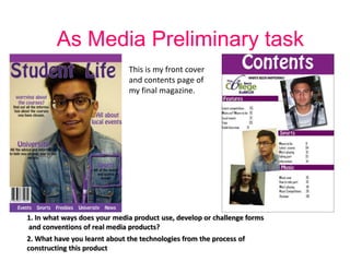
This is my front cover
and contents page of
my final magazine.
1. In what ways does your media product use, develop or challenge forms
and conventions of real media products?
2. What have you learnt about the technologies from the process of
constructing this product
2. Similarities- The similarities of my college magazine and “Elle”
magazine.
They both have a
Masthead
Both have
various Cover
lines, to advertise
what's inside.
Both have a
plain
background
and use of
“rule of
thirds” as
well as a
mid-shot
3. The differences of my college magazine and “Elle” magazine
My college magazine has
an image of a college
student representing the
college, however “Elle”
magazine uses a fashion
celebrity as it is for the
fashion audience.
The type of sell lines are
different “Style” is for the
fashion magazine yet the
college magazine has sell
lines about university.
Different house style,
the college magazine
is fun with purple.
Elle magazine is black
and elegant.
4. What's similar with the contents pages? How does mine
challenge the other magazine?
They both have
images relating to
the magazine. E.g.
college students
and make-up. ELLE
is more professional
and the college
magazine is more
laid back.
Both have the
sub headings
helping the
reader find
what they are
looking for.
Different
columns
categorised for
different
interests.
5. Differences with the contents page
The images used in
“Elle” magazine are
more professional
and sophisticated
and they look like
they have been taken
on fashion shows or
photo shoots, aiming
at fashion conscious
people. Where as my
images are more
casual around college
and have a laid back
feel to the magazine,
giving a wider range
for an audience.
“Elle” magazine also
has a paragraph of
information which
helps the reader, so
to improve my
magazine I could add
a feature paragraph
with more
information.
6. What have you learnt about the technologies from the process
of constructing this product
PHOTO SHOP CS6
In photo shop I learnt how to edit and manipulate images to make
them better in there own way I learnt how to use the different
tools such as changing the contrast, brightness or colour to make
them more professional.
This is the image I used for
my front cover, this is it
edited on Photoshop.
INDESIGN
I used InDesign to help me create my double page spread as well as my
contents page. By using this I was able to create manipulate my images
further changing the view of them.
I used a DIGITAL CAMERA to create
different shots like long shot, head
shot but mainly mid-shots for the
I used MOODLE to collect all of my resources to magazine.
create my magazine
7. By being able to use the camera for my Front cover image I was able to make sure the
photo I was taking was the right type of shot for me, this being a Mid-shot. I made
sure
the model was standing in front
of a plain blank wall so he would
be the main focus of the image.
I made sure he was smiling to make
sure I supported the casual feel to
the college magazine.
I used ADOBE PHOTO SHOP to
edit the student into what you
would see on a college magazine.
This is how I edited my image, I made
it more brighter and increased the
contrast, making him be the main
focus of the image.
8. Using InDesign to create my contents.
Looking back on my contents page I like the layout
I chose, I think I layered out the columns well so its
easy to find what you are looking for.
To improve it I think I could add a box of
information or a paragraph about what's in the
magazine just so it has a professional feel as well
as being more welcoming for the audience.
In some areas it seems to be there is a lot of dead
space so to improve this I could add more
information.
I like how my images are spread out and placed at
different angles, however the image on the bottom
left I had to squash down to fit, so I should have
done this over Photoshop. However no I know how
to use the software I think I am more able to
create this with more knowledge of tools to make
it better.