
Recommended
More Related Content
What's hot
What's hot (19)
Viewers also liked
Viewers also liked (20)
Similar to Screenshots
Similar to Screenshots (20)
Recently uploaded
Recently uploaded (20)
Screenshots
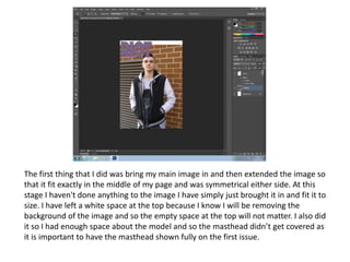
- 1. The first thing that I did was bring my main image in and then extended the image so that it fit exactly in the middle of my page and was symmetrical either side. At this stage I haven't done anything to the image I have simply just brought it in and fit it to size. I have left a white space at the top because I know I will be removing the background of the image and so the empty space at the top will not matter. I also did it so I had enough space about the model and so the masthead didn’t get covered as it is important to have the masthead shown fully on the first issue.
- 2. I then added my main coverline, issue number, date and barcode. I have brought these in before removing the background so that I can fit them in accurately and ensure that they fit onto the front cover. I also did it so that I could fit the text around my models body and so that when I do crop the background I know that the text from my main coverline will still stand out.
- 3. I then removed the background of the main image using the magic wand tool on Photoshop. I did this so the colours of the brick wall didn’t clash with my theme colours, grey and purple. It also ensures that my coverlines stand out and the background of the image doesn’t distract from both the model in the image and my coverlines. Once the background had been removed I started to add my coverlines, the plain background made the words stand out and lift off the screen. I also framed them around my model so the attention wasn’t taken away from him.
- 4. Finally I added a grey ombre background. I rasterized the image so that it was of good quality and fit it so size on my front cover. I chose a simple background so that all the attention was on my model and the coverlines were able to stand out. I chose a grey one so that it still fit in with my colour theme and allowed all the attention to be on the model.
- 5. I got the idea of a plain background from the Kerrang front covers that I looked at, almost all of them have got a simple plain background so I followed convention and went with the simple grey background. I also followed the style of having my main coverline really stand out so that it catches the readers eye. They have also included a strip just like Kerrang has done, they have there's at the top and I have one at the bottom. They both still do the same thing by letting the reader know what else they can find inside the magazine.
- 6. On the left is the original image that I had taken and my final front cover is on the right. After I got the image on to Photoshop I then adjusted it so that it fit in the middle of the page with enough space around the sides and front. I then used the magic wand tool and removed the background so it was a plain background so I was able to add my own background to the front cover.
- 7. The first thing I did was bring my masthead from my front cover and create the contents masthead. I kept the same colour scheme so that my magazine was consistent. I have made the words ‘Riot’ smaller so that the branding from the front cover carries on throughout the magazine but doesn’t take away from the main masthead ‘contents’. I also changed the background so that it was just a plain white and followed my colour scheme.
- 8. I then brought my images in one at a time. I added a border around all my images so that they lift off the page and stand out the reader when flicking through the magazine. I have also anchored them to page numbers so that when they look at the contents page they can see the picture and find the exact page that they are linked to an article within the magazine and will be able to find it easier.
- 9. I then finished it off by adding the contents information, all linked with pages within the magazine. I then added an editorial so that I could make my magazine more personal and directly address my readers. I then added social media information and a website page so that people can find information about the magazine in other areas than the magazine.
- 10. On the right is my original image and you can see the background from where the white screen stops I have decided that I will crop that background so that it can’t be seen when on my magazine double page spread. On the right is my edited version and the background matches the white back drop and you can see where it cuts off.
- 11. I have inserted my text onto InDesign and made it so it fits onto the right hand side so that I can place my image onto the left hand. I will make sit so my image fits across the entire left hand side.
- 12. My final double page spread has got my main image and then I decided to add three further images along the bottom that all relate to the article I have written. I have manipulated the background out of all the images so that the cut off of the white screen can not be seen.