Networking in the Penumbra presented by Geoff Huston at NZNOG
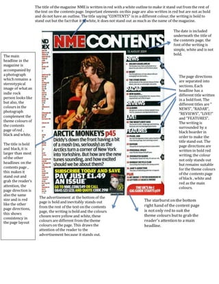
Contents page of NME magazine
1. The title of the magazine NME is written in red with a white outline to make it stand out from the rest of
the text on the contents page. Important elements on this page are also written in red but are not as bold
and do not have an outline. The title saying ‘’CONTENTS’’ is in a different colour,the writing is bold to
stand out but the factthat it is white, it does not stand out as much as the name of the magazine.
The date is included
underneath the title of
the contents page; the
font of the writing is
simple, white and is not
bold.
The page directions
are separated into
sections. Each
headline has a
different title written
in a bold font. The
different titles are ‘’
NEWS’’, ‘’RADAR’’,
‘’REVIEWS’’, ‘’LIVE!’’
and ‘’FEATURES’’.
The writing is
surrounded by a
black boarder in
order to make the
title stand out. The
page directions are
written in bold red
writing, the colour
not only stands out
but remains suitable
for the theme colours
of the contents page
of black , white and
red as the main
colours.
The advertisement at the bottom of the
page is bold and inevitably stands out
from the rest of the text on the contents
page, the writing is bold and the colours
chosen were yellow and white, these
colours are different from the theme
colours on the page. This draws the
attention of the reader to the
advertisement because it stands out.
The main
headline in the
magazine is
accompanied by
a photograph
whichremains a
stereotypical
image of whatan
indie rock
person looks like
but also, the
colours in the
photograph
complement the
theme colours of
the contents
page of red ,
black and white.
The title is bold
and black,it is
larger than most
of the other
headlines on the
contents page ,
this makes it
stand out and
grab the reader’s
attention, the
page direction is
also the same
size and is red
like the other
page directions,
this shows
consistency in
the page layout
The starburst on the bottom
right hand of the content page
is not only red to suit the
theme colours but to grab the
reader’s attention to a main
headline.