The document describes the typical layout and conventions of a music magazine contents page. It notes that the contents page usually features a large central image related to the main article. Key information like the magazine masthead, date, and page numbers are prominently displayed in bold fonts. The contents are organized in sections with clear subheadings and page numbers highlighted in red. Larger text is used to draw attention to the main article which often has its own accompanying image. Music magazine contents pages generally follow a consistent color scheme of black, white, and red to emphasize important details.
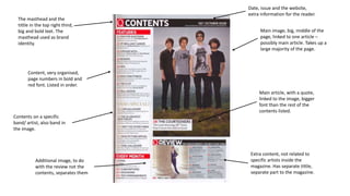
1. Main image, big, middle of the
page, linked to one article –
possibly main article. Takes up a
large majority of the page.
The masthead and the
tittle in the top right third,
big and bold text. The
masthead used as brand
identity.
Contents on a specific
band/ artist, also band in
the image.
Main article, with a quote,
linked to the image, bigger
font than the rest of the
contents listed.
Extra content, not related to
specific artists inside the
magazine. Has separate tittle,
separate part to the magazine.
Content, very organised,
page numbers in bold and
red font. Listed in order.
Additional image, to do
with the review not the
contents, separates them
Date, issue and the website,
extra information for the reader.
2. Some of the contents have
their own photo, show
their importance to the
magazine, bring attention
to them on the page.
Main image, goes with the
conventions as it takes up a
large majority of the page,
but is of a band at a concert
signing autographs rather
than at a photo-shoot.
Follows the conventions
as there is almost always
subscription information
on the contents page.
Follow the house style as
Kerrang always uses dirty
looking fonts in heading,
linked to rock.
Signature from the editor,
convention of contents
pages.
The contents are
categorised with
subheadings.
3. Tittle in large, bold font,
stands out. Also includes
the masthead for brand
identity.
Large image in the middle of the
page of a particular artist/ band.
Then large font on its article
and page number of that artist,
the main article.
All the contents very
organised, in serial order, red
highlighted page numbers,
have separate subheadings
for different types of articles.
The main article in large
writing
NME’s house style sticks
generally with its colour
scheme of black, white
and red to highlight
important information,
common of rock
magazines.
Follows the conventions
as there is almost always
subscription information
on the contents ages
4. The main tittle is very
small and hard to see as it
is only in black font and in
the corner. Against
conventions as it is usually
in bold and across the
top.
The main article is in very
large font with its own
image that dominates the
majority of the contents
page, very important
artist, encourages reader
to look at that article.
House style – has a retro look to
it which is part of the house style
as it is called ‘Classic Rock’. Also
uses a very iconic band as its
main article and image. As usual
it uses black and white and then
red to highlight the important
information like many music
magazines do.
All of the contents are in black
plain font with the page number
in bright red. Conventions of a
contents page as many music
magazines use it. Also the tittles
of the contents are just the
names of the artists, not about
the article.
Competition information.
Exclusive interviews, shows the
articles are about the recent
events and may have information
about the artist that is new.
5. No tittle of ‘contents’ at
the top of the page,
against the usual
conventions of any
contents page in a
magazine.
Brand identity at the top of the
page in the largest font and in
bold, shows its importance. Also
includes the date and issue
number, typical of a contents
page.
Main image dominates
the majority of the
contents page, very
important artist. Also has
a quote to go with it from
the artist. In black, white
and red clothes which
match the colours of the
page.
tittles of the contents are
just the names of the
artists, not about the
article.
Rock Sound’s house style
is very similar to other
rock magazine as it sticks
generally with its colour
scheme of black, white
and red to highlight
important information.