Mayiladuthurai Call Girls 8617697112 Short 3000 Night 8000 Best call girls Se...
Task 1d
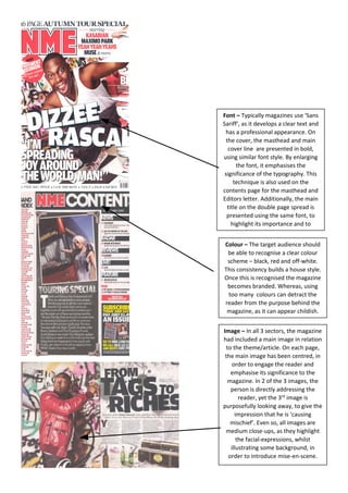
1. Font – Typically magazines use ‘Sans
Sariff’, as it develops a clear text and
has a professional appearance. On
the cover, the masthead and main
cover line are presented in bold,
using similar font style. By enlarging
the font, it emphasises the
significance of the typography. This
technique is also used on the
contents page for the masthead and
Editors letter. Additionally, the main
title on the double page spread is
presented using the same font, to
highlight its importance and to
correspond with the magazine’s
Colour – The target audience should
be able to recognise a clear colour
scheme – black, red and off-white.
This consistency builds a house style.
Once this is recognised the magazine
becomes branded. Whereas, using
too many colours can detract the
reader from the purpose behind the
magazine, as it can appear childish.
Image – In all 3 sectors, the magazine
had included a main image in relation
to the theme/article. On each page,
the main image has been centred, in
order to engage the reader and
emphasise its significance to the
magazine. In 2 of the 3 images, the
person is directly addressing the
reader, yet the 3rd image is
purposefully looking away, to give the
impression that he is ‘causing
mischief’. Even so, all images are
medium close-ups, as they highlight
the facial-expressions, whilst
illustrating some background, in
order to introduce mise-en-scene.