1. Masthead – Typically magazines will follow the codes and conventions of magazine design and present their masthead in bold at the top of the page, so it can be easily identified by the reader. The yellow corresponds with the colours used throughout the cover, whilst the ‘smashed’ effect connotes this idea of mayhem and outrage, imposed by rock music.
Left Third – A lot of this magazine’s cover lines and images are presented in the left- third. This is due to the way magazines are displayed on a shop shelf. Therefore, even though only the left-third may be shown on display, the reader can still identify the house style and the genre/sub-genre.
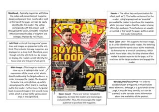
Main Image – This image is a medium close up, as it highlights the facial expressions of the music artist, who is directly addressing the target audience, in order to engage the reader. The image of the guitar is a centred close-up, which almost gives the effect that it is reaching out to the reader. Furthermore, the guitar leads to second image of the second music artist, which is a lead to the various cover lines in the right-third.
Barcode/Date/Issue/Price – In order to successfully sell a magazine, it must include these elements. Although, it is quite small on the page, it must be easy identify, so it can be scanned, as the barcode stores information about the availability of the product.
Cover mount – These are ‘extras’ included in magazines, to imply the readers are receiving an exclusive offer. Thus, this encourages the target audience to purchase the magazine.
Main Cover Line – This supports the main image, so it can be identified by the reader. The lettering is presented in the same colour as the masthead, to demonstrate a sense of consistency, which builds house style. Also, the drop shadow effect makes it appear separate to the page, as if to reach out to the target audience and engage the reader.
Header – The editor has used punctuation for effect, such as ‘!’. This builds excitement for the reader. Using language such as ‘essential’ persuades the reader to purchase the magazine, whilst ‘preview’ implies that the reader is being offered an exclusive. These features are usually presented at the top of the page, as this is what the reader notices first.