
Recommended
More Related Content
What's hot
What's hot (17)
Viewers also liked
Viewers also liked (10)
Similar to Nme dizze rascal double page
Similar to Nme dizze rascal double page (20)
More from asmediad14
More from asmediad14 (20)
Recently uploaded
Recently uploaded (20)
Nme dizze rascal double page
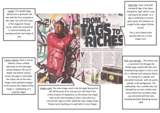
- 1. Main title- Uses irony with instead of rags it has been changed to ‘tags’ which is eye catching to the reader as a tag is something a criminal wears gives the audience an insight to the subject (Dizzee rascal) This is also linked to the position that he is in the image used. Font size and type - The article uses a consistent font through the double page spread with the main heading being largest in size is also has a informal and colloquial theme to it being all in capitals and unlevelled moreover with the paints splatter in the background. The subheading has a smaller text size followed by an even smaller main article which has included a drop cap consistent with the main heading therefore following houses style. Layout -This double page spread uses a grid split into two with the first assigned to the cover star and main topic of the magazine 'Dizzee rascal'. while the second half is used for heading sub heading and the main body of text Colour scheme there is not an obvious colour scheme operating on this two page spread however the use of bright and vibrant colours across the page is noticeable the colour red on the main image could symbolise danger to the actions the subject of the image is undertaking as it could be illegal. Images used The main image used is the full page featured on the left because of its size you can infer that it has similar amount of importance as the article, the image links to the main heading as that is also refer to a criminal life 'tags to riches' while the main image shows 'Dizzee rascal' grafting on a wall which is also illegal.