
Recommended
More Related Content
Similar to Front cover 2
Similar to Front cover 2 (20)
More from franzzz101
More from franzzz101 (20)
Recently uploaded
Recently uploaded (20)
Front cover 2
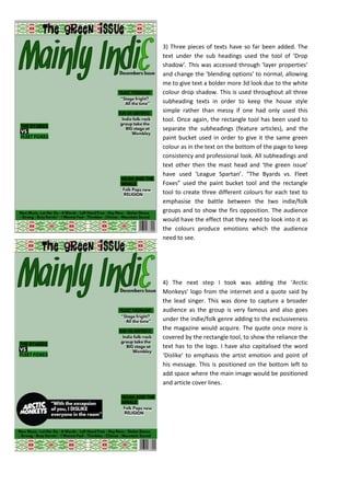
- 1. 3) Three pieces of texts have so far been added. The text under the sub headings used the tool of ‘Drop shadow’. This was accessed through ‘layer properties’ and change the ‘blending options’ to normal, allowing me to give text a bolder more 3d look due to the white colour drop shadow. This is used throughout all three subheading texts in order to keep the house style simple rather than messy if one had only used this tool. Once again, the rectangle tool has been used to separate the subheadings (feature articles), and the paint bucket used in order to give it the same green colour as in the text on the bottom of the page to keep consistency and professional look. All subheadings and text other then the mast head and ‘the green issue’ have used ‘League Spartan’. “The Byards vs. Fleet Foxes” used the paint bucket tool and the rectangle tool to create three different colours for each text to emphasise the battle between the two indie/folk groups and to show the firs opposition. The audience would have the effect that they need to look into it as the colours produce emotions which the audience need to see. 4) The next step I took was adding the ‘Arctic Monkeys’ logo from the internet and a quote said by the lead singer. This was done to capture a broader audience as the group is very famous and also goes under the indie/folk genre adding to the exclusiveness the magazine would acquire. The quote once more is covered by the rectangle tool, to show the reliance the text has to the logo. I have also capitalised the word ‘Dislike’ to emphasis the artist emotion and point of his message. This is positioned on the bottom left to add space where the main image would be positioned and article cover lines.