
Recommended
More Related Content
Similar to Magazine Front Cover Analysis
Similar to Magazine Front Cover Analysis (20)
Recently uploaded
Recently uploaded (20)
Magazine Front Cover Analysis
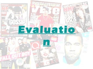
- 1. Evaluatio n
- 2. 1. In what ways does your media product use, develop or challenge forms and conventions of real media products? SIMILARITIES FRONT PAGE •Big striking mastheads of the magazine is a big convention shows the buyer clearly what there buying. •There is big bold text that is used to anchors the main image which helps encourage the reader to buy the magazine.
- 3. 1. In what ways does your media product use, develop or challenge forms and conventions of real media products? SIMILARITIES • On my magazine it shares the same obvious conventions such as the date, price and barcode. • The bold cover lines help highlight a specific topic covered inside the magazine.
- 4. 1. In what ways does your media product use, develop or challenge forms and conventions of real media products? SIMILARITIES FRONT PAGE •The colour in both magazines show a consistent theme in the “Vibe” magazine there’s the use of green, white and a bit of red. In my “Beatz” magazine there is the use of black, red and white. •They both share the same convention of having a ‘puff’ to attract the reader.
- 5. 1. In what ways does your media product use, develop or challenge forms and conventions of real media products? DIFFERENCES FRONT PAGE •The “vibe” magazine demonstrates the use of a close up photograph where as in my “beatz” magazine I’ve shown a main image reflecting a medium long shot. •There is a variation of the amount of font sizes used which helps
- 6. 1. In what ways does your media product use, develop or challenge forms and conventions of real media products? DIFFERENCES • Om my magazine front cover I have challenged the convention by the Idea of having a ‘scan barcode’ to make my magazine look modern and engage the target audience. • The size of the main image take up majority of the space provided, and the eye line is in the top third of the page which is also a convention.
- 7. 1. In what ways does your media product use, develop or challenge forms and conventions of real media products? SIMILARITIES •Large images to show the reader who will feature inside the magazine. •The numbers next to the headings reference what page it is going to be on, this is a popular convention that makes is clear for the reader. •‘contents’ is massively highlighted to alert the reader exactly what page it is.
- 8. 1. In what ways does your media product use, develop or challenge forms and conventions of real media products? DIFFERENCES •In my media product I have chosen to have a more consistency of colours however the theme choice isn't random its just set in a different style to most magazine contents pages.
- 9. 1. In what ways does your media product use, develop or challenge forms and conventions of real media products? SIMILARITIES • The contents page has may conventional similarities as like other existing products. • A numerous amount of images to allow the reader to get a clear idea of the genre music type. this is conventional because its showing a various amount of artist that feature in the magazine. • An ‘editors note’ which is mostly seen in magazine once they publish there first issue.
- 10. 1. In what ways does your media product use, develop or challenge forms and conventions of real media products? DIFFERENCES • From looking at the example of an existing double page spread from the ‘VIBE’ magazine I can see how much my own double spread page differs in a way of originality. • In the existing magazine there are a limited amount of colours used which makes it look like a more mature adult audience that it is targeted to.
- 11. 1. In what ways does your media product use, develop or challenge forms and conventions of real media products? SIMILARITIES • From looking at this existing double page spread we share the same similarities in the way there is a large text taking up a lot of space however it looks very decorative and creative. • What I’ve found to notice that in this ‘NME’ music magazine its similar to mine because it has a female artist picture which takes up majority of the page posing , this shows that the model must has a dominant relative part of the article.
- 12. 2.How does your media product represent particular social groups? • I have made the front cover of my magazine very stereotypical reflecting the music genre- RnB. • I thought doing this would give the audience and social groups a clear understanding and insight as to what the product is about.
- 13. 2.How does your media product represent particular social groups? • My media has represented the not only the social group of the music genre RnB, but has represented an16+ audience that will find great interest into this type of media product which I have found out from my previous research-questionnaire. • A cover line on the front page of my magazine product “Jessie J stars on a new talent show” indicates and suggest a different class that isn't just interested in music media but also television which is still a type of media.
- 14. 2.How does your media product represent particular social groups? • The mise en sine that has been represented through the clothing of the model on the front page of the music magazine is an obvious assumption as too what “Hip-Hop” “RnB” artist wear, baggy top. Baseball hat/cap, chain and the idea of him holding a microphone is to portray the music magazine product.
- 15. 2.How does your media product represent particular social groups? •On my contents page I have another picture which represent the obvious RnB genre as to the clothing the models are wearing- the idea of tracksuits, trainers and hoddie. • On the contents page I have notified the audience on up coming events that they may be interested in, which also representing a different type of social class.
- 16. 2.How does your media product represent particular social groups? • In my media product I have included some “celebrity gossip” which I thought the audience I am targeting this would entertain them as many people within that age group have celebrity role models they look up to. • Technology such as iPods, headphones, iPhones, ect have been shown in my contents page because it’s a popular devices mi imagine my audience to have and they are all in a way connected to the music genre whether you can listen to or buy music off them. This suggest another type of social class.
- 17. 2.How does your media product represent particular social groups? • I have also included a list of activities that the audience can keep entertained such as “ “chances to win” this is designed to represent another type of social class so my media product isn’t bias. • In my contents page I have listed an number of topics so its not just concentrating on one thing it has various things that the audience can relate to as they may be apart of many different social classes.
- 18. 2.How does your media product represent particular social groups? • The double page spread is a great way to show how my media product represent, many different social groups because its and interview that asks question about many different things all people would be interested in.
- 19. 3.What kind of media institution might distribute your media product and why? • The type of media institution that could distribute my media product would be the music company “EMI” • This is because the company have taken on only a few artist that are within my chosen music genre RnB. • Artist such as snoop dogg,Emile Sande, TinieTempah, J.Holiday, professer Green however this is like a minumum amount compared to the many RnB artist out there that are very much in the media limelight.
- 20. 3.What kind of media institution might distribute your media product and why? • From doing some research ive found that the music record company “UNIVERSAL RECORDS” has a numerous amount of RnB artist signed than any other. • So I think my media product could easily be distributed to this type of media institution. This way my media product could be a type of publisher advertising there artist of my chosen music genre. • I also think that my media product is appropriate to this specific institution as I can relate to many artist within the company.
- 21. 3.What kind of media institution might distribute your media product and why? • AKON • ASHANTI • AMERIE • CHAMILLIONAIRE • DIDDY • DRAKE • DR DRE • LL COOL J • LIL JON • LIL WAYNE • LLOYD • LUDACRIS • BIG BOI • AALIYAH
- 22. 3.What kind of media institution might distribute your media product and why? TEYANA TAYLOR RICKROSS RIHANNA TIMBERLAND THE DREAM JESSIE J JAY Z KAYNE WEST KEYSHIA KELLY ROWLAND KERI HILSON MANY MORE…
- 23. 4.Who would the audience be for your media product? • For my media product the audience would be a mixture of social classes. • It’s mainly targeted at people who like the RnB music genre and then a age group that is 16+. • I have chosen this age group because they are at a mature level to be able to participate in the activities and prizes that are included in my music magazine. • I also think that the wording and topics highlighted in my music magazine relate to this age group and I am able to relate to my music magazine as I am within that age.
- 24. 5.How did you attract/address your audience? • To attract the audience I used bright eye catching colours however I kept a theme going because it I had lots of colours then my magazine would look childish and the age group of my target audience is 16+ so I used mature colours. • A large imagine central of the front page is also away to attract the audience /readers attention. The front cover is the first thing the reader sees and this way they are able to tell whether or not they like the music magazine.
- 25. 5.How did you attract/address your audience? • There is the same amount of colours used in the contents page which helps make the magazine look neat and tidy. • In the contents page there was more to say and I could address the audience as though I was talking directly to them by using words like “us” and “you”
- 26. 5.How did you attract/address your audience? • To address the audience I did a interview and written it in colloquial language so many of the audience of the target age I chose to do will be able to understand and relate to it. • To attract the audience I decide to do the models image very large on one side of the page so it was clear and on the I did a border around the page by recreating shapes and changing the colour of them to make them eye catching and a well presented page to look at for my preferred audience.
- 27. 6.What have you learnt about technologies from the process of constructing this product? • I have learnt how to edit images in photo shop, for instance changing a photo from the original image into a black and white image and changing the brightness and contrast of it so the image looks more professional and clean.
- 28. 6.What have you learnt about technologies from the process of constructing this product? This was the end result once I changed and messed around with the brightness and contrast of the image. I also cropped it down so there was precise and together.
- 29. 6.What have you learnt about technologies from the process of constructing this product? To start off with I had to get together some images of models that were dressed in a way that could project a “RnB” or “Hip-Hop” style to it, I also had to focus on getting the right sort of background which was appropriate for my magazine. I also had to decide what type of shots I wanted for what parts of my magazine, whether it was a close up medium shot for my front cover or a long shot for my contents.
- 30. 6.What have you learnt about technologies from the process of constructing this product? • I have learnt how to import text off the internet and change it in a way that satisfy's me and that fits in with my magazine design. Here I have created a logo and title for my magazine. I have used to different types of fonts that I though bring out that “urban” and “Hip Hop” sort of style. The red a black colours are a consistent theme which is run throughout the whole of the magazine.
- 31. 7.Looking back to your preliminary task, what do you feel you have learnt in progressions from it to the full product? • Ive now been able to construct and create a double page spread which I have not done before in my preliminary task. This has helped me become confident in using the ‘In design programme”.
- 32. 7.Looking back to your preliminary task, what do you feel you have learnt in progressions from it to the full product? • I think by doing more research into the music magazine genre I have gained more knowledge about the industry and It has impacted me to produce a music magazine that is very conventional in ways to other existing music magazine products.