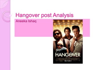
3. Key image
One man has a baby brace on the
front of him; the baby is wearing big
sunglasses resembling him, the man
behind has a cut lip and the man on
the left has a missing tooth and looks
puzzled, all three characters look
scruffy. With the image covering most
of the poster it teases us what the film
is going to be about.
4. Title
The Hangover suggests that the three
men have woken up after a drunken
night and are stuck in a situation with
the baby, the scruffy look and the two
men's injuries. This brings the humour
element to the film as we presume
they have woken up clueless to what
happened the night before.
5. Genre
When looking at this poster the
audience are able to see that there is
going to be some action happening,
through their body language, but then
when we see the state of the
characters, their facial expression and
the props that have been used, it
looks like that comedy will be the main
genre.
6. Stars
The names of the main stars have not
been displayed, this is because the main
characters may not be well known so
therefore their names would not be
necessary. By not writing their names on
the poster it focuses more on the
storyline of the film and attracts viewers
to the image and the bold title instead.
Above the tagline there is information on
the director of the film, `From the director
of `Old School`` written on the top of the
poster aims to pull in viewers.
7. Layout
At the top is the tagline and a line to
advertise the director by using the
name of a film previously made by
him. Then there is the main image
with the three men and the baby
taking up most of the page below the
Vegas lights. Lastly there is the title in
bold and the release date.
8. Fonts
The title emphasises the `Hangover`
part mainly. It is San Serif font to make
it bold and easy to read for viewers,
the audience straight away know the
film will be something to do with
having a hangover. The `the` part is
not so important, to make it more
visually appealing and so that the
`Hangover` part could be as big and
noticeable. The `the` is put inside the
`O` of `HANGOVER`, this is attractive.
9. Colours
The colour scheme of this poster is gold
and black, the background colour is gold
which connotes wealth , however this
links in with the film as the characters
end up spending their money and ending
up in a bad state and that is how the
‘Hangover’ comes on. The theme of
Vegas is kept in the poster through the
glamorous, dazzling gold lights in the
background and the shining graphics of
the lettering for the film name.
10. Tagline
A tagline has been used to give extra
information to the viewers, it says
`Some guys just can't handle Vegas`
This gives the viewer a further insight
into the film, they assume the film is
based in Vegas through the tagline;
where the three men come across as
trouble.