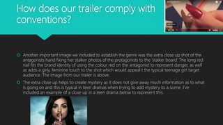
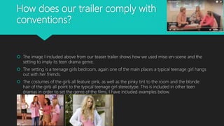
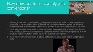
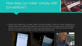
Download to read offline

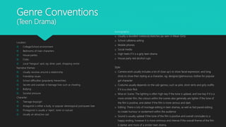
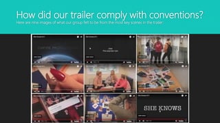
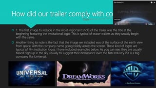
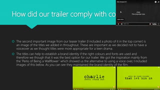
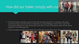

The document analyzes how the author's media product complies with conventions of real teen drama media. It discusses 9 key scenes from the teaser trailer that demonstrate adherence to conventions. These include opening with the institutional logo high in the sky, using titles throughout for information rather than voiceover, featuring typical teen drama settings like schools, incorporating close-ups to add mystery, using mise-en-scene to imply the genre through items like pink bedrooms, showing an escalation of drama and tension, including mobile phones to continue building suspense, and ending with the film title to leave a lasting impression. The analysis compares these elements to conventions found in other popular teen drama trailers and media.