Private Call Girls Bally - 8250192130 | 24x7 Service Available Near Me
Film posters analysis
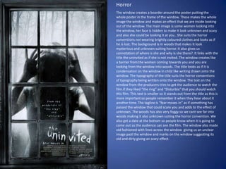
1. Horror The window creates a boarder around the poster putting the whole poster in the frame of the window. These makes the whole image the window and makes an effect that we are inside looking out of the window. The main image is some women looking into the window, her face is hidden to make it look unknown and scary and also she could be looking it at you.. She suits the horror conventions not wearing brightly coloured clothes and looks as if he is lost. The background is in woods that makes it look mysterious and unknown suiting horror. It also gives us connotation of where is she and why is she there?. It links with the title the uninvited as if she is not invited. The window creates like a barrier from the women coming towards you and you are looking from the window into woods. The title looks as if it is condensation on the window in child like writing drawn onto the window. The typography of the title suits the horror conventions of typography being written onto the window. The text on the window from the producers tries to get the audience to watch the film if they liked “the ring” and “Disturbia” that you should watch this film. This text is smaller so it stands out from the title as this is more important so people remember it when they hear about it another time. The tagline is “fear moves in” as if something has passed the window that could scare you and adds to the effect of unknown. The woods has also very foggy so we cant see far into woods making it also unknown suiting the horror convention. We also get a date at the bottom so people know when it is going to come out so the audience can see the film. The window also made old fashioned with lines across the window giving us an unclear image past the window and marks on the window suggesting its old and dirty giving an scary effect.
2. Comedy The main image is the two people smiling as if it’s a family photo, they are both smiling and are dressed up for it in a way they act as still children as if there mother dressed them ready for there picture. They are both wearing similar clothes which tells us they are both brothers linking with the title which is telling us they are step brothers and are important characters in the film. Both of the actors names are at the top to try and sell to audience if they like these actors they will want to watch this film. The tagline “they grow up fast.” links with there age and still are like children. The background is a blue colour which links with the idea that they are getting a photo doe because similar backgrounds are usually used when having a photo. The title is at the bottom and is bold and clear and catches your eye so the audience see what it is called so they can go watch this film. Both of the words “step” and “brothers” colours link together both the opposite way round so we know that is the title. The title is made as if it is and actually step by having the word step on top of brothers. The date is also quite a big font showing the audience when the film is going to come out. We also get a reference from a previous film that the audience might have seen, giving a reason why you should watch this film.
3. Action The title has sharp straight edges and a plane white colour making it look modern. The text “ULTIMATUM” goes underneath so it fits into that poster and still uses a large enough font so it is easy to read and grabs your attention because its unusual. “The” is a slightly smaller font because it is not that important compared to the other words that they want to stand out more and grab your attention. We get the actors name for people who like that actor will go and watch because he is in it. The text is a different colour so it keeps the title clear and separate from the title. The main image is the actor looking as if he is in a rush from someone most likely the police because he has a gun in his hand suggesting he has done something wrong. He is wearing casual clothes, to try and blend in with the crowd and hide. The clothes are blended with the background so we know that the main focus point of him is his face reaction with gives connotation. The background has a blur effect suggesting he is on the move running away from someone. At the bottom we get a quote telling us how good this film is and gives us a reason why we should come and see this film. The background is hard to see what is there but we assume that its in a normal place and the main question focus is the main image. It uses action conventions as he already he looks like he is in a rush with a gun which ties with normal action films. This film is going to be for teenagers, young adults because it will have violence in it suggesting from the gun.