2. INFORMATION
Artist Name: Beyonce
Album Name: I am... Sasha Fierce
(Plantinum Edition)
I Am... Sasha Fierce is the third
studio album by the american recording
artist Beyonce.
Sasha Fierce – which is named after
Beyonce’s on-stage alter ego,
concentrates on more untempo beats
that blend the Europop and the elctro-
pop genres.
The Deluxe Edition of the album was
released simultaneously along with the
standard edition.
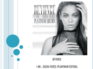
3. FRONT COVER
As mentioned
before, Beyonce’s
alter-ego on stage is
Sasha. And the line, “I
Am...” represents
Beyonce’s personal life
and experiences as the
album name is “ I Am...
Sasha Fierce. And the
word fierce refers to
having voilent
aggressiveness as it is
associated with an
unconstrained person.
The artist is projecting
herself. The main image
fimiliarizes with
Rihanna’s album “Loud”
as they both have a
feminine look.
Beyonces’s
straightened
hair, and bit of her lips
opened, gives more of a
sensious feel which
attracts the audience
towards her. This image
fits in perfectly with
Laura Mulvey’s theory of
the Male Gaze in which
women are looked upon.
The bracelet along with a
ring in her hand, portrays
her star persona and her
accesssories.
The font used, makes the
artist name prominent as
it is in Bold manner. The
album name is in the
same font.
The image is in black and white which gives a special impact.
The artist and its expressions are the main focus as the
background ios blurred.
4. BACK COVEROn the back
cover, the track list
has been printed.
The same font has
been used, but the
size is used is
small, which makes it
a little difficult to
read the tracks in
one go.
The barcode
information is printed
on the backside of the
digipak which is
present on all digipaks.
Thethin and thick
differentiates this
digibak from the others
and helps to keep
record of large
amounts of digipaks.
The viewer’s are
able to see a
Close-up of
Beyonce. The
make-up of the
star’s face in this
image is different
from that on the
front cover. Her
eyes portray a
shadowy effect. It
seems that the
artist is very
consious about
her accessories
as we can see a
golden scarf
which shiny
broches on it
usually to
represent herself
as a fashion
statement.
The colour scheme of the background has not ben kept uniform. It
gives more of light purplish feel which makes the her golden
accessory the main focus.
5. CD
On the cd, the
colours seem a bit
faded and the
audience is not able
to see the real
colours.
Simultaneouly, the cd
is more appealing, as
it shows the long
shot of the Beyonce.
Up till now, she didn’t
reveal herself to the
fullest, but now she’s
fully exposed. The
artist’s way of
standing gives a
sensious feel to the
audience which
makes her more
alluring.
The font sizes and the
layouts used are
appropriate according
to the digipak. The fonts
and the font sizes have
been kept uniform
throughout the digipak
which develops the
same mood from the
beggining till the end.
6. CD-2
Similarly like CD-1, the
audience is able to see a
Long Shot of Beyonce.
This CD colour is black
and white. However, the
audience can see
Beyonce in a different
style and in a different
pose, thus, making her
looks even more
attractive.
The font sizes
and the layouts
that are used
have been kept
consistent
throughout the
digipak. The fonts
and the font
sizes have been
kept uniform
which makes the
digipak follow the
set of codes.