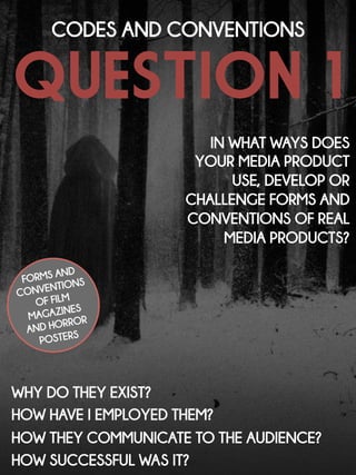
1. QUESTION 1
CODES AND CONVENTIONS
IN WHAT WAYS DOES
YOUR MEDIA PRODUCT
USE, DEVELOP OR
CHALLENGE FORMS AND
CONVENTIONS OF REAL
MEDIA PRODUCTS?
FORMS AND
CONVENTIONS
OF FILM
MAGAZINES
AND HORROR
POSTERS
WHY DO THEY EXIST?
HOW HAVE I EMPLOYED THEM?
HOW THEY COMMUNICATE TO THE AUDIENCE?
HOW SUCCESSFUL WAS IT?
2. PART 1: FILM MAGAZINES
In the first part of this special issue I
will be exploring the forms and
conventions of film magazines
and comparing them to our
magazine ‘Focus’ promoting our
film ‘Wiccan’. I will show how we
have employed these
conventions and the intended
impact of them.
3.
4. They take up the whole
space and is usually
positioned behind whoever is
on the cover.
The masthead on mainstream
film magazines is
conventionally placed in the
centre of the upper third.
THE masthead
5. We have placed the masthead behind the subject on
the cover. This reflects their importance as the main
magazine story is about this actress and the film she
stars in – Wiccan.
The masthead on our magazine is shown in the
largest font. Because of this, its boldness and its
positioning on the page (whole upper third) it stands
out against the rest of the text allowing audiences to
recognise the magazine.
OUR masthead
6. The text is usually large too so it
stands out to the readers. The
font used often reflects the film
so audiences can understand
the film’s genre or tone by the
font.
Magazines often feature the
name of a the film that the main
story will cover. Readers will
know what the issue is mostly
dedicated to before buying and
gives the film promotion.
THE TITLE OF FILM
7. It also takes up the whole
width and is in a a large
font to stand out against
the other story lines.
We have featured the title of
our film ‘Wiccan’ on the
magazine. This was placed
in the lower third which we
found to be a convention.
OUR title of film
The same font has been used in the trailer and
poster to showing we have branded our
promotional scheme. Audiences will associate this
medieval font with witchcraft and identify it with
our film as it is very distinctive and memorable.
8. They are featured in a
smaller font in
comparison to the title
of film and masthead
but certain cover story
lines are larger than
others to suggest their
importance.
These are also
included on the front
cover and tell the
reader about other
stories inside in just a
few words.
THE COVER STORY LINES
9. We also feature a cover story
line that is more important than
the others and therefore it is
shown in a slightly larger font
and placed at the top.
We follow the conventions of
cover story lines by placing them
on the left and right of the cover.
Our COVER STORY LINES
The font and
colours are also
consistent with the
style of the
magazine cover.
10. It is placed in a font and
colour to stand out and
grab the readers attention
– yellow is a common
colour as it will successfully
grab the attention of
whoever is reading.
The skyline is featured at the
very top of the cover and
give information about
special offers or something to
entice the readers.
THE SKYLINE
11. It is also at the very top just above the
masthead and stays consistent with the colour
scheme of black, white and red and the same
font has been used.
Our skyline relates ‘Wiccan’ and witchcraft seen in
the film enticing audiences to purchase the
magazine.
Our skyline
12. This is still a convention on
magazines. It is usually
placed in the corner of
the cover or on the edge
as it shouldn’t be drawn
attention to.
THE barcode
13. We have followed the convention of the barcode
placement and have placed it on the edge of the
magazine as this wont draw attention to it but as it is
still necessary, this was the best place to insert it.
Our barcode
14. In this Premiere cover, the
pink and white colour
scheme will appeal to a
female demographic which
would be their intention as it
features Jennifer Lawrence –
a possible role model for
young girls.
Usually the colour scheme
is linked to the film or the
actor who is on the cover.
In this Total Film cover the
blue suggests isolation and
coldness linked to
Maleficent – a famous
villain.
THE colour scheme
15. The colour scheme
consists of mainly red
and black. These colours
creates an impression of
horror suggesting to the
audience images of
blood and violence may
be seen in the film.
Our colour scheme follows conventions as
it relates to the genre of horror and
therefore our film ‘Wiccan’.
Our colour scheme
This will be appealing to a younger audience who
love the thrill of horror films and can easily identify
the genre through various colours and styles.
16. The font conventionally links
to the main film being
promoted. The font for the
masthead of this Empire
cover has been edited gold
(usually red) connoting
success and luxury and
relates to the masculine
energy of James Bond.
A certain style usually
shown on a cover to
appeal to a desired
audience. This Premiere
cover adopts a very
feminine style with Robert
Pattinson on the cover to
appeal to a female
audience.
STYLES AND FONTS
17. Our font for the magazine
‘Market Deco’ may be
associated with blockbuster
films because of its tall
appearance and suggests
predominance and greatness
due to the Art Deco style of
the font.
For our magazine ‘Focus’, we have adopted a
very professional and conventional style that will
be effective in enticing readers into buying the
issue and reading the interview with the actress.
Our STYLES AND FONTS
As mentioned previously, the font for ‘Wiccan’
has been changed to reflect the film’s theme of
witchcraft and to be associated with a main prop
in the film – the Book of Shadows. This is the same
font used in the trailer and the poster (branding
our products).
18. In these two issues from
Total Film and Empire,
close up shots have been
utilised on Johnny Depp
and Daniel Radcliffe
allowing the audiences to
recognise these huge
actors in film.
Mainstream film magazines
conventionally show very
famous actors and actresses
on the cover to appeal to
mass audiences. Mid-close
ups are common as the
allow the audience to
recognise the subject and
the films they have been in.
The picture
19. Using Adobe Photoshop, we have placed her in front of
the masthead to show her importance in this issue. Her
facial expression is very sinister and serious suggesting the
tone of ‘Wiccan’ and the role she plays which is further
backed up by the mise-en-scene of her black costume
which we can see because of the mid-close up.
We have used a mid-close up in our picture for our
cover. This is to allow the readers to acknowledge
the actress and to remember her and therefore
recognise her in other media.
Our picture
20. PART 2: HORROR FILM
POSTERS
In the second part of the issue I will
be exploring the forms and
conventions of horror film posters
and comparing them to our
magazine ‘Focus’ promoting our
film ‘Wiccan’. I will show how we
have employed these
conventions and the intended
impact of them.
21.
22. In both these posters for
Scream and Saw VI, the
title is in the largest and
boldest font and stands
out against the other
text. The title of the film
catches the eye straight
away which is what
posters aim to do.
The title of the film is
conventionally placed in
the centre of the lower
third of the poster and
positioned just above the
billing block.
THE TITLE OF FILM
23. The title of film is in the largest font and is shown in a
deep red colour so audiences can associate the
poster with horror straight away (the lighting is a big
factor that helps them to do so too).
Following conventions, the title of our film ‘Wiccan’ is
placed in the lower third and covers the whole
width of the poster.
OUR TITLE OF FILM
24. They are usually placed
in centre right at the top
of the poster, however
they are sometimes
placed just above the
title of film as the tagline
always relates to the title.
Taglines are often featured
with the title of the film. This
usually allows the audience
to gain a simple
understanding of the film and
the tone of it.
THE tagline
25. We wanted the audiences to make the link between
the book reference and the Book of Shadows seen in
the trailer as one of the main props. If this book was
left unopened, Violet’s life would never have been
turned upside down.
We placed our tagline in the upper third of our
poster to make it stand out as this is an obvious
(and conventional) place to put it.
OUR TAGLINE
26. Sometimes the release
information is featured which is
also normally at the very
bottom – below the billing
block. This creates a buzz for
the release.
If featured, the billing block is
conventionally placed at the very
bottom of the poster and is
displayed in a very small font. This
features cast and crew members
that are involved in the film,
crediting them for their talent and
input.
THE BILLING BLOCK AND
RELEASE INFORMATION
27. As well as these conventions, we featured ”#Wiccan”
encouraging consumers to tweet about the buzz of
the film leading up to its release as social networking
sites like Twitter are becoming a great way to promote
any product, especially through word of mouth.
We placed our billing block below the title in the
conventional tall font used in many posters. Below
this was the release information to create a buzz.
Our BILLING BLOCK AND
RELEASE INFORMATION
28. Another typical colour used in
(paranormal) horror posters is
blue. This creates a sense of
isolation and is a colour that is
used time and time again for
paranormal posters as it links
to the coldness of ancient,
evil spirits and the dead
coming back to haunt
innocent people.
Especially for slasher horror
films, red is a typical colour
scheme along with black.
Consumers will automatically
think of horror and associate
these colours with blood,
violence and fear.
THE COLOUR SCHEME
29. Although blue is conventionally used in supernatural
posters, we sightly subvert this convention by having a
colour scheme that slasher posters would normally
adopt. This was due to the level of violence, blood
and gore seen in the film and we thought having red
and black in the poster would give audiences a good
idea what they are in for when viewing the film.
Our colour scheme consists of red and black, again
colours that consumers will straight away think of
death, violence and fear all things that a horror film
conveys.
OUR colour scheme
30. Typical horror fonts are also
used in posters, typical of the
genre. This is more of a
convention for slasher posters
– they look like they have
been written in blood
suggesting fear and violence
for the consumers – this allows
them to associate the poster
with the horror genre.
Many horror films use serif
fonts perhaps indicating true
events the film is based on;
this is a formal decision if the
film is done in accordance
with convention. Formal fonts
like these suggest true and
serious matters. In this poster
the ‘D’ has been flipped to
suggest not everything is as it
seems – fear of the unknown.
The FONTS
31. For the title, we have adopted a medieval font that
audiences will associate with the medieval time
period and witchcraft (links to the Book of Shadows
seen in the trailer. This is in a deep red colour to
suggest violence and fear for the costumers.
We have also adopted a serif font, following
conventions of paranormal horror film posters. We
wanted this to link to the ancient, evil spirit that
possesses the protagonist due to the formal and old
appearance of serif fonts.
OUR fonts
32. The poster for Annabelle was our main
inspiration. Both this and the alternate
Poltergeist poster features close up
shots of the objects an ancient demon
attaches itself to. Surrounded by
darkness, the objects give off a sense
of fear of the unknown and unease.
Many supernatural posters feature a significant
character in the film through a close up shot. The
lighting projected onto their faces leaves
shadows around them suggesting the darkness is
within them – it is surrounded by them.
The PICTURE
33. The positioning of the camera is not central to
suggest to the consumers not everything is as it
should be – Violet, the protagonist who we should
side with is in fact possessed and therefore becoming
evil, turning into something the audiences would not
want to side with.
We have included a close up shot of our main
protagonist, Violet. We positioned the lighting to
have half of her face in complete darkness
indicating to the consumers she has two sides to her
– good and evil. She is surrounded by this darkness
to suggest the darkness is within her.
OUR PICTURE
34. conclusion
In conclusion, I believe we have
followed many forms and
conventions with film magazines
and horror film posters with similar
intentions for the audience to
existing products. Our primary
audience will be mainstreamers
who seek security and prefer for
conventions to stay consistent and
not change from film to film so
they are familiar with them and
recognise them in various
products.