1. Music magazine research
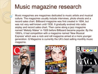
Music magazines are magazines dedicated to music artists and musical
culture. The magazines usually include interviews, photo shoots and a
record sales chart. Billboard magazine was first created in 1894, but
was not very well known until 1936. It gradually evolved into radio
airplay and record sales chart. Then came along a jazz magazine
named ‘Melody Maker’ in 1926 before Billboard became popular. By the
1950’s, it had competition with a magazine named ‘New Musical
Express’ which was a rock and roll magazine aimed at a more younger
generation. Q Magazine is currently the UK’s best selling monthly music
magazine.
2. Textual analysis
Front cover
Masthead
The masthead of this magazine is located at the top of the
magazine. Because of the popularity of this magazine, part of
the main image is covering the masthead. As my magazine will
be the first issue, I will not have my masthead like this. I shall
have my masthead clear and bold at the top of the page with
the image behind it.
Colour scheme
The colour scheme of this magazine remains constant throughout.
The colours scheme consists of white, yellow, black and red. By
keeping the colour scheme to a minimum of four colours, this
makes the magazine look profession, whilst eye catching and
creative at the same time. The colours are bold, block colours
which also helps when it comes to trying to grab the publics
attention.
Main image
The main image of this magazine overlaps the
masthead. The main image on this magazine is shot
from a low angle. This creates the effect that the
person in the image is of some importance and
power. There are also little side images running up
Sell lines the side of the magazine. This gives the reader an
insight as to what is included in the magazine.
The sell lines on a magazine are what attracts the
audience the most. The sell lines on this magazine are
in a huge, bold font to grab the audiences attention
straight away. The text is also in white which stands out
against the darkness of the main image on the
magazine,
3. Front cover
Masthead
Like most magazines, the masthead is located at the top
of the magazine. On this magazine cover the masthead
has been placed over the image letting the audience
know what magazine it is. The holes within the letters of
the masthead have been coloured in red, yellow, blue
and green. This is a reoccurring theme on all of
Billboard’s magazines. It makes the masthead stand out
against the main image.
Colour scheme
The colour scheme of this magazine
matches the masthead. The reoccurring
colours of mainly red, green and blue
make the magazine seem fun and
attractive to the public.
Main image
The main image of this magazine is looking
straight at the camera. This will draw the
audience in straight away as they will feel as
though Shakira is looking right at them. The
image has a sort of sophisticated look to it
Sell lines whilst trying to not be too serious.
The sell lines on this cover are all in
different colours. Once again this stands
out against the main image of the
magazine. The heading ‘Shakira times
two’ refers to the main image of the
magazine. This may suggest to the
audience that within the magazine they
will get to see two different sides to
4. Contents page
Colour scheme
The colour scheme of this contents page is
black, red and white. These three colours ensure
that the contests page isn’t too overcomplicated.
It keeps a real sophisticated look to the contents
page.
Main image
The main image of this magazine is a taster of
what is included inside the magazine. This
image will probably appear somewhere in the
magazine , but on a larger scale. It gives the
reader an idea of what sort of genre the
magazine is and what to expect inside.
Features list
The features list on this contents page is
located at the far left of the page. This gives
the page an organised look. If the features
were randomly located around the page then
the reader would get confused and not know
where to look at. It is best to keep it all in one
column and organised for the readers’
benefit.
Review
Located at the bottom of this contents
page is a review. Not many magazines
include this. This is a great feature to
add into the contents page as it lets the
reader know what the magazine is like
from another persons point of view.
5. Contents page
Header
Most magazines simply use the header
‘Contents’ on the contents page, but this
particular magazine has used the heading
‘We love this...’. This gives a fun aspect to
the magazine. It is as if the editor has
collected a range of different things the
target audience love and out it all
together.
Images
This contents page includes a range of
different side images. This gives the target
audience an idea as to what is included
within the magazine. Most contents pages
of this particular genre include a range of
images.
Inside..
There is a separate section included on this contents
page that lets the reader know what is inside the
magazine. Just like any other magazine, it includes the
page numbers, but the font and style of this contents
page gives it a fun aspect. This is mainly because the
target audience seems to be young females.
6. Double page spread
Main image
The main image of this double page
spread is spread out across both
pages. The image is striking, and
strong as the band included in the
image are stood in strong poses.
The clothes that the band members
are wearing seem to represent what
genre the magazine is.
Text
Header The text on this double page spread is
The header of this double page located on just one page. It is in columns
spread is a quote. This quote will and in an orderly fashion. One part of the
give the reader an idea as to what text is bigger than the rest and is made to
they can expect in this interview. It is stand out. One can only assume that this
in a bold, red font which is eye piece of text is important. This piece of
catching and attractive at the same text will be the first thing the reader lays
time. eyes on and will draw them in
immediately. This piece of text must be
exciting and must draw the reader in and
make them want to read more.
7. Main image
Double page spread The main image of this double page
spread is located on the whole of the left
page. Unlike most magazines where the
image is either spread across both
pages or located on just the right. The
artist in the image has a serious, yet sort
of mysterious look on her face and the
fact that she is not wearing any clothes
makes her seem sort of bizarre.
Text
Located on the right page of this
double page spread is a large ‘L’ in
a bold red font that covers the
whole of the page. This could be
because the artist is named Lady
Gaga and the L could represent her.
This straight away grabs the
readers attention.
Colour scheme
The colour scheme on this double page
spread seems to be just red, white and
black with the image remaining black and
white. This makes the interview look
serious and sophisticated. This could
represent what sort of interview it is.