
Recommended
More Related Content
What's hot
What's hot (19)
Viewers also liked
Viewers also liked (20)
Similar to Contents Page Analysis
Similar to Contents Page Analysis (20)
Recently uploaded
Recently uploaded (20)
Contents Page Analysis
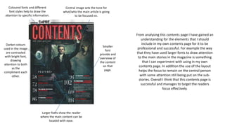
- 1. From analysing this contents page I have gained an understanding for the elements that I should include in my own contents page for it to be professional and successful. For example the way that they have used larger fonts to draw attention to the main stories in the magazine is something that I can experiment with using in my own contents page. In addition the use of the layout helps the focus to remain on the central person with some attention still being put on the sub- stories. Overall I think that this contents page is successful and manages to target the readers focus effectively. Coloured fonts and different font styles help to draw the attention to specific information. Central image sets the tone for what/who the main article is going to be focused on. Larger fonts show the reader where the main content can be located with ease. Smaller font provide and overview of the content on that page. Darker colours used in the image are contrasted with bright font, drawing attention to both as the compliment each other.
- 2. Magazine company's recognisable font Use of image shows the audience who the content is going to be based on. Simple palette of colours Use of larger text to help break up the large amount of contents. Variety of different colour and styles of fonts. When analysing this specific contents page I found it very interesting that they used an image down one side of the page and placed the contents on the opposite side. This is something that I will experiment with using in my own magazine contents page. Also the use of the text inside of the circle at the top of the page I think is an effective way to draw the readers attention to the key and potentially unique features of the magazine.