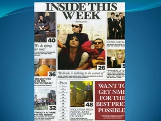
2. NME 2 – contents page
The contents page for this NME magazine, has a range of bright colours and bold text,
this is to emphasise the style of the magazine, and keep in context with the chosen
theme, which is to not use dull colours as it would be out of place. The text used on the
contents page, is symbolic to the text used on the font cover as it is quite forceful, and it
beholds a different approach upon the audience, which is a positive aspect as it makes the
articles sound interesting for example ‘we do things our way’ it almost holds an aggressive
tone, as its telling its audience in a ‘pointing of the finger’ tone, instead of a simple
informational manner. The contents page is just there to orientate the reader and guide
them to their chosen articles. NME’s contents page is all laid out onto one page making it
more information packed and easier for the reader to guide themselves, as its more
visually orientated. Everything is centred on the main image, and its attached article, this
is to emphasise its importance of being the lead article. The picture attached is a medium
close up of three guys members of the band, one of them is drinking and smoking, this is
symbolic of the fact that its showing that it’s a music magazine, as everything is laid back
in a one sense. There is also an advertisement voucher attached to the bottom of the
contents page, this is good for the magazine for many reason, one could be good for
advertisement increasing the audiences number, another could be that’s its pleasing the
audience, again increasing the amount of NME purchasers.