Analyzing and resolving a communication crisis in Dhaka textiles LTD.pptx
Analysing front page student
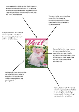
1. There isa strapline atthe verytopof thismagazine
whichhas provenunconventionalforthe wedding
genre butseemstowork here as itfitswell despite
the brightcolourused whichI personallydon’tlike
and isalsounconventional.
The mastheadhas conventionaltext
fontand size buthas a very
unconventional colourjustlike the
strapline whichdoesn’tworkwith
the weddinggenre.
In myopinionthere aren’tenough
coverlinesbutthe onesthatare
there have a stylisticfontvariation
and size aswell ascolour.
PersonallyIlove the image because
it isconventional beingina
naturisticsettingwiththe bride
dressedintraditional weddingattire
withprops.The image isalso edgy
because there isa pastel pink
colouredchair.
The language usedinthe cover lines
usesalliterationwhichmakesit
more appealingtoreaders.For
example ‘definingdetails’and
‘gownsgalore’.
To me,the barcode looksplonked
ontothe page insteadof craftedinto
it connotingthatitis actuallya
studentswork,thisissomethingI
don’twant mine tolooklike.