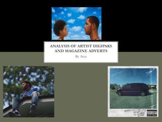
2. FOREST HILL DRIVE
J.COLE-2014
FRONT COVER
On the front of the cover, J. Cole is seen
poised on top of a roof, presumably on
top of his own house as it’s taken from his
hometown of Fayetteville, North Carolina.
He takes centre stage and is the main
attraction on the cover of the album.
The cover is relatively friendly and relaxing
to a potential audience. The mix of a blue
sky and green trees in the background
produces an almost inviting tone.
Includes sticker of ‘Parental Advisory’
which labels the album containing strong
or possibly offensive language. Posted on
the front, it blends in relatively well with
the black and white background of the
roof of the house.
3. FOREST HILL DRIVE
DISK DIGIPAK
In the cd It represents the audio producers, singers
And other casts that were involved with the album
;especially the record album
* The plaque “2014” number basically shows the
Release of the album on a background of red bricks,
Resembling the form of a established house, meaning
It could show a friendly persona and showing a
Subliminal personal tone.
4. FOREST HILL DRIVE
BACK COVER
The back cover seems intriguing as the audience is mostly
Targeted towards in the genre of hip-hop/rap. This could
Perhaps be noticeable from j.coles perspective from the front
Cover as he is contemplating pose on the roof of the bricked
House linking to the depth of the lyrics in his songs or by his
Vivid appearance. As his conventions are a football shirt and a
Nike trainers as they are commonly associated with rappers of
His era.
The text shown on the left of the cover is sleek and capitalised. In
Addition, the way it is adjusted with the theme of the background
Is well incorporated in to the design is quite effective as well as the
Number of releases on the plaque and the name of the album on
The street sign.
Furthermore, the red, green and white text scheme on a black
Background is contrasting as it makes the album subtle and clear to
A potential target audience.
Rather conventionally, the songs that
have been listed on the cover is
accompanied by credits and a barcode.
This is all small print as its mainly legal
information and law detailing copyright
Overall the album presents a very clean
slate look, using images which do not
stereotypically associate with
gender,guns,violence, and wealthy
gratification for instance money.
5. KENDRICK LAMAR
GOOD KID,M.A.A.D CITY-2012
“Good kid,maad city (2012)-deluxe cover on the
right, standard cover on the left”
Use of graffiti styles shows connotations of
gangs spraying showing tag of property
.This perhaps shows he is taking his own
ownership of his work in his album.
Cover shows a family soccer van parked up.
Kendrick Lamar illustrates the childhood of his life
with.
A rapper at these ages show their conventions of
where they come from to add personality to their
persona .
The cover portrays a type of polaroid effect of filter with crack
or tears over the images possibly indicates the thought process
of behind the album. It shows Kendrick Lamar is implying tot
create a subliminal message or tone for his album.
The standard edition if the album
Includes an appeared family gathering
With other considered friends or relatives
Having their identities hidden with a black
Censor across their eyes , except form the kid which
is Kendrick Lamar
.the use of drinks in the small gathering as well as
The poster with love hearts in the background
Implies a more personal tone for the album.
6. GOOD KID,M.A.A.D CITY CD PRINT
In the background,
another car,
specifically a sedan is
parked up. The use
of cars is a possible
reference to the car
culture in presence of
Compton, USA
(where Kendrick
Lamar spent most of
his childhood and
where he was raised)
or gang culture.
CD’s share a similar tone,
by adopting the graffiti-
styled font with a figure of
Kendrick Lamar printed
on the disk. It also
includes the credits and
producers of the album on
the actual disk.
Back cover has a
conventional list of songs
and tracks on the album,
as well as the list of credits
of producers and
companies
7. DRAKE
NOTHING WAS THE SAME-2013
This is r&b/hip hop drakes third
studio album, front cover, nothing
was the same was recorded at 2012
to 2103 and released at September
2012
The use of chain (convention) around his neck is
a big statement in terms of financial strength. As
this shows he is not concerned about his wealth
not ony this but the gold chain being gold as well
as its size only shows this idea
The title is faded and barely seen,
Shown on the bottom left corner
Of the cover. The small font is used
As it shows perhaps the picture is
Used more to representor portrays
The album ,with no attention to the
Name as it not a priority. Therefore
The image can make the audience
Give a vivid detail of the album
The cover showing him a hair slit and a shape-up
Connotes the idea of the urban lifestyle that exists, as
Also the attached beard and moustache could portray that
He is growing up and maturing.
8. NOTHING WAS THE SAME
CD PRINT
Nothing was the same has the continuous
Impression on the front cover and at the
Cd print. When putting both the front and
Cd picture side by side, they link intentionally.
The background of the sky is still established
Which helps maintain the theme.
Even from the picture showing drake as a
Child to him in the present, the colours is
Done to match the theme perfectly and
As well as the complexion of the skin to the hair colour.
Props such as combs shown In the child
Stresses the idea of youth. The neatness
In its appearance correlates with how he is
In the future and furthers the idea of the title
As the album explains a lot as “nothing was the same” means
he might look different but he is the same person.
9. NOTHING WAS THE SAME
BACK COVER
Instead of having the song lists
Shown on the back cover, nothing
Was the same has each track inside
Of the cd, with detail on the
Production casts, as I have
Researched that the song “thank you”
Features for showing respect for the
Musicians. This allows for full
Concertation for the album.