1. Music Magazine
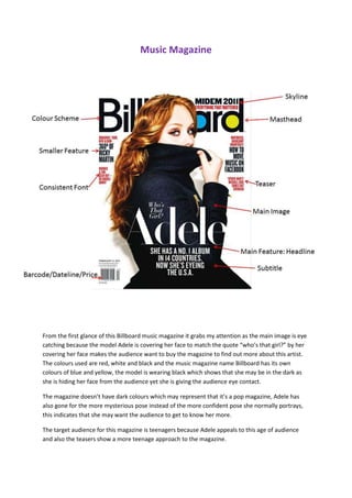
From the first glance of this Billboard music magazine it grabs my attention as the main image is eye
catching because the model Adele is covering her face to match the quote “who’s that girl?” by her
covering her face makes the audience want to buy the magazine to find out more about this artist.
The colours used are red, white and black and the music magazine name Billboard has its own
colours of blue and yellow, the model is wearing black which shows that she may be in the dark as
she is hiding her face from the audience yet she is giving the audience eye contact.
The magazine doesn’t have dark colours which may represent that it’s a pop magazine, Adele has
also gone for the more mysterious pose instead of the more confident pose she normally portrays,
this indicates that she may want the audience to get to know her more.
The target audience for this magazine is teenagers because Adele appeals to this age of audience
and also the teasers show a more teenage approach to the magazine.
2. Why is the content page important? In this content page there are a few
images which illustrate that the magazine
To tell you what is in the magazine is not focusing on one artist, as some
Page reference to navigate through the magazine magazines do. The colours used are blue,
yellow, green, red, pink, white and black
Forms
to represent the colour scheme of the
Images Billboard masterhead, the use of these
Graphics colours are eye catching in the content
Headlines page as some information may stand out
Quotes more to the audience than other to show
Cullum’s that it may be more important than the
Boxes other information given in the content
page.
3. Main headline Sub-headline Double page
Page number Website Article Centre line/spine Main image
This double page spread is based on Cher Lloyd. The image is on the right of the double page
spread and the text is on the left, this is not following the rule of the thirds as the audience
automatically look to the left hand side of the double page spread, they put the text there
instead of the image so that the audience can read the information rather than skipping the
information as they would normally do.
The colours of this article stand out and they contrast the main image. This is also a question
and answer article, where we can find out more about Cher Lloyd. There are not large
amounts of text used for this article which would appeal to a younger audience as younger
generations don’t like to read large amounts of text.
The main image of Cher Lloyd looks like she is taking the picture of herself, which looks cool
and teenagers would appeal to this sort of image which may attract them more and make
them want to buy the magazine and read it.