SlideShare a Scribd company logo
1 of 6
Codes and Conventions of Pop Music Cover
    Masthead                                                   Main image
Draws readers attention because it                           Appealing models used to attract
 shows the genre of the magazine.                            Attention of readers. Top celebrities
Its written in bubbly font and is very                       also used because their fan base are
 colourful thus appeals to                                   likely to buy the magazine because
 younger teenagers.                                          They want to read about them.
                                                             The advantage for the magazine is
                                                             that this gives them a chance to
                                                             gain more readers.

   Feature                                                     Kicker
Scorching summer style “NOW!” this
                                                              This is a story aimed to stand out
is a an example of a one off feature
                                                              the most from the page cover.
 because it is not sunny all year
                                                              Kickers normally talk about an
around. People who are interested
                                                              exclusive images or interviews with
in fashion will get lured into the
                                                               famous celebrities.
magazine with this “one off”
fashion advice.

                                                                Basic Info
                                                             Featured on the front cover
   Buzz Words                                                with general info like a bar code,
                                                             price and issue date. If the
 Used in order to attract attention                          magazine is cheap then the price
  for example "plus" and "free",                             is in a large font in order to catch
 these words both get the reader                             their attention. If its more
  to want to buy that magazine.                              expensive then the price is smaller
                                                             so it not the first thing the audience
                                                             see because they would get put off.
Overall analysis of similarities in Pop Music Magazine covers
Codes and Conventions of Pop Music Magazine Contents Page

    Masthead
                                                                             Main image
  Some magazines have the masthead
  included in the contents page                                             The main image in a contents
   as well. It makes readers                                                page normally focuses on
   remember the magazine                                                    the main story in the magazine.
   and acts like an “icon.”                                                 This image is very bright, colourful,
                                                                            and very fun as she is jumping on the
                                                                            Bed having fun. This attracts
 Letter from editor                                                         young readers.

  This makes the magazine more                                               Page Layout
  personal. It makes the readers
  feel more involved                                                       The layout is quite structured. It has a
  because the editor is writing                                            letter from the editor on one side and
  directly to the readers.                                                 it has the contents on the right. However
                                                                           it does have lots of random lines which
                                                                           can be disturbing because it blocks some
  Colour Scheme                                                            words like “competition”. However the
There are a lot of colours on this                                         light green colour compliments
contents page such as blues, greens,                                       the other headings.
reds and yellows. However the
background is plain and white thus
contrasts so too many colours on the                                        Sections- Category headings
pages don’t clash and make                                                  The contents in nicely organised in
the page look uncomfortable.                                                different columns such as “features”,
                                                                            “style file” and the “final 50” which
         Quotes                                                             helps the reader find the page they
                                                                            are looking for in the magazine
Sometimes quotes are put on
contents pages from interview’s
inside the magazine. They are mostly
placed below the image of the artist
they interviewed .
Codes and Conventions of Pop Music Magazine Double Page Spread 2


  Colour Scheme
Plain three colour scheme
so the double page spread
is focused on the article.
The colours sued are light
Blue, gold and white.


   Main Text
The main text and images
always compliment each other.
Main text is usually written
in columns to tidy the page.

 This page only has one
column therefore is not
 confusing to read at all.
                                            Quotes                                  Main Image
                             The double spread has quotes that are enlarged   Main image is very clear, the band
                             So it catches the reader’s audience.             Members are staring straight at the
                                                                              Camera thus engaging with the audience.
Codes and Conventions of Pop Music Magazine Double Page Spread 3


 Columns

This structures the
whole article.


Colour Scheme
The colour scheme is
 plain and only has a
 three colour scheme.          Main image
 The colours are pink,
white and black           The images are usually very big and tends to engage with
which                     the audience. In this double page spread the model is
 are very girly           facing you and but is making an embarrassed face thus does
colours.
                          not look at the direction of the camera. This shows
                          personality, making the article more personal.
Codes and Conventions of Pop Music Magazine Double Page Spread 1


Colour scheme                                                                  Main Text
Plain two colour                                                          Main text usually
scheme so that
                                                                          Starts with a drop cap
readers focus on
the article. The                                                          So the readers know
colours used are                                                          Where to start
Blue and white .                                                          Reading from.

                                                                        Celebrities name in bold

Quotes                                                                   This introduces the
Quotes attract                                                           Celebrity to the reader
attention specially if                                                   therefore the reader
it is juicy gossip!                                                      feels more engaged
 Quotes are usually                                                      with the article
Quite Shocking to grip the    Main Image                                 because it normally
Reader.                                                                  follows up with a
                       Relevant to the double page spread. The images
                                                                         description or quote of
Sometimes quotes are are always very large, pleasant to look at and
                                                                         by the celebrity
Used to break up texts tends to bleed over whole double page.
                                                                         therefore it’s personal.

More Related Content

What's hot

Magazine Cover Terminology
Magazine Cover TerminologyMagazine Cover Terminology
Magazine Cover TerminologyRobBeynon1
 
Analysis of music magazine covers
Analysis of music magazine coversAnalysis of music magazine covers
Analysis of music magazine coversHollyHayne
 
Music Magazine Research
Music Magazine ResearchMusic Magazine Research
Music Magazine ResearchSamChittock
 
Textual analysis
Textual analysisTextual analysis
Textual analysisjoelbmedia
 
Music Magazine Research
Music Magazine ResearchMusic Magazine Research
Music Magazine ResearchSamChittock
 
Front Cover and Contents Analysis
Front Cover and Contents AnalysisFront Cover and Contents Analysis
Front Cover and Contents AnalysisJessicaolds
 
Movie Magazine Cover & Poster analysis
Movie Magazine Cover & Poster analysis Movie Magazine Cover & Poster analysis
Movie Magazine Cover & Poster analysis Naomi Collins
 
Analysis of Front covers, contents pages and double page spreads.
Analysis of Front covers, contents pages and double page spreads.Analysis of Front covers, contents pages and double page spreads.
Analysis of Front covers, contents pages and double page spreads.lozfenwick9
 

What's hot (16)

Smash hits
Smash hitsSmash hits
Smash hits
 
Market research
Market researchMarket research
Market research
 
Magazine Cover Terminology
Magazine Cover TerminologyMagazine Cover Terminology
Magazine Cover Terminology
 
Analysis of music magazine covers
Analysis of music magazine coversAnalysis of music magazine covers
Analysis of music magazine covers
 
Music Magazine Research
Music Magazine ResearchMusic Magazine Research
Music Magazine Research
 
Textual analysis
Textual analysisTextual analysis
Textual analysis
 
Liiar analysis
Liiar analysisLiiar analysis
Liiar analysis
 
Music Magazine Research
Music Magazine ResearchMusic Magazine Research
Music Magazine Research
 
Case Study Notes
Case Study NotesCase Study Notes
Case Study Notes
 
Evaluating my music magazine
Evaluating my music magazineEvaluating my music magazine
Evaluating my music magazine
 
Presentation1
Presentation1Presentation1
Presentation1
 
Front Cover and Contents Analysis
Front Cover and Contents AnalysisFront Cover and Contents Analysis
Front Cover and Contents Analysis
 
Movie Magazine Cover & Poster analysis
Movie Magazine Cover & Poster analysis Movie Magazine Cover & Poster analysis
Movie Magazine Cover & Poster analysis
 
Evaluation
EvaluationEvaluation
Evaluation
 
Analysis of Front covers, contents pages and double page spreads.
Analysis of Front covers, contents pages and double page spreads.Analysis of Front covers, contents pages and double page spreads.
Analysis of Front covers, contents pages and double page spreads.
 
Ali (1)
Ali (1)Ali (1)
Ali (1)
 

Similar to Codes and conventions presentation

Music Magazine Research (Unfinished)
Music Magazine Research (Unfinished)Music Magazine Research (Unfinished)
Music Magazine Research (Unfinished)SamChittock
 
Textual Analysis 1
Textual Analysis 1Textual Analysis 1
Textual Analysis 1mnoficzer
 
Presentation2[1] (1)
Presentation2[1] (1)Presentation2[1] (1)
Presentation2[1] (1)eilisbell
 
Textual analysis music magazine
Textual analysis music magazineTextual analysis music magazine
Textual analysis music magazineannie-rose3
 
Textual analysis
Textual analysisTextual analysis
Textual analysisAmyDoyle_
 
Analysis of examples
Analysis of examplesAnalysis of examples
Analysis of exampleskatemeads
 
Evaluation -1. In what ways does your media product use forms and conventions...
Evaluation -1. In what ways does your media product use forms and conventions...Evaluation -1. In what ways does your media product use forms and conventions...
Evaluation -1. In what ways does your media product use forms and conventions...CharleyO16
 
Analysis of music magazines
Analysis of music magazinesAnalysis of music magazines
Analysis of music magazineskatemeads
 
Analysingmusicmagazines 120219122142-phpapp02
Analysingmusicmagazines 120219122142-phpapp02Analysingmusicmagazines 120219122142-phpapp02
Analysingmusicmagazines 120219122142-phpapp02karamediastudies
 
Music magazine analysis
Music magazine analysisMusic magazine analysis
Music magazine analysisEloise Clark
 
Music magazine analysis
Music magazine analysisMusic magazine analysis
Music magazine analysisEloise Clark
 
Analysingmusicmagazines 120219122142-phpapp02
Analysingmusicmagazines 120219122142-phpapp02Analysingmusicmagazines 120219122142-phpapp02
Analysingmusicmagazines 120219122142-phpapp02karamediastudies
 
Drawn design sheets
Drawn design sheetsDrawn design sheets
Drawn design sheets014326
 

Similar to Codes and conventions presentation (20)

Music Magazine Research (Unfinished)
Music Magazine Research (Unfinished)Music Magazine Research (Unfinished)
Music Magazine Research (Unfinished)
 
Contents page research
Contents page researchContents page research
Contents page research
 
Task 8
Task 8Task 8
Task 8
 
Textual Analysis 1
Textual Analysis 1Textual Analysis 1
Textual Analysis 1
 
Radial Analysis
Radial AnalysisRadial Analysis
Radial Analysis
 
Presentation2[1] (1)
Presentation2[1] (1)Presentation2[1] (1)
Presentation2[1] (1)
 
Textual analysis music magazine
Textual analysis music magazineTextual analysis music magazine
Textual analysis music magazine
 
Textual analysis
Textual analysisTextual analysis
Textual analysis
 
Analysis of examples
Analysis of examplesAnalysis of examples
Analysis of examples
 
Evaluation -1. In what ways does your media product use forms and conventions...
Evaluation -1. In what ways does your media product use forms and conventions...Evaluation -1. In what ways does your media product use forms and conventions...
Evaluation -1. In what ways does your media product use forms and conventions...
 
Analysis of music magazines
Analysis of music magazinesAnalysis of music magazines
Analysis of music magazines
 
Analysingmusicmagazines 120219122142-phpapp02
Analysingmusicmagazines 120219122142-phpapp02Analysingmusicmagazines 120219122142-phpapp02
Analysingmusicmagazines 120219122142-phpapp02
 
Music magazine analysis
Music magazine analysisMusic magazine analysis
Music magazine analysis
 
Case study 2
Case study 2Case study 2
Case study 2
 
Music magazine analysis
Music magazine analysisMusic magazine analysis
Music magazine analysis
 
Analysing music magazines
Analysing music magazinesAnalysing music magazines
Analysing music magazines
 
Analysingmusicmagazines 120219122142-phpapp02
Analysingmusicmagazines 120219122142-phpapp02Analysingmusicmagazines 120219122142-phpapp02
Analysingmusicmagazines 120219122142-phpapp02
 
Drawn design sheets
Drawn design sheetsDrawn design sheets
Drawn design sheets
 
Ali (1)
Ali (1)Ali (1)
Ali (1)
 
Case study 2
Case study 2Case study 2
Case study 2
 

Codes and conventions presentation

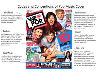
  • 1. Codes and Conventions of Pop Music Cover Masthead Main image Draws readers attention because it Appealing models used to attract shows the genre of the magazine. Attention of readers. Top celebrities Its written in bubbly font and is very also used because their fan base are colourful thus appeals to likely to buy the magazine because younger teenagers. They want to read about them. The advantage for the magazine is that this gives them a chance to gain more readers. Feature Kicker Scorching summer style “NOW!” this This is a story aimed to stand out is a an example of a one off feature the most from the page cover. because it is not sunny all year Kickers normally talk about an around. People who are interested exclusive images or interviews with in fashion will get lured into the famous celebrities. magazine with this “one off” fashion advice. Basic Info Featured on the front cover Buzz Words with general info like a bar code, price and issue date. If the Used in order to attract attention magazine is cheap then the price for example "plus" and "free", is in a large font in order to catch these words both get the reader their attention. If its more to want to buy that magazine. expensive then the price is smaller so it not the first thing the audience see because they would get put off.
  • 2. Overall analysis of similarities in Pop Music Magazine covers
  • 3. Codes and Conventions of Pop Music Magazine Contents Page Masthead Main image Some magazines have the masthead included in the contents page The main image in a contents as well. It makes readers page normally focuses on remember the magazine the main story in the magazine. and acts like an “icon.” This image is very bright, colourful, and very fun as she is jumping on the Bed having fun. This attracts Letter from editor young readers. This makes the magazine more Page Layout personal. It makes the readers feel more involved The layout is quite structured. It has a because the editor is writing letter from the editor on one side and directly to the readers. it has the contents on the right. However it does have lots of random lines which can be disturbing because it blocks some Colour Scheme words like “competition”. However the There are a lot of colours on this light green colour compliments contents page such as blues, greens, the other headings. reds and yellows. However the background is plain and white thus contrasts so too many colours on the Sections- Category headings pages don’t clash and make The contents in nicely organised in the page look uncomfortable. different columns such as “features”, “style file” and the “final 50” which Quotes helps the reader find the page they are looking for in the magazine Sometimes quotes are put on contents pages from interview’s inside the magazine. They are mostly placed below the image of the artist they interviewed .
  • 4. Codes and Conventions of Pop Music Magazine Double Page Spread 2 Colour Scheme Plain three colour scheme so the double page spread is focused on the article. The colours sued are light Blue, gold and white. Main Text The main text and images always compliment each other. Main text is usually written in columns to tidy the page. This page only has one column therefore is not confusing to read at all. Quotes Main Image The double spread has quotes that are enlarged Main image is very clear, the band So it catches the reader’s audience. Members are staring straight at the Camera thus engaging with the audience.
  • 5. Codes and Conventions of Pop Music Magazine Double Page Spread 3 Columns This structures the whole article. Colour Scheme The colour scheme is plain and only has a three colour scheme. Main image The colours are pink, white and black The images are usually very big and tends to engage with which the audience. In this double page spread the model is are very girly facing you and but is making an embarrassed face thus does colours. not look at the direction of the camera. This shows personality, making the article more personal.
  • 6. Codes and Conventions of Pop Music Magazine Double Page Spread 1 Colour scheme Main Text Plain two colour Main text usually scheme so that Starts with a drop cap readers focus on the article. The So the readers know colours used are Where to start Blue and white . Reading from. Celebrities name in bold Quotes This introduces the Quotes attract Celebrity to the reader attention specially if therefore the reader it is juicy gossip! feels more engaged Quotes are usually with the article Quite Shocking to grip the Main Image because it normally Reader. follows up with a Relevant to the double page spread. The images description or quote of Sometimes quotes are are always very large, pleasant to look at and by the celebrity Used to break up texts tends to bleed over whole double page. therefore it’s personal.

Editor's Notes

  1. http://www.slideshare.net/Laurengibney/codes-and-conventions-of-a-double-page-spread