SlideShare a Scribd company logo
1 of 9
This is a wob which is white
text on a black or different
coloured background. This is
a simple logo that doesn’t
particularly have a theme
which is good for this
magazine since this is a
multi-genre magazine and
not a specific magazine.
The colour scheme sets of the
front cover relates to the
celebrities on the front cover of
the magazine, setting the mood
for the magazine. In this case the
colour scheme is pink, magenta
and white.
In this particular magazine, the
subheads aren’t in their
conventional areas and are on the
bottom of the magazine instead of
the sides. The barcode of the
magazine isn’t in it’s usual place as
well since it’s placed on the middle
right instead of the bottom right.
The puff piece is in the middle of the
magazine to signify that this is a
special edition of the magazine and it
is to stand out to customers walking
by.
The main image of the magazine is of
two band members in a pose staring
at the camera with blown up guitar
amps, this is to show that this
particular band is back with a bang
or their song is in the top ten songs
of the month.
There is another wob on the very top of
the cover advertising a 17 page special
about Jeff Buckley, showing a portrait of
the artist and a border around the text to
highlight it out of the other subheads
The photo of the models in the cover
is overlapping the logo of the
magazine, this is a convention in most
magazine.
The masthead of this section
says ‘QCONTENTS’, this doesn’t
confuse the reader because the
sound the letter q makes
sounds very similar to the
sound the ‘c’ makes in the word
contents
The contents section of the
magazine goes on multiple
pages, this is because the
magazine has a lot of content in
it and the subheads are a
detailed paragraph about what
each section is
The images used in the
contents pages are relevant
to the subheading they are
reflecting and will grab the
readers attention just in
case the reader is skimming
and happens to catch their
favourite artist picture.
The subheadings are
colour coordinated
so when the reader
stumbles upon the
page, they will know
it’s about a certain
topic until the colour
turns into a different
colour marking a
new section in the
magazine.
The masthead of
the double page
spread is on the
left along with a
small sell under it
introducing and
selling the article
to the reader.
The introduction of
the article is
highlighted in the
black while the text
is in white, whilst
the artist’s name is
in red text to signify
that they are
important subject in
the article. This
could be because
the article is about
them.
The articles are all
placed on the top right
of the magazine on
the right page in a
tombstone format to
take less space to
make room for the
image on the bottom.
The photo is about
the article and it’s
showing who the
article is about. There
is also a caption on
the bottom right of
the picture explaining
what is going on in the
photo
The magazine’s masthead is covered
with the head of the model in the
photo, in this case, the model is the
artist of one of the bands featured in
the magazine.
The puff piece is related to the
main model on the front cover of
the magazine. This also has 2 sells
on top of the magazine describing
the article in one sentence. There
is a short subhead telling the
reader briefly what the article is
going to be about.
The subheading in the front cover are
just naming the names of popular
metal bands that are featured in this
issue of the magazine with a short
sentence under it also giving a brief
explanation on what will be said
about the band.
The barcode is placed on the
bottom-middle of the magazine,
this subversive to the usual
magazine format since the barcode
would be on the bottom left.
There is a promotion in the magazine
advertising a free poster and CD inside
the magazine, this will tempt people to
buy the magazine just for the free stuff
within.
The logo of the magazine has a little
noise to show that it has been worn a
lot, this is because the genre of the
magazine is heavy metal so the logo is a
stereotypical metal font, along with
colour and the textures used on the
front cover such as grunge, blood and
scratches.
The contents page of
the magazine is not
labelled which could
be confusing to
readers looking for
the contents page.
Each content headline
is once again, just the
name of the band that
is featured along with
a small subhead
describing the article
to get the readers
attention in case the
are quickly skimming
through the magazine
and want something to
catch their eye.
The thee photos
featured in the
contents page are
one of the bigger
articles featured in
the magazine and on
the right of it there is
an even bigger
description of the
article and with a
small caption
describing what is
going on in the
pictures.
There are
advertisements
on the bottom of
the contents
page advertising
upcoming events
such as concerts.
There is a collage of
pictures featuring
many bands that
were in the festival
that the article is
talking about.
The articles with the
white background
are using the
tombstone format
while the articles
with the black
background are not.
There is a sell on the left page of the article
on top of the title of the article, this is
because readers who skim through the
magazine would title then look up to see
the picture, instead, they would look at the
sell, selling the article to them.
There are multiple
captions describing all
the pictures and when
they were taken and
who by.
The fonts used in the front cover have a
graphic on them to make it look dirty and
bloody as if a fight has gone on around it.
This fits in with the mise-en-scene as there
is a baseball bat which makes me assume
that it has a connection to the blood splatter
on the font. This makes the logo of the
magazine and the only heading on the front
cover fit in with the CVI of the main cover.
The cover has stuck to a simple colour
scheme of blue and yellow with a bit of
orange. This will make the magazine look
more organised as there won’t be a clutter
of colours occupying the front cover.
The models of the front cover all look
dirty and as if they have been in the
desert for a while. This goes with the
conventions of Metal music as most
metal musicians are seen as dirty and
as slobs. The mise-en-scene used in
the front cover also goes with the
convention that Metal music is brutal
and angry, so to make it clear that it
is a metal magazine, they have
included weapons such as a baseball
bat given to the lead of the band.
In most magazines, the barcode would be on
the bottom right of the magazine because
that would be the one of the first places the
human eye will look. But Metal Hammer
magazine has decided to take the subversive
route and put it directly in the middle. This
goes with the conventions of metal
magazines as they are preserved to have a
rebellious nature due to the brutal music.
The cover doesn’t have any sub heads or
anything else to tell the readers of any other
article featured in the magazine. This will
show that the main focus of the magazine
and the main headline of the magazine will
be the band at the front cover.
This magazine cover is really
different to other magazines as
there are no subheads at all on
the front cover besides the
name of the magazine and
small Japanese writing under
the Metal Hammer logo. This
suggests that the band on the
front page is so popular that
they don’t even need any
subheads to identify them.
Although the cover band is
considered a metal band, they
don’t fit the conventions of a
metal band such as a dirty
leather jacket sided with a
brutal/angry face with the body
language as if a fight is about to
break loose. The cover models
look calm and collected with
straight faces looking at the
camera. The mise-en-scene
doesn’t go with the conventions
of metal music because they are
wearing what looks to be a
custom studded dress and bows
on in clipped to their hair. The
lead in the cover photo seems to
be holding a fox mask, covering
half of her face. The fact that the
cover photo doesn’t go with any
conventions of the metal genre
will make it harder for people to
realise it is a metal magazine if it
wasn’t for the magazine name.
The barcode is in a different
each issue of the magazine.
This could be due to the CVI
taking up a lot of space so they
had to find a place with open
space or a place with less
significance.
The colour scheme in the front
cover is black and red with a
little bit of white.
The copy used in
the DPS is in a
Q&A format where
the interviewer
would ask a
question in bold
and the reply will
be right under it in
a thinner font. This
will make it easier
for the reader to
identify the
question from the
answers.
The tag of the article links all of the pages that are about this specific article.
This will indicate what each page is talking about and it will cause less
confusion to the reader as it will inform them that the page they are reading
is still linked to the previous article but spanning over a few pages.
A pull quote to pull in
the reader who may
just be skimming
through the
magazine. This is
used to grab the
readers attention by
a phrase or an
interesting comment
someone has made
in the main body of
the article.
There are smaller photos
on the article side of the
DPS to give the reader
more of an insight of what
the article is talking about.

More Related Content

What's hot

Contents cover analysis
Contents cover analysisContents cover analysis
Contents cover analysisjessicahooker6
 
Magazine analysis
Magazine analysisMagazine analysis
Magazine analysisasmediag13
 
Magazine Construction
Magazine ConstructionMagazine Construction
Magazine ConstructionTMoorwood
 
Presentation1
Presentation1Presentation1
Presentation1spidergap
 
Magazine Front Cover Analysis.
Magazine Front Cover Analysis.Magazine Front Cover Analysis.
Magazine Front Cover Analysis.Raychelleshaw
 
Contents analysis
Contents analysisContents analysis
Contents analysiskimb0ot
 
Contents analysis
Contents analysisContents analysis
Contents analysiskimb0ot
 
Music Magazine Analysis
Music Magazine AnalysisMusic Magazine Analysis
Music Magazine AnalysisDarciBoamah
 
Research on music magazines
Research on music magazinesResearch on music magazines
Research on music magazinesMary Lee-Ann
 

What's hot (12)

Contents cover analysis
Contents cover analysisContents cover analysis
Contents cover analysis
 
Magazine analysis
Magazine analysisMagazine analysis
Magazine analysis
 
Front cover analysis
Front cover analysisFront cover analysis
Front cover analysis
 
Contents page analysis
Contents page analysisContents page analysis
Contents page analysis
 
Magazine Construction
Magazine ConstructionMagazine Construction
Magazine Construction
 
Presentation1
Presentation1Presentation1
Presentation1
 
Magazine Front Cover Analysis.
Magazine Front Cover Analysis.Magazine Front Cover Analysis.
Magazine Front Cover Analysis.
 
Contents analysis
Contents analysisContents analysis
Contents analysis
 
Contents analysis
Contents analysisContents analysis
Contents analysis
 
Recovered file 1
Recovered file 1Recovered file 1
Recovered file 1
 
Music Magazine Analysis
Music Magazine AnalysisMusic Magazine Analysis
Music Magazine Analysis
 
Research on music magazines
Research on music magazinesResearch on music magazines
Research on music magazines
 

Similar to Magazine Analysis

Analysing music magazines tasks 1,2,3
Analysing music magazines tasks 1,2,3Analysing music magazines tasks 1,2,3
Analysing music magazines tasks 1,2,3asmediag13
 
Research on music magazines
Research on music magazinesResearch on music magazines
Research on music magazinesMary Lee-Ann
 
Music Magazine Contents Page Analysis
Music Magazine Contents Page AnalysisMusic Magazine Contents Page Analysis
Music Magazine Contents Page AnalysisPieter Jollans
 
Music Magazine Analysis; Front Cover, Contents & Dps
Music Magazine Analysis; Front Cover, Contents & DpsMusic Magazine Analysis; Front Cover, Contents & Dps
Music Magazine Analysis; Front Cover, Contents & DpsWill Drummee
 
Magazine cover review
Magazine cover review Magazine cover review
Magazine cover review 09lakeland
 
Analysis of magazines (1)
Analysis of magazines (1)Analysis of magazines (1)
Analysis of magazines (1)sherieallen
 
magazine analysis
magazine analysismagazine analysis
magazine analysisKatie Leese
 
Analysis of Contents Pages
Analysis of Contents PagesAnalysis of Contents Pages
Analysis of Contents PagesLterry95
 
Analysis of Contents Pages
Analysis of Contents PagesAnalysis of Contents Pages
Analysis of Contents PagesLterry95
 
Music magazine anaylsis
Music magazine anaylsis Music magazine anaylsis
Music magazine anaylsis kirbiekay
 
Contents page nme (sept 2009) analysis (2)
Contents page nme (sept 2009) analysis (2)Contents page nme (sept 2009) analysis (2)
Contents page nme (sept 2009) analysis (2)Holly Redmond
 
Magazine Cover Deconstruction
Magazine Cover DeconstructionMagazine Cover Deconstruction
Magazine Cover DeconstructionLawrenceNorman
 
Magazine covers
Magazine coversMagazine covers
Magazine coversrj5453
 
Music magazine front cover analysis
Music magazine front cover analysisMusic magazine front cover analysis
Music magazine front cover analysisjacobcrossley37
 
Magazine analysis
Magazine analysisMagazine analysis
Magazine analysisemzywmzy087
 
Analysis of music magazine covers/contents/doublepage
Analysis of music magazine covers/contents/doublepageAnalysis of music magazine covers/contents/doublepage
Analysis of music magazine covers/contents/doublepagejamsterdj
 

Similar to Magazine Analysis (20)

Analysing music magazines tasks 1,2,3
Analysing music magazines tasks 1,2,3Analysing music magazines tasks 1,2,3
Analysing music magazines tasks 1,2,3
 
Textual analysis
Textual analysisTextual analysis
Textual analysis
 
Research on music magazines
Research on music magazinesResearch on music magazines
Research on music magazines
 
Music Magazine Contents Page Analysis
Music Magazine Contents Page AnalysisMusic Magazine Contents Page Analysis
Music Magazine Contents Page Analysis
 
Cover research
Cover researchCover research
Cover research
 
Music Magazine Analysis; Front Cover, Contents & Dps
Music Magazine Analysis; Front Cover, Contents & DpsMusic Magazine Analysis; Front Cover, Contents & Dps
Music Magazine Analysis; Front Cover, Contents & Dps
 
Magazine cover review
Magazine cover review Magazine cover review
Magazine cover review
 
Analysis of magazines (1)
Analysis of magazines (1)Analysis of magazines (1)
Analysis of magazines (1)
 
magazine analysis
magazine analysismagazine analysis
magazine analysis
 
Analysis of Contents Pages
Analysis of Contents PagesAnalysis of Contents Pages
Analysis of Contents Pages
 
Analysis of Contents Pages
Analysis of Contents PagesAnalysis of Contents Pages
Analysis of Contents Pages
 
Music magazine anaylsis
Music magazine anaylsis Music magazine anaylsis
Music magazine anaylsis
 
Contents page nme (sept 2009) analysis (2)
Contents page nme (sept 2009) analysis (2)Contents page nme (sept 2009) analysis (2)
Contents page nme (sept 2009) analysis (2)
 
Magazine Cover Deconstruction
Magazine Cover DeconstructionMagazine Cover Deconstruction
Magazine Cover Deconstruction
 
Magazine covers
Magazine coversMagazine covers
Magazine covers
 
Music magazine front cover analysis
Music magazine front cover analysisMusic magazine front cover analysis
Music magazine front cover analysis
 
Magazine analysis
Magazine analysisMagazine analysis
Magazine analysis
 
Contents analysis 1 & 2
Contents analysis 1 & 2Contents analysis 1 & 2
Contents analysis 1 & 2
 
Analysis of music magazine covers/contents/doublepage
Analysis of music magazine covers/contents/doublepageAnalysis of music magazine covers/contents/doublepage
Analysis of music magazine covers/contents/doublepage
 
Magazine cover
Magazine coverMagazine cover
Magazine cover
 

Recently uploaded

Proudly South Africa powerpoint Thorisha.pptx
Proudly South Africa powerpoint Thorisha.pptxProudly South Africa powerpoint Thorisha.pptx
Proudly South Africa powerpoint Thorisha.pptxthorishapillay1
 
18-04-UA_REPORT_MEDIALITERAСY_INDEX-DM_23-1-final-eng.pdf
18-04-UA_REPORT_MEDIALITERAСY_INDEX-DM_23-1-final-eng.pdf18-04-UA_REPORT_MEDIALITERAСY_INDEX-DM_23-1-final-eng.pdf
18-04-UA_REPORT_MEDIALITERAСY_INDEX-DM_23-1-final-eng.pdfssuser54595a
 
Types of Journalistic Writing Grade 8.pptx
Types of Journalistic Writing Grade 8.pptxTypes of Journalistic Writing Grade 8.pptx
Types of Journalistic Writing Grade 8.pptxEyham Joco
 
Framing an Appropriate Research Question 6b9b26d93da94caf993c038d9efcdedb.pdf
Framing an Appropriate Research Question 6b9b26d93da94caf993c038d9efcdedb.pdfFraming an Appropriate Research Question 6b9b26d93da94caf993c038d9efcdedb.pdf
Framing an Appropriate Research Question 6b9b26d93da94caf993c038d9efcdedb.pdfUjwalaBharambe
 
call girls in Kamla Market (DELHI) 🔝 >༒9953330565🔝 genuine Escort Service 🔝✔️✔️
call girls in Kamla Market (DELHI) 🔝 >༒9953330565🔝 genuine Escort Service 🔝✔️✔️call girls in Kamla Market (DELHI) 🔝 >༒9953330565🔝 genuine Escort Service 🔝✔️✔️
call girls in Kamla Market (DELHI) 🔝 >༒9953330565🔝 genuine Escort Service 🔝✔️✔️9953056974 Low Rate Call Girls In Saket, Delhi NCR
 
Enzyme, Pharmaceutical Aids, Miscellaneous Last Part of Chapter no 5th.pdf
Enzyme, Pharmaceutical Aids, Miscellaneous Last Part of Chapter no 5th.pdfEnzyme, Pharmaceutical Aids, Miscellaneous Last Part of Chapter no 5th.pdf
Enzyme, Pharmaceutical Aids, Miscellaneous Last Part of Chapter no 5th.pdfSumit Tiwari
 
MICROBIOLOGY biochemical test detailed.pptx
MICROBIOLOGY biochemical test detailed.pptxMICROBIOLOGY biochemical test detailed.pptx
MICROBIOLOGY biochemical test detailed.pptxabhijeetpadhi001
 
DATA STRUCTURE AND ALGORITHM for beginners
DATA STRUCTURE AND ALGORITHM for beginnersDATA STRUCTURE AND ALGORITHM for beginners
DATA STRUCTURE AND ALGORITHM for beginnersSabitha Banu
 
EPANDING THE CONTENT OF AN OUTLINE using notes.pptx
EPANDING THE CONTENT OF AN OUTLINE using notes.pptxEPANDING THE CONTENT OF AN OUTLINE using notes.pptx
EPANDING THE CONTENT OF AN OUTLINE using notes.pptxRaymartEstabillo3
 
Difference Between Search & Browse Methods in Odoo 17
Difference Between Search & Browse Methods in Odoo 17Difference Between Search & Browse Methods in Odoo 17
Difference Between Search & Browse Methods in Odoo 17Celine George
 
Final demo Grade 9 for demo Plan dessert.pptx
Final demo Grade 9 for demo Plan dessert.pptxFinal demo Grade 9 for demo Plan dessert.pptx
Final demo Grade 9 for demo Plan dessert.pptxAvyJaneVismanos
 
MARGINALIZATION (Different learners in Marginalized Group
MARGINALIZATION (Different learners in Marginalized GroupMARGINALIZATION (Different learners in Marginalized Group
MARGINALIZATION (Different learners in Marginalized GroupJonathanParaisoCruz
 
Pharmacognosy Flower 3. Compositae 2023.pdf
Pharmacognosy Flower 3. Compositae 2023.pdfPharmacognosy Flower 3. Compositae 2023.pdf
Pharmacognosy Flower 3. Compositae 2023.pdfMahmoud M. Sallam
 
CELL CYCLE Division Science 8 quarter IV.pptx
CELL CYCLE Division Science 8 quarter IV.pptxCELL CYCLE Division Science 8 quarter IV.pptx
CELL CYCLE Division Science 8 quarter IV.pptxJiesonDelaCerna
 
Roles & Responsibilities in Pharmacovigilance
Roles & Responsibilities in PharmacovigilanceRoles & Responsibilities in Pharmacovigilance
Roles & Responsibilities in PharmacovigilanceSamikshaHamane
 
Introduction to AI in Higher Education_draft.pptx
Introduction to AI in Higher Education_draft.pptxIntroduction to AI in Higher Education_draft.pptx
Introduction to AI in Higher Education_draft.pptxpboyjonauth
 
Introduction to ArtificiaI Intelligence in Higher Education
Introduction to ArtificiaI Intelligence in Higher EducationIntroduction to ArtificiaI Intelligence in Higher Education
Introduction to ArtificiaI Intelligence in Higher Educationpboyjonauth
 
AmericanHighSchoolsprezentacijaoskolama.
AmericanHighSchoolsprezentacijaoskolama.AmericanHighSchoolsprezentacijaoskolama.
AmericanHighSchoolsprezentacijaoskolama.arsicmarija21
 

Recently uploaded (20)

Proudly South Africa powerpoint Thorisha.pptx
Proudly South Africa powerpoint Thorisha.pptxProudly South Africa powerpoint Thorisha.pptx
Proudly South Africa powerpoint Thorisha.pptx
 
18-04-UA_REPORT_MEDIALITERAСY_INDEX-DM_23-1-final-eng.pdf
18-04-UA_REPORT_MEDIALITERAСY_INDEX-DM_23-1-final-eng.pdf18-04-UA_REPORT_MEDIALITERAСY_INDEX-DM_23-1-final-eng.pdf
18-04-UA_REPORT_MEDIALITERAСY_INDEX-DM_23-1-final-eng.pdf
 
Types of Journalistic Writing Grade 8.pptx
Types of Journalistic Writing Grade 8.pptxTypes of Journalistic Writing Grade 8.pptx
Types of Journalistic Writing Grade 8.pptx
 
Framing an Appropriate Research Question 6b9b26d93da94caf993c038d9efcdedb.pdf
Framing an Appropriate Research Question 6b9b26d93da94caf993c038d9efcdedb.pdfFraming an Appropriate Research Question 6b9b26d93da94caf993c038d9efcdedb.pdf
Framing an Appropriate Research Question 6b9b26d93da94caf993c038d9efcdedb.pdf
 
call girls in Kamla Market (DELHI) 🔝 >༒9953330565🔝 genuine Escort Service 🔝✔️✔️
call girls in Kamla Market (DELHI) 🔝 >༒9953330565🔝 genuine Escort Service 🔝✔️✔️call girls in Kamla Market (DELHI) 🔝 >༒9953330565🔝 genuine Escort Service 🔝✔️✔️
call girls in Kamla Market (DELHI) 🔝 >༒9953330565🔝 genuine Escort Service 🔝✔️✔️
 
Enzyme, Pharmaceutical Aids, Miscellaneous Last Part of Chapter no 5th.pdf
Enzyme, Pharmaceutical Aids, Miscellaneous Last Part of Chapter no 5th.pdfEnzyme, Pharmaceutical Aids, Miscellaneous Last Part of Chapter no 5th.pdf
Enzyme, Pharmaceutical Aids, Miscellaneous Last Part of Chapter no 5th.pdf
 
OS-operating systems- ch04 (Threads) ...
OS-operating systems- ch04 (Threads) ...OS-operating systems- ch04 (Threads) ...
OS-operating systems- ch04 (Threads) ...
 
MICROBIOLOGY biochemical test detailed.pptx
MICROBIOLOGY biochemical test detailed.pptxMICROBIOLOGY biochemical test detailed.pptx
MICROBIOLOGY biochemical test detailed.pptx
 
DATA STRUCTURE AND ALGORITHM for beginners
DATA STRUCTURE AND ALGORITHM for beginnersDATA STRUCTURE AND ALGORITHM for beginners
DATA STRUCTURE AND ALGORITHM for beginners
 
ESSENTIAL of (CS/IT/IS) class 06 (database)
ESSENTIAL of (CS/IT/IS) class 06 (database)ESSENTIAL of (CS/IT/IS) class 06 (database)
ESSENTIAL of (CS/IT/IS) class 06 (database)
 
EPANDING THE CONTENT OF AN OUTLINE using notes.pptx
EPANDING THE CONTENT OF AN OUTLINE using notes.pptxEPANDING THE CONTENT OF AN OUTLINE using notes.pptx
EPANDING THE CONTENT OF AN OUTLINE using notes.pptx
 
Difference Between Search & Browse Methods in Odoo 17
Difference Between Search & Browse Methods in Odoo 17Difference Between Search & Browse Methods in Odoo 17
Difference Between Search & Browse Methods in Odoo 17
 
Final demo Grade 9 for demo Plan dessert.pptx
Final demo Grade 9 for demo Plan dessert.pptxFinal demo Grade 9 for demo Plan dessert.pptx
Final demo Grade 9 for demo Plan dessert.pptx
 
MARGINALIZATION (Different learners in Marginalized Group
MARGINALIZATION (Different learners in Marginalized GroupMARGINALIZATION (Different learners in Marginalized Group
MARGINALIZATION (Different learners in Marginalized Group
 
Pharmacognosy Flower 3. Compositae 2023.pdf
Pharmacognosy Flower 3. Compositae 2023.pdfPharmacognosy Flower 3. Compositae 2023.pdf
Pharmacognosy Flower 3. Compositae 2023.pdf
 
CELL CYCLE Division Science 8 quarter IV.pptx
CELL CYCLE Division Science 8 quarter IV.pptxCELL CYCLE Division Science 8 quarter IV.pptx
CELL CYCLE Division Science 8 quarter IV.pptx
 
Roles & Responsibilities in Pharmacovigilance
Roles & Responsibilities in PharmacovigilanceRoles & Responsibilities in Pharmacovigilance
Roles & Responsibilities in Pharmacovigilance
 
Introduction to AI in Higher Education_draft.pptx
Introduction to AI in Higher Education_draft.pptxIntroduction to AI in Higher Education_draft.pptx
Introduction to AI in Higher Education_draft.pptx
 
Introduction to ArtificiaI Intelligence in Higher Education
Introduction to ArtificiaI Intelligence in Higher EducationIntroduction to ArtificiaI Intelligence in Higher Education
Introduction to ArtificiaI Intelligence in Higher Education
 
AmericanHighSchoolsprezentacijaoskolama.
AmericanHighSchoolsprezentacijaoskolama.AmericanHighSchoolsprezentacijaoskolama.
AmericanHighSchoolsprezentacijaoskolama.
 

Magazine Analysis

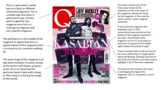
  • 1. This is a wob which is white text on a black or different coloured background. This is a simple logo that doesn’t particularly have a theme which is good for this magazine since this is a multi-genre magazine and not a specific magazine. The colour scheme sets of the front cover relates to the celebrities on the front cover of the magazine, setting the mood for the magazine. In this case the colour scheme is pink, magenta and white. In this particular magazine, the subheads aren’t in their conventional areas and are on the bottom of the magazine instead of the sides. The barcode of the magazine isn’t in it’s usual place as well since it’s placed on the middle right instead of the bottom right. The puff piece is in the middle of the magazine to signify that this is a special edition of the magazine and it is to stand out to customers walking by. The main image of the magazine is of two band members in a pose staring at the camera with blown up guitar amps, this is to show that this particular band is back with a bang or their song is in the top ten songs of the month. There is another wob on the very top of the cover advertising a 17 page special about Jeff Buckley, showing a portrait of the artist and a border around the text to highlight it out of the other subheads The photo of the models in the cover is overlapping the logo of the magazine, this is a convention in most magazine.
  • 2. The masthead of this section says ‘QCONTENTS’, this doesn’t confuse the reader because the sound the letter q makes sounds very similar to the sound the ‘c’ makes in the word contents The contents section of the magazine goes on multiple pages, this is because the magazine has a lot of content in it and the subheads are a detailed paragraph about what each section is The images used in the contents pages are relevant to the subheading they are reflecting and will grab the readers attention just in case the reader is skimming and happens to catch their favourite artist picture. The subheadings are colour coordinated so when the reader stumbles upon the page, they will know it’s about a certain topic until the colour turns into a different colour marking a new section in the magazine.
  • 3. The masthead of the double page spread is on the left along with a small sell under it introducing and selling the article to the reader. The introduction of the article is highlighted in the black while the text is in white, whilst the artist’s name is in red text to signify that they are important subject in the article. This could be because the article is about them. The articles are all placed on the top right of the magazine on the right page in a tombstone format to take less space to make room for the image on the bottom. The photo is about the article and it’s showing who the article is about. There is also a caption on the bottom right of the picture explaining what is going on in the photo
  • 4. The magazine’s masthead is covered with the head of the model in the photo, in this case, the model is the artist of one of the bands featured in the magazine. The puff piece is related to the main model on the front cover of the magazine. This also has 2 sells on top of the magazine describing the article in one sentence. There is a short subhead telling the reader briefly what the article is going to be about. The subheading in the front cover are just naming the names of popular metal bands that are featured in this issue of the magazine with a short sentence under it also giving a brief explanation on what will be said about the band. The barcode is placed on the bottom-middle of the magazine, this subversive to the usual magazine format since the barcode would be on the bottom left. There is a promotion in the magazine advertising a free poster and CD inside the magazine, this will tempt people to buy the magazine just for the free stuff within. The logo of the magazine has a little noise to show that it has been worn a lot, this is because the genre of the magazine is heavy metal so the logo is a stereotypical metal font, along with colour and the textures used on the front cover such as grunge, blood and scratches.
  • 5. The contents page of the magazine is not labelled which could be confusing to readers looking for the contents page. Each content headline is once again, just the name of the band that is featured along with a small subhead describing the article to get the readers attention in case the are quickly skimming through the magazine and want something to catch their eye. The thee photos featured in the contents page are one of the bigger articles featured in the magazine and on the right of it there is an even bigger description of the article and with a small caption describing what is going on in the pictures. There are advertisements on the bottom of the contents page advertising upcoming events such as concerts.
  • 6. There is a collage of pictures featuring many bands that were in the festival that the article is talking about. The articles with the white background are using the tombstone format while the articles with the black background are not. There is a sell on the left page of the article on top of the title of the article, this is because readers who skim through the magazine would title then look up to see the picture, instead, they would look at the sell, selling the article to them. There are multiple captions describing all the pictures and when they were taken and who by.
  • 7. The fonts used in the front cover have a graphic on them to make it look dirty and bloody as if a fight has gone on around it. This fits in with the mise-en-scene as there is a baseball bat which makes me assume that it has a connection to the blood splatter on the font. This makes the logo of the magazine and the only heading on the front cover fit in with the CVI of the main cover. The cover has stuck to a simple colour scheme of blue and yellow with a bit of orange. This will make the magazine look more organised as there won’t be a clutter of colours occupying the front cover. The models of the front cover all look dirty and as if they have been in the desert for a while. This goes with the conventions of Metal music as most metal musicians are seen as dirty and as slobs. The mise-en-scene used in the front cover also goes with the convention that Metal music is brutal and angry, so to make it clear that it is a metal magazine, they have included weapons such as a baseball bat given to the lead of the band. In most magazines, the barcode would be on the bottom right of the magazine because that would be the one of the first places the human eye will look. But Metal Hammer magazine has decided to take the subversive route and put it directly in the middle. This goes with the conventions of metal magazines as they are preserved to have a rebellious nature due to the brutal music. The cover doesn’t have any sub heads or anything else to tell the readers of any other article featured in the magazine. This will show that the main focus of the magazine and the main headline of the magazine will be the band at the front cover.
  • 8. This magazine cover is really different to other magazines as there are no subheads at all on the front cover besides the name of the magazine and small Japanese writing under the Metal Hammer logo. This suggests that the band on the front page is so popular that they don’t even need any subheads to identify them. Although the cover band is considered a metal band, they don’t fit the conventions of a metal band such as a dirty leather jacket sided with a brutal/angry face with the body language as if a fight is about to break loose. The cover models look calm and collected with straight faces looking at the camera. The mise-en-scene doesn’t go with the conventions of metal music because they are wearing what looks to be a custom studded dress and bows on in clipped to their hair. The lead in the cover photo seems to be holding a fox mask, covering half of her face. The fact that the cover photo doesn’t go with any conventions of the metal genre will make it harder for people to realise it is a metal magazine if it wasn’t for the magazine name. The barcode is in a different each issue of the magazine. This could be due to the CVI taking up a lot of space so they had to find a place with open space or a place with less significance. The colour scheme in the front cover is black and red with a little bit of white.
  • 9. The copy used in the DPS is in a Q&A format where the interviewer would ask a question in bold and the reply will be right under it in a thinner font. This will make it easier for the reader to identify the question from the answers. The tag of the article links all of the pages that are about this specific article. This will indicate what each page is talking about and it will cause less confusion to the reader as it will inform them that the page they are reading is still linked to the previous article but spanning over a few pages. A pull quote to pull in the reader who may just be skimming through the magazine. This is used to grab the readers attention by a phrase or an interesting comment someone has made in the main body of the article. There are smaller photos on the article side of the DPS to give the reader more of an insight of what the article is talking about.