SlideShare a Scribd company logo
1 of 4
The audience of this magazine is for both
male and female aged 16 above and who          The name o the magazine Q is very simple
are into music of any kind.                     and easy to remember. It is also very easy
                                               to say making it a very effective as a magazine
                                               name. there are not any semiotics for this name
                                                because it is a word its just letter making it
                                                difficult to know what it means.

The fonts used in the content page
are very simple and not fancy at
all so they easy to read. The title is      The image used on in Q’s contents page is very
in a bold black font hitting g you as       impactful as the way he is staring directly into
soon as you turn the page making            the camera a engages the audience. The image
it unmissbale. The font used to the         is not to powerful that it draws you away from
text is a perfect size not to big that      the pages main use telling you what in the magazine.
it look stupid but not to small that        The image could be seen as him trying to gain
its unreadable.                             dominance as he is looking serious and angry as
                                            his arms are out to his side.


The colours used are white ,black
and red contrasting with each               The layout used follows a simple genre
other making everything stand out           convention with the list of articles down the left
from each other. This make it ;look         to make it easy to find and simple to read. It also
modern and something which kids             has the magazine logo at the top left of the
wouldn't read as it look                    screen, also the title “content” is bold at the top
sophisticated.                              of the page to make it easy to see. Issue number
                                            can be found next to the logo in big number
                                            which is a bit different as it is normally found by
                                            the barcode.
The audience of this magazine is for                The layout of the contents page is very different as
 people aged 13 above for both male and              the majority of the page is taken up by a giant picture.
 female. This is because it look like a              With just a tiny bit of writing down the left hand side.
 sophisticated magazine and not                      The masthead is in the top left corner and is layed out
 something young people would read.                  a bit different with “co” Nten” “ts” on different lines
                                                     this makes it stand out from the rest.


                                                         The fonts which are used a plain and simple.
                                                          The sub headings are in a fancy style which
   I don’t know what the masthead of this                appeals more to the older audience but can
    magazine is.                                         be easily seen and read. This makes it allot
                                                         easier to read the page numbers below. The
                                                         heading is in a bold and clear font which makes
                                                         it easy to read and understand what the page
                                                          is about.


                                                     The colours which are used are very plain as its
                                                     just a white background with black font for the
                                                     writing. This is so the picture can stand out of the
The image used is of 2 girls with there hands on     page. Also so its easy to read the text.
 their hips this could suggest the are dominate
and are strong. The way they look into the lens
can also suggest this. What they are wearing is
Very sexual this can suggest also that it is not a
children's magazine.
The layout of the contents page is very simple
                                                  And effective as the articles are listed clearly
                                                  down the side of the page and the image to
                                                  the right. The header is at the top of the page .
                                                  The date the issue was released is in the top left
                                                  Corner.


 The audience of this magazine is for adults
  both male and female aged 18 above who
 like all types of music.


                                                                                      The fonts used are clear and bold against the
                                                                                      plain white background. The names of the
                                                                                      bands are in bold and there is a little bit of
                                                                                      information below in a paler colour so you
                                                                                      don’t get distracted from the band names.


 I don’t know the name of the magazine.


                                                                                        The colours used are simple an with on 3
The image used is of a man wearing baggy                                                colours been used throughout the
 clothes this could suggest he is a rapper. The                                         contents page. These colours are red
Way he is looking into the camera makes                                                 black and white all of the colours contrast
It look like he is dressing the audience.                                               each other do they all stick out from each
                                                                                        other.
•   Audience
•   Genre conventions (sub genre)
•   Name of magazine/masterhead (semiotics)
•   Images (semiotics)
•   Layout
•   Fonts
•   colours

More Related Content

What's hot

Research magazine front cover
Research magazine front coverResearch magazine front cover
Research magazine front covernessahhh_24
 
Contents page music magazine deconstruction
Contents page music magazine deconstructionContents page music magazine deconstruction
Contents page music magazine deconstructionRebecca Black
 
Magazine front cover and contents page layouts, fonts and colours
Magazine front cover and contents page layouts, fonts and coloursMagazine front cover and contents page layouts, fonts and colours
Magazine front cover and contents page layouts, fonts and coloursJessicaaaaaaaaJM
 
Magazine analysis
Magazine analysisMagazine analysis
Magazine analysispangk1
 
Analysis of as magazine cover, contents and
Analysis of as magazine cover, contents andAnalysis of as magazine cover, contents and
Analysis of as magazine cover, contents andTwistedangel666
 
Double Page Spread
Double Page SpreadDouble Page Spread
Double Page SpreadNicoleMedia
 
Front cover analysis
Front cover analysisFront cover analysis
Front cover analysisharrydonald
 
Main article analysis
Main article analysisMain article analysis
Main article analysisharrydonald
 
Presentation1[1]
Presentation1[1]Presentation1[1]
Presentation1[1]Domelar
 
Media contents page analysis
Media contents page analysis Media contents page analysis
Media contents page analysis harrydonald
 
Analysing articles
Analysing articlesAnalysing articles
Analysing articlesKyle150
 
SIMILAR PRODUCT RESEARCH (SPR) OF 3 FEATURE ARTICLES
SIMILAR PRODUCT RESEARCH (SPR) OF 3 FEATURE ARTICLESSIMILAR PRODUCT RESEARCH (SPR) OF 3 FEATURE ARTICLES
SIMILAR PRODUCT RESEARCH (SPR) OF 3 FEATURE ARTICLESsammieharris
 
Double page spread analysis
Double page spread analysisDouble page spread analysis
Double page spread analysisgeorgialaurenmc
 
Tasks 1, 2 & 3 music magazine covers powerpoint
Tasks 1, 2 & 3 music magazine covers powerpointTasks 1, 2 & 3 music magazine covers powerpoint
Tasks 1, 2 & 3 music magazine covers powerpointlindseyberrill
 

What's hot (20)

Research magazine front cover
Research magazine front coverResearch magazine front cover
Research magazine front cover
 
Contents page music magazine deconstruction
Contents page music magazine deconstructionContents page music magazine deconstruction
Contents page music magazine deconstruction
 
Magazine front cover and contents page layouts, fonts and colours
Magazine front cover and contents page layouts, fonts and coloursMagazine front cover and contents page layouts, fonts and colours
Magazine front cover and contents page layouts, fonts and colours
 
Double page spreads
Double page spreadsDouble page spreads
Double page spreads
 
My magazine convention
My magazine conventionMy magazine convention
My magazine convention
 
Magazine analysis
Magazine analysisMagazine analysis
Magazine analysis
 
Radial analysis
Radial analysisRadial analysis
Radial analysis
 
Analysis of as magazine cover, contents and
Analysis of as magazine cover, contents andAnalysis of as magazine cover, contents and
Analysis of as magazine cover, contents and
 
Double page spreads
Double page spreadsDouble page spreads
Double page spreads
 
Double Page Spread
Double Page SpreadDouble Page Spread
Double Page Spread
 
Front cover analysis
Front cover analysisFront cover analysis
Front cover analysis
 
Main article analysis
Main article analysisMain article analysis
Main article analysis
 
Presentation1[1]
Presentation1[1]Presentation1[1]
Presentation1[1]
 
Media contents page analysis
Media contents page analysis Media contents page analysis
Media contents page analysis
 
Analysing articles
Analysing articlesAnalysing articles
Analysing articles
 
SIMILAR PRODUCT RESEARCH (SPR) OF 3 FEATURE ARTICLES
SIMILAR PRODUCT RESEARCH (SPR) OF 3 FEATURE ARTICLESSIMILAR PRODUCT RESEARCH (SPR) OF 3 FEATURE ARTICLES
SIMILAR PRODUCT RESEARCH (SPR) OF 3 FEATURE ARTICLES
 
Drafts annotations
Drafts annotationsDrafts annotations
Drafts annotations
 
Final evaluation 2
Final evaluation 2Final evaluation 2
Final evaluation 2
 
Double page spread analysis
Double page spread analysisDouble page spread analysis
Double page spread analysis
 
Tasks 1, 2 & 3 music magazine covers powerpoint
Tasks 1, 2 & 3 music magazine covers powerpointTasks 1, 2 & 3 music magazine covers powerpoint
Tasks 1, 2 & 3 music magazine covers powerpoint
 

Viewers also liked

Double page drafts and feedback3
Double page drafts and feedback3Double page drafts and feedback3
Double page drafts and feedback3Tubbsterinator
 
Considérations sur les risques psychosociaux à l’hôpital
Considérations sur les risques psychosociaux à l’hôpitalConsidérations sur les risques psychosociaux à l’hôpital
Considérations sur les risques psychosociaux à l’hôpitalRéseau Pro Santé
 
Double page drafts and feedback
Double page drafts and feedbackDouble page drafts and feedback
Double page drafts and feedbackTubbsterinator
 
Hierarchy of type faces
Hierarchy of type facesHierarchy of type faces
Hierarchy of type facesTubbsterinator
 
Corporate Presentation ~ Enthu Interactive
Corporate Presentation ~ Enthu InteractiveCorporate Presentation ~ Enthu Interactive
Corporate Presentation ~ Enthu Interactiveenthu.interactive
 
Understanding Micro Elements in Film Openings
Understanding Micro Elements in Film OpeningsUnderstanding Micro Elements in Film Openings
Understanding Micro Elements in Film OpeningsGianluca Kul
 
New and-converging-technologies
New and-converging-technologiesNew and-converging-technologies
New and-converging-technologiesbhavna134
 
Understanding Micro Elements in Film Openings
Understanding Micro Elements in Film OpeningsUnderstanding Micro Elements in Film Openings
Understanding Micro Elements in Film OpeningsGianluca Kul
 
BDO India Corporate Presentation 2014
BDO India Corporate Presentation 2014BDO India Corporate Presentation 2014
BDO India Corporate Presentation 2014bhavna134
 
Devenez le parfait i radiologue !
Devenez le parfait i radiologue !Devenez le parfait i radiologue !
Devenez le parfait i radiologue !Réseau Pro Santé
 
Cas clinique enoncé 1 rédigé par cnerm
Cas clinique   enoncé 1 rédigé par cnermCas clinique   enoncé 1 rédigé par cnerm
Cas clinique enoncé 1 rédigé par cnermRéseau Pro Santé
 

Viewers also liked (20)

Double page drafts and feedback3
Double page drafts and feedback3Double page drafts and feedback3
Double page drafts and feedback3
 
Fonts
FontsFonts
Fonts
 
Considérations sur les risques psychosociaux à l’hôpital
Considérations sur les risques psychosociaux à l’hôpitalConsidérations sur les risques psychosociaux à l’hôpital
Considérations sur les risques psychosociaux à l’hôpital
 
Magazine cover
Magazine coverMagazine cover
Magazine cover
 
Contents layouts
Contents layoutsContents layouts
Contents layouts
 
Double page drafts and feedback
Double page drafts and feedbackDouble page drafts and feedback
Double page drafts and feedback
 
Evaluation
EvaluationEvaluation
Evaluation
 
Hierarchy of type faces
Hierarchy of type facesHierarchy of type faces
Hierarchy of type faces
 
Corporate Presentation ~ Enthu Interactive
Corporate Presentation ~ Enthu InteractiveCorporate Presentation ~ Enthu Interactive
Corporate Presentation ~ Enthu Interactive
 
Katalog Baghera 2012
Katalog Baghera 2012Katalog Baghera 2012
Katalog Baghera 2012
 
Understanding Micro Elements in Film Openings
Understanding Micro Elements in Film OpeningsUnderstanding Micro Elements in Film Openings
Understanding Micro Elements in Film Openings
 
New and-converging-technologies
New and-converging-technologiesNew and-converging-technologies
New and-converging-technologies
 
Understanding Micro Elements in Film Openings
Understanding Micro Elements in Film OpeningsUnderstanding Micro Elements in Film Openings
Understanding Micro Elements in Film Openings
 
Contents page
Contents pageContents page
Contents page
 
Evaluation
EvaluationEvaluation
Evaluation
 
BDO India Corporate Presentation 2014
BDO India Corporate Presentation 2014BDO India Corporate Presentation 2014
BDO India Corporate Presentation 2014
 
Devenez le parfait i radiologue !
Devenez le parfait i radiologue !Devenez le parfait i radiologue !
Devenez le parfait i radiologue !
 
2223 Irlande du nord
2223 Irlande du nord2223 Irlande du nord
2223 Irlande du nord
 
Chosen genre and song
Chosen genre and songChosen genre and song
Chosen genre and song
 
Cas clinique enoncé 1 rédigé par cnerm
Cas clinique   enoncé 1 rédigé par cnermCas clinique   enoncé 1 rédigé par cnerm
Cas clinique enoncé 1 rédigé par cnerm
 

Similar to Content page reviews

Analysis of front covers contents and double 2
Analysis of front covers contents and double 2Analysis of front covers contents and double 2
Analysis of front covers contents and double 2EllieEmmett12
 
Analyse 3 music magazines
Analyse 3 music magazinesAnalyse 3 music magazines
Analyse 3 music magazinescharliewalden95
 
Contents pages
Contents pagesContents pages
Contents pagesCraig Hunt
 
Deconstructions
DeconstructionsDeconstructions
DeconstructionsCrazyMel
 
Analysing 3 magazine covers
Analysing 3 magazine coversAnalysing 3 magazine covers
Analysing 3 magazine coversblack-bird
 
Analysis of Music Magazines
Analysis of Music MagazinesAnalysis of Music Magazines
Analysis of Music MagazinesBeniboy39
 
Analyse 3 music magazines
Analyse 3 music magazinesAnalyse 3 music magazines
Analyse 3 music magazinescharliewalden95
 
Tasks 1 4 and hwk 1
Tasks 1 4 and hwk 1Tasks 1 4 and hwk 1
Tasks 1 4 and hwk 1charlie__1
 
Analyses of double page spreads
Analyses of double page spreadsAnalyses of double page spreads
Analyses of double page spreads10lysharp
 
Task 2 double page spread
Task 2   double page spreadTask 2   double page spread
Task 2 double page spreadchloegray
 
Media coursework 9 analysis'
Media coursework 9 analysis'Media coursework 9 analysis'
Media coursework 9 analysis'Mcyuzuzo
 
Media coursework 9 analysis'
Media coursework 9 analysis'Media coursework 9 analysis'
Media coursework 9 analysis'Mcyuzuzo
 
Tasks 1 4 and hwk 2
Tasks 1 4 and hwk 2Tasks 1 4 and hwk 2
Tasks 1 4 and hwk 2charlie__97
 
Double Page Spread Analysis
Double Page Spread AnalysisDouble Page Spread Analysis
Double Page Spread Analysisdjardine94
 

Similar to Content page reviews (20)

Textual analysis
Textual analysisTextual analysis
Textual analysis
 
Magazine evaluation
Magazine evaluationMagazine evaluation
Magazine evaluation
 
Radial Analysis
Radial AnalysisRadial Analysis
Radial Analysis
 
Analysis of front covers contents and double 2
Analysis of front covers contents and double 2Analysis of front covers contents and double 2
Analysis of front covers contents and double 2
 
Deconstructions
DeconstructionsDeconstructions
Deconstructions
 
Analyse 3 music magazines
Analyse 3 music magazinesAnalyse 3 music magazines
Analyse 3 music magazines
 
Magazine annotations
Magazine annotationsMagazine annotations
Magazine annotations
 
Contents pages
Contents pagesContents pages
Contents pages
 
Deconstructions
DeconstructionsDeconstructions
Deconstructions
 
Analysing 3 magazine covers
Analysing 3 magazine coversAnalysing 3 magazine covers
Analysing 3 magazine covers
 
Analysis of Music Magazines
Analysis of Music MagazinesAnalysis of Music Magazines
Analysis of Music Magazines
 
Analyse 3 music magazines
Analyse 3 music magazinesAnalyse 3 music magazines
Analyse 3 music magazines
 
3 dps
3 dps3 dps
3 dps
 
Tasks 1 4 and hwk 1
Tasks 1 4 and hwk 1Tasks 1 4 and hwk 1
Tasks 1 4 and hwk 1
 
Analyses of double page spreads
Analyses of double page spreadsAnalyses of double page spreads
Analyses of double page spreads
 
Task 2 double page spread
Task 2   double page spreadTask 2   double page spread
Task 2 double page spread
 
Media coursework 9 analysis'
Media coursework 9 analysis'Media coursework 9 analysis'
Media coursework 9 analysis'
 
Media coursework 9 analysis'
Media coursework 9 analysis'Media coursework 9 analysis'
Media coursework 9 analysis'
 
Tasks 1 4 and hwk 2
Tasks 1 4 and hwk 2Tasks 1 4 and hwk 2
Tasks 1 4 and hwk 2
 
Double Page Spread Analysis
Double Page Spread AnalysisDouble Page Spread Analysis
Double Page Spread Analysis
 

More from Tubbsterinator (19)

My genre conventions
My genre conventionsMy genre conventions
My genre conventions
 
Inspiration for chosen genre
Inspiration for chosen genreInspiration for chosen genre
Inspiration for chosen genre
 
Music videos and music genres
Music videos and music genresMusic videos and music genres
Music videos and music genres
 
Evaluation
EvaluationEvaluation
Evaluation
 
Evaluation
EvaluationEvaluation
Evaluation
 
Double page layouts
Double page layoutsDouble page layouts
Double page layouts
 
Image editing
Image editingImage editing
Image editing
 
Double page drafts and feedback3
Double page drafts and feedback3Double page drafts and feedback3
Double page drafts and feedback3
 
Conetnts page drafts
Conetnts page draftsConetnts page drafts
Conetnts page drafts
 
Drafts front cover
Drafts front coverDrafts front cover
Drafts front cover
 
Colour palette
Colour paletteColour palette
Colour palette
 
Conetnts page drafts
Conetnts page draftsConetnts page drafts
Conetnts page drafts
 
Magazine final
Magazine finalMagazine final
Magazine final
 
2nd draft
2nd draft2nd draft
2nd draft
 
First test magazine improvements
First test magazine improvementsFirst test magazine improvements
First test magazine improvements
 
Test magazine
Test magazineTest magazine
Test magazine
 
Fonts
FontsFonts
Fonts
 
Genre of magazine
Genre of magazineGenre of magazine
Genre of magazine
 
Front page review 1
Front page review 1Front page review 1
Front page review 1
 

Content page reviews

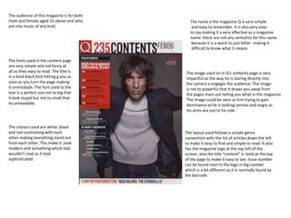
  • 1. The audience of this magazine is for both male and female aged 16 above and who The name o the magazine Q is very simple are into music of any kind. and easy to remember. It is also very easy to say making it a very effective as a magazine name. there are not any semiotics for this name because it is a word its just letter making it difficult to know what it means. The fonts used in the content page are very simple and not fancy at all so they easy to read. The title is The image used on in Q’s contents page is very in a bold black font hitting g you as impactful as the way he is staring directly into soon as you turn the page making the camera a engages the audience. The image it unmissbale. The font used to the is not to powerful that it draws you away from text is a perfect size not to big that the pages main use telling you what in the magazine. it look stupid but not to small that The image could be seen as him trying to gain its unreadable. dominance as he is looking serious and angry as his arms are out to his side. The colours used are white ,black and red contrasting with each The layout used follows a simple genre other making everything stand out convention with the list of articles down the left from each other. This make it ;look to make it easy to find and simple to read. It also modern and something which kids has the magazine logo at the top left of the wouldn't read as it look screen, also the title “content” is bold at the top sophisticated. of the page to make it easy to see. Issue number can be found next to the logo in big number which is a bit different as it is normally found by the barcode.
  • 2. The audience of this magazine is for The layout of the contents page is very different as people aged 13 above for both male and the majority of the page is taken up by a giant picture. female. This is because it look like a With just a tiny bit of writing down the left hand side. sophisticated magazine and not The masthead is in the top left corner and is layed out something young people would read. a bit different with “co” Nten” “ts” on different lines this makes it stand out from the rest. The fonts which are used a plain and simple. The sub headings are in a fancy style which I don’t know what the masthead of this appeals more to the older audience but can magazine is. be easily seen and read. This makes it allot easier to read the page numbers below. The heading is in a bold and clear font which makes it easy to read and understand what the page is about. The colours which are used are very plain as its just a white background with black font for the writing. This is so the picture can stand out of the The image used is of 2 girls with there hands on page. Also so its easy to read the text. their hips this could suggest the are dominate and are strong. The way they look into the lens can also suggest this. What they are wearing is Very sexual this can suggest also that it is not a children's magazine.
  • 3. The layout of the contents page is very simple And effective as the articles are listed clearly down the side of the page and the image to the right. The header is at the top of the page . The date the issue was released is in the top left Corner. The audience of this magazine is for adults both male and female aged 18 above who like all types of music. The fonts used are clear and bold against the plain white background. The names of the bands are in bold and there is a little bit of information below in a paler colour so you don’t get distracted from the band names. I don’t know the name of the magazine. The colours used are simple an with on 3 The image used is of a man wearing baggy colours been used throughout the clothes this could suggest he is a rapper. The contents page. These colours are red Way he is looking into the camera makes black and white all of the colours contrast It look like he is dressing the audience. each other do they all stick out from each other.
  • 4. Audience • Genre conventions (sub genre) • Name of magazine/masterhead (semiotics) • Images (semiotics) • Layout • Fonts • colours