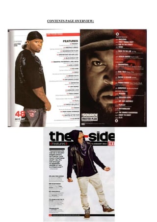
2. As featured within the three magazine contents pages above are a list of content
which will feature in the magazine. These articles all feature the dominant artist
who is also the dominant feature on the front cover of the magazine. This
highlights the artist’s importance in the magazine are they are the prominent
feature. The text (list of content) on the contents page is also usually displayed
on one side of the page to separate the artist (image) the rest of this text. This is
a very effective and clever use of composition as the audience are able to clearly
read the text as well as see the image as well.
They are all magazines from the same genre: Hip-hop and demonstrate a clear
example of this by their attire and dominant appearance. The three contents
pages all maintain the typical conventions used in magazines. Each main point
(sub-heading) is highlighted in a bigger, bolder font than the rest of the text
displayed underneath. This is because the editor wants to make the reader feel
intrigued by the short, snappy sub-headings. This allows the page to stand out
more and makes it more interesting and intriguing for the audience to look at as
if all the text on the page where of the same size, font and style, the audience
may lose interest as the page wouldn’t seem as interesting and effective.
The last contents page of Chris Brown differs slightly and seems quite unusual
as the audience are provided with a pull quote from within the magazine to lure
them in and catch their vivid attention. The fact that this is displayed beside him
shows that this specific quote is specifically related to him and as it is displayed
in the main section of the page (centre left), so the audience are automatically
presented with this. They all also feature a plain white background to again
show the significance of the artist. On the majority of contents pages, the artists
tend to make direct address to the audience to gain their attention. The plain
background also allows the audience to concentrate on the artist as well which
is effective. All three contents pages also feature black males which reinforce
the stereotype of men dominating the world and taking over. Their facial
expressions see quite intimidating but masculine and again reflects the genre.
The contents page of ICE CUBE (2nd Contents page) interests me the most as it
very unusual but striking at the same time. I love the fact that only his face is
shown as it is the most intimate place a person sees. It’s as if he’s looking
directly into the audiences eyes, with his sniggering face. Also, the act that one
eye is covered with the contents shows that he plays a big part in the magazine
and that all eyes should be on him. I also love the fact that the image of him is
3. from the night time and he seems to be wearing all black which again highlights
his status and power.
Two out of three of the contents pages all feature the date and month of which
the magazine which can be useful for the audience as they would be able
remember when the magazine was released. The fact that it is positioned at the
top of the page shows the importance of the date on a contents page. On the first
and third contents pages, they both include a sub title: Features which shows
what the text will include. The use of a subtitle makes it clearer for the audience
to see and allows them to identity the main topics within the contents page.
The colours used are very masculine and typical in hip-hop magazines. Red,
Black and white all represents masculinity in a number of ways, for example,
red connotes danger and black connotes power, strength and masculinity. The
colours come together to great a typical representation of males, fearless,
troublesome but powerful at the same time.