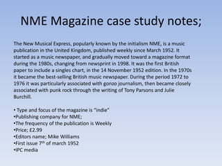
1. Grime Music Magazine
Grime is a style of music that emerged from Bow, East London, England in
the early 2000s, primarily as a development of UK garage, British hip hop
and dancehall. Pioneers of the style include Dizzee Rascal, Wiley, and Roll
Deep.
Youths 16+ students – early 20’s
Monthly
Issue size – 100 pages
Typical contents - Up and coming artists
Interviews
Gigs around the uk
£ 3:00
2. Flavour Magazine Case Study Notes;
• Urban music based in the u.k looking at genre’s such as hip hop, mc’ing and rapping.
•The publishing company is called “greenpark publishing” The Staff
The Staff
•Flavour Magazine Publisher: Leonard Foster
•Flavour Magazine Editorial Director: Annika Allen
•Flavour Magazine Advertising Executive: Siobhan Copland
•Art Editor: Ikem Ononiwu
•Fashion Editor: Denise Brown
•Events Team: Laura Rinaldi
•Events Team: Denise Kodia
•Sub Editor: Francesca Twinn
• bi-monthly urban entertainment and arts magazine in the United Kingdom. The
publication targets men and women 18–34. It presents interviews and discussions on
people in music, art, TV, film, beauty and fashion.
Price: Free
Frequency of Publication: Monthly
3. Sophisticated colour
scheme Uncluttered Main Image Needs A
The web
front page Medium Close Up Barcode
address
featured Cover lines
Includes a header and a
slogan above it.
Quite Plain, wouldn’t
get me the best Issue Information
grade, good to know it
needs more skills Cover Line; Identifying
shown to become the Cover Star and
more successful. Giving a small detail of
the further interview
Girly Colours, need to inside.
be more for both
genders so a colour that
is not specifically linked Listing other featured
to either gender. artist so you can see
what to expect In this
I think their should be issue of the magazine.
more Images on the front
cover to attract more A lot of jewellery worn to give that hip
readers if they are not hop Urban feel to the magazine e.g
interested in main image. chains worn
4. Page Numbers in chronological
Relevant images, order and defined into different This specific one from
but not enough sections e.g “Exposure” “Flavour” is so Plain, I
on there and a don’t want my
irrelevant image Contents page to look
should not be the Anything like this.
biggest one.
The colour
Not detailed when scheme is not
discussing the titles of very clear, the
different articles, which white is too
means it is hard to basic and the
differentiate between look of the
different ones and harder to contents page
navigate through the is too
magazine. simplistic.
There is no point in
subheadings for
different types of I don’t like the idea of the page being folded
articles if they are in up looks scruffy and if there is not much detail
chronological order. about the magazine you shouldn't have details
that are unnecessary
5. Again too Needs to not just be bulk text, too overwhelming
simplistic and for some readers, should have quotes or snippets
Nice
boring. to attract attention
relevant
images, lo
Colour ok
scheme profession
is simple al have
but been
effective photo
and shopped
works well.
nicely
with the Interestin
photogra g topics
phs used to the
in this article
article. e.g. the
gossip/sc
andal
Font is very small
etc.
It would be very expensive (especially for a free magazine) to
produce a full-page image and is unnecessary if the article is
thorough.
6. NME Magazine case study notes;
The New Musical Express, popularly known by the initialism NME, is a music
publication in the United Kingdom, published weekly since March 1952. It
started as a music newspaper, and gradually moved toward a magazine format
during the 1980s, changing from newsprint in 1998. It was the first British
paper to include a singles chart, in the 14 November 1952 edition. In the 1970s
it became the best-selling British music newspaper. During the period 1972 to
1976 it was particularly associated with gonzo journalism, then became closely
associated with punk rock through the writing of Tony Parsons and Julie
Burchill.
• Type and focus of the magazine is “indie”
•Publishing company for NME;
•The frequency of the publication is Weekly
•Price; £2.99
•Editors name; Mike Williams
•First issue 7th of march 1952
•IPC media
7. NME trademark text is clear and big, easy to identify.
Great use of
colour scheme
Picture fits in with
colour scheme e.g
A puff is in the red in his shirt = red
top right hand text
corner of the
magazine Blue against red is
used cleverly to
Issue contrast against
information each other so the
(price date etc.) cover lines telling
you what is in this
weekly magazine
The image
are clear and
overlaps the
stand out against
title so as not
the rest.
to obscure
the medium
shot of Alex The convention of
Turner. a bar code is
used.
Vynal relevant to magazine. Question used on the front to entice the target audience.
8. Clear colour Enticing the
scheme reader
looks very mentioning “free
effective posters”
sticking to insentives.
the pink
white and
black
background.
I want to
emulate the Barcodes used as
idea and look a usual magazine
of the Polaroid convention
images it
would be very
simple to do
on Photoshop Cover lines used
and looks very at the start
effective.
9. Interesting and Issue information on top of an Relevant Images
engaging layout. image
Columns like the
Page numbers big
“PLUS” column to
and bold and
entice the reader
shown with an
and add little
image so it’s
extra’s so nothing
obvious what the
is missing on the
topic is for that
contents page.
particular article
Date on the top
and the title is
unique as well not
just putting
“contents” and
giving that page a
specific name.
10. I really love the idea of the newspaper cutting out as a title is looks
really effective and gives it an alternative “punk” look which goes with The image
the look of Lilly Allen in this photo as she is wearing tartan. I am going goes with
to try and emulate this title idea in my double page spread. the colour
scheme
again red
Relevant image from the
of artist which shirt is
is the focus of reflected
the whole into the odd
article the rare section
photo is a of text in
medium long this double
shot and it page
takes up a full spread.
page which
looks good but
will be costly in
printing Not too much actual article or text Colour scheme
expenses. for a double page spread could be is effective;
disappointing to readers that like a using black,
lot of information. white and red
throughout.
11. If text is
overwhelming
they have a
dip in and out
of side bar so
readers can
get bite size
information
quickly and it
is separated
from the text I
would like to
use this idea in
my double
page spread.
Really nice different images
selection. Action shots