SlideShare a Scribd company logo
1 of 3
Each of the eight contents pages all feature typical magazine content page conventions; such as the use of the brand identity to
continuously portrait the magazines key features across each of their magazines. Typically in We (Love) Pop magazine a main image
that is slightly larger that the other smaller feature images dominates the front cover, drawing the audience into buying the magazine
by showing the big main articles image to make you want to read on and find out more information about this celeb. Pull out quotes
are used either to the side of the image or just below the image so the target audience are able to get an inkling into what the article
may be about. The use of these friendlier words such as “reem” and “quid” make the magazine seem more direct to the audience
using direct address to draw the readership into the magazine. Finally a masthead in an appropriate colour and font to link in with the
magazine and keep this repetitive look and colour scheme throughout as it is the same font as most of the font used throughout the
magazine and black Is a key feature.

Adding to this, repeated patterns are shown throughout each one of the magazines contents pages. Everyone of the contents pages
always features the big celeb artists and images of these celebs. This is typically as the target audience what we expect to see on
the contents page of the magazine as it is a music magazine and the use of these images draws the target audience in; There is a
heavy mix of bands and solo artists, therefore this is able to show that the world of pop is not heavily one sided of either bands or
solo artists but consists of a range of different bands and artists. Not only famous singers and artists are shown in the magazine,
other celebs such as actors and reality TV stars are shown such as Joey Essex and Taylor Lautner; this also appeals to the needs of
the magazines target audience as they have other interests other than just music so this is a good way to appeal to a wider audience.
All of the contents pages we can see; that all of the images are positioned to the right hand side and middle of the magazine.

There is a real mix between the gender of the artists, there are both female and male solo artists and female and male group artists;
but we don’t seem to see groups where there is a mix of female and male artists. Some of the magazine contents pages show that
this months issue is focused on an all male issue and others all female. This can reflect the fact that the genre of Pop is associated
with fashion and very girly things such as fashion, clothes and make-up etc; and that the genre of Pop is predominantly aimed at the
female audience, but the use of showing a lot of female and male Pop artists in this magazine shows that neither sex dominates the
Pop music industry. Were also able to see other similarities in the mise-en-scene elements of the magazine that are shown in each of
the magazines the contents pages. Typical costume’s that the artists are shown to wear are things such as quite edgy and quirky
clothes, such as dresses, converse, shirts, jeans and bright colours are used to convey the conventions of Pop etc. This is a look that
generally associated with the Pop genre; it is commonly shown throughout We (Love) Pop and what the target audience of pop
expect to see the artists to be wearing.

Another shared feature across the contents pages is that they all include a small puff in the top left hand corner of the page, “for your
eyes only” again using direct address towards the audience so they can make the magazine their own and make it personal to them,
feeling like the editor is talking directly to them as an individual.
On each contents page, the signature We (Love) Pop masthead appears. It is positioned in each magazine contents page, in the top
right hand corner, it is consistently in the exact same position each time. The font is the same every time and does not change
throughout all eight magazine contents pages, always keeping the same look of black and bold fonts throughout the magazine but
there is also this yellowish gold-ish colour that conveys happiness and shows that the magazine is friendly and bubbly. Just like the
name on the magazine, the masthead on the contents page links with it as it is called “We love this” like the name of the magazine is
“We love pop”. It is obvious that We (Love) Pop has its own brand identity and signature look that is easily recognized by its target
audience. This is maintained image through the repetition of the layout and stylistic features from each issue and is a very good way
of helping the magazine to sell and succeed with its magazine.

More Related Content

What's hot

PresentationMedia
PresentationMediaPresentationMedia
PresentationMediarawanmahm
 
Media Powerpoint
Media Powerpoint Media Powerpoint
Media Powerpoint srallison
 
Identifying a music cover page
Identifying a music cover pageIdentifying a music cover page
Identifying a music cover pageKayyMurphyy
 
Music Magazine Conventions
Music Magazine Conventions Music Magazine Conventions
Music Magazine Conventions Phoebe Thompson
 
Cover deconstruction
Cover deconstructionCover deconstruction
Cover deconstructionchlozeebo
 
Billboard Double Page Spread
Billboard Double Page SpreadBillboard Double Page Spread
Billboard Double Page Spreadannabellehussey
 
Fader music magazine analysis
Fader music magazine analysisFader music magazine analysis
Fader music magazine analysiszombiejuicek
 
Hip Hop magazine analysis
Hip Hop magazine analysisHip Hop magazine analysis
Hip Hop magazine analysisJoeGriffiths
 
Front cover, contents page and double page
Front cover, contents page and double pageFront cover, contents page and double page
Front cover, contents page and double pagemegancampbellmedia
 
technical deconstruction
technical deconstructiontechnical deconstruction
technical deconstructionmaxmorton050726
 
Front Cover Analysis
Front Cover AnalysisFront Cover Analysis
Front Cover AnalysisPhil_Harrison
 
Final magazine cover analysis
Final magazine cover analysisFinal magazine cover analysis
Final magazine cover analysisMahnoor Tariq
 

What's hot (20)

PresentationMedia
PresentationMediaPresentationMedia
PresentationMedia
 
Media Powerpoint
Media Powerpoint Media Powerpoint
Media Powerpoint
 
Identifying a music cover page
Identifying a music cover pageIdentifying a music cover page
Identifying a music cover page
 
Music Magazine Conventions
Music Magazine Conventions Music Magazine Conventions
Music Magazine Conventions
 
Nme analysis
Nme analysisNme analysis
Nme analysis
 
Research on music mag 3
Research on music mag 3Research on music mag 3
Research on music mag 3
 
Cover deconstruction
Cover deconstructionCover deconstruction
Cover deconstruction
 
Billboard Double Page Spread
Billboard Double Page SpreadBillboard Double Page Spread
Billboard Double Page Spread
 
Front cover overview
Front cover overviewFront cover overview
Front cover overview
 
Fader music magazine analysis
Fader music magazine analysisFader music magazine analysis
Fader music magazine analysis
 
Textual analysis 1
Textual analysis 1 Textual analysis 1
Textual analysis 1
 
Magazine analysis
Magazine analysis Magazine analysis
Magazine analysis
 
Textual analysis 2
Textual analysis 2Textual analysis 2
Textual analysis 2
 
Hip Hop magazine analysis
Hip Hop magazine analysisHip Hop magazine analysis
Hip Hop magazine analysis
 
NME
NME NME
NME
 
Front cover, contents page and double page
Front cover, contents page and double pageFront cover, contents page and double page
Front cover, contents page and double page
 
technical deconstruction
technical deconstructiontechnical deconstruction
technical deconstruction
 
Front Cover Analysis
Front Cover AnalysisFront Cover Analysis
Front Cover Analysis
 
Analysis of
Analysis ofAnalysis of
Analysis of
 
Final magazine cover analysis
Final magazine cover analysisFinal magazine cover analysis
Final magazine cover analysis
 

Viewers also liked

Zoe Hickson - 1033 - Schedule
Zoe Hickson - 1033 - ScheduleZoe Hickson - 1033 - Schedule
Zoe Hickson - 1033 - Schedulezhickson
 
Zoe Hickson - Location Recce
Zoe Hickson - Location RecceZoe Hickson - Location Recce
Zoe Hickson - Location Reccezhickson
 
Zoe Hickson Mood Board
Zoe Hickson Mood BoardZoe Hickson Mood Board
Zoe Hickson Mood BoardZoe Hickson
 
Zoe Hickson - Primary Research Evaluation
Zoe Hickson - Primary Research EvaluationZoe Hickson - Primary Research Evaluation
Zoe Hickson - Primary Research Evaluationzhickson
 
Zoe Hickson Production Plan
Zoe Hickson Production PlanZoe Hickson Production Plan
Zoe Hickson Production Planzhickson
 
Zoe Hickson Photography Plan
Zoe Hickson Photography PlanZoe Hickson Photography Plan
Zoe Hickson Photography Planzhickson
 

Viewers also liked (6)

Zoe Hickson - 1033 - Schedule
Zoe Hickson - 1033 - ScheduleZoe Hickson - 1033 - Schedule
Zoe Hickson - 1033 - Schedule
 
Zoe Hickson - Location Recce
Zoe Hickson - Location RecceZoe Hickson - Location Recce
Zoe Hickson - Location Recce
 
Zoe Hickson Mood Board
Zoe Hickson Mood BoardZoe Hickson Mood Board
Zoe Hickson Mood Board
 
Zoe Hickson - Primary Research Evaluation
Zoe Hickson - Primary Research EvaluationZoe Hickson - Primary Research Evaluation
Zoe Hickson - Primary Research Evaluation
 
Zoe Hickson Production Plan
Zoe Hickson Production PlanZoe Hickson Production Plan
Zoe Hickson Production Plan
 
Zoe Hickson Photography Plan
Zoe Hickson Photography PlanZoe Hickson Photography Plan
Zoe Hickson Photography Plan
 

Similar to Contents page overview

Similar to Contents page overview (20)

Front Cover Overview
Front Cover OverviewFront Cover Overview
Front Cover Overview
 
Front cover overview we love pop edited
Front cover overview we love pop editedFront cover overview we love pop edited
Front cover overview we love pop edited
 
Front Cover Overview
Front Cover Overview Front Cover Overview
Front Cover Overview
 
Front Cover Overview
Front Cover OverviewFront Cover Overview
Front Cover Overview
 
Evaluation
EvaluationEvaluation
Evaluation
 
Evaluation
EvaluationEvaluation
Evaluation
 
Front Cover Overview
Front Cover OverviewFront Cover Overview
Front Cover Overview
 
Contents page overview edited
Contents page overview editedContents page overview edited
Contents page overview edited
 
Overviews
OverviewsOverviews
Overviews
 
Contents Page Overview
Contents Page Overview Contents Page Overview
Contents Page Overview
 
Contents Page Overview
Contents Page OverviewContents Page Overview
Contents Page Overview
 
Overview
OverviewOverview
Overview
 
VO
VOVO
VO
 
Front Cover Analysis
Front Cover AnalysisFront Cover Analysis
Front Cover Analysis
 
Overview
OverviewOverview
Overview
 
Codes and Conventions
Codes and ConventionsCodes and Conventions
Codes and Conventions
 
Front Cover Analysis
Front Cover AnalysisFront Cover Analysis
Front Cover Analysis
 
My front cover overview
My front cover overviewMy front cover overview
My front cover overview
 
Analysing existing magazines
Analysing existing magazinesAnalysing existing magazines
Analysing existing magazines
 
Analysing existing magazines
Analysing existing magazinesAnalysing existing magazines
Analysing existing magazines
 

More from Stephaniee Beharry (20)

Evaluation
EvaluationEvaluation
Evaluation
 
Trailer analysis 1
Trailer analysis 1Trailer analysis 1
Trailer analysis 1
 
Trailer analysis 3
Trailer analysis 3Trailer analysis 3
Trailer analysis 3
 
Trailer overviews
Trailer overviewsTrailer overviews
Trailer overviews
 
The devil inside analysis
The devil inside analysisThe devil inside analysis
The devil inside analysis
 
Magazine frontcover Analysis
Magazine frontcover AnalysisMagazine frontcover Analysis
Magazine frontcover Analysis
 
Ideas for our tagline
Ideas for our taglineIdeas for our tagline
Ideas for our tagline
 
Target audience 2nd draft
Target audience 2nd draftTarget audience 2nd draft
Target audience 2nd draft
 
Questionaire
QuestionaireQuestionaire
Questionaire
 
Questionaire results
Questionaire resultsQuestionaire results
Questionaire results
 
Practice shots
Practice shotsPractice shots
Practice shots
 
Mock ups
Mock upsMock ups
Mock ups
 
Mission statement media
Mission statement mediaMission statement media
Mission statement media
 
Mise en scene
Mise en sceneMise en scene
Mise en scene
 
Focus group
Focus groupFocus group
Focus group
 
Feature artists
Feature artistsFeature artists
Feature artists
 
Costume ideas
Costume ideasCostume ideas
Costume ideas
 
Contents page analysis
Contents page analysisContents page analysis
Contents page analysis
 
Codes and conventions of pop
Codes and conventions of popCodes and conventions of pop
Codes and conventions of pop
 
Casy study
Casy studyCasy study
Casy study
 

Contents page overview

  • 1.
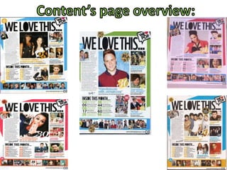
  • 2. Each of the eight contents pages all feature typical magazine content page conventions; such as the use of the brand identity to continuously portrait the magazines key features across each of their magazines. Typically in We (Love) Pop magazine a main image that is slightly larger that the other smaller feature images dominates the front cover, drawing the audience into buying the magazine by showing the big main articles image to make you want to read on and find out more information about this celeb. Pull out quotes are used either to the side of the image or just below the image so the target audience are able to get an inkling into what the article may be about. The use of these friendlier words such as “reem” and “quid” make the magazine seem more direct to the audience using direct address to draw the readership into the magazine. Finally a masthead in an appropriate colour and font to link in with the magazine and keep this repetitive look and colour scheme throughout as it is the same font as most of the font used throughout the magazine and black Is a key feature. Adding to this, repeated patterns are shown throughout each one of the magazines contents pages. Everyone of the contents pages always features the big celeb artists and images of these celebs. This is typically as the target audience what we expect to see on the contents page of the magazine as it is a music magazine and the use of these images draws the target audience in; There is a heavy mix of bands and solo artists, therefore this is able to show that the world of pop is not heavily one sided of either bands or solo artists but consists of a range of different bands and artists. Not only famous singers and artists are shown in the magazine, other celebs such as actors and reality TV stars are shown such as Joey Essex and Taylor Lautner; this also appeals to the needs of the magazines target audience as they have other interests other than just music so this is a good way to appeal to a wider audience. All of the contents pages we can see; that all of the images are positioned to the right hand side and middle of the magazine. There is a real mix between the gender of the artists, there are both female and male solo artists and female and male group artists; but we don’t seem to see groups where there is a mix of female and male artists. Some of the magazine contents pages show that this months issue is focused on an all male issue and others all female. This can reflect the fact that the genre of Pop is associated with fashion and very girly things such as fashion, clothes and make-up etc; and that the genre of Pop is predominantly aimed at the female audience, but the use of showing a lot of female and male Pop artists in this magazine shows that neither sex dominates the Pop music industry. Were also able to see other similarities in the mise-en-scene elements of the magazine that are shown in each of the magazines the contents pages. Typical costume’s that the artists are shown to wear are things such as quite edgy and quirky clothes, such as dresses, converse, shirts, jeans and bright colours are used to convey the conventions of Pop etc. This is a look that generally associated with the Pop genre; it is commonly shown throughout We (Love) Pop and what the target audience of pop expect to see the artists to be wearing. Another shared feature across the contents pages is that they all include a small puff in the top left hand corner of the page, “for your eyes only” again using direct address towards the audience so they can make the magazine their own and make it personal to them, feeling like the editor is talking directly to them as an individual.
  • 3. On each contents page, the signature We (Love) Pop masthead appears. It is positioned in each magazine contents page, in the top right hand corner, it is consistently in the exact same position each time. The font is the same every time and does not change throughout all eight magazine contents pages, always keeping the same look of black and bold fonts throughout the magazine but there is also this yellowish gold-ish colour that conveys happiness and shows that the magazine is friendly and bubbly. Just like the name on the magazine, the masthead on the contents page links with it as it is called “We love this” like the name of the magazine is “We love pop”. It is obvious that We (Love) Pop has its own brand identity and signature look that is easily recognized by its target audience. This is maintained image through the repetition of the layout and stylistic features from each issue and is a very good way of helping the magazine to sell and succeed with its magazine.