SlideShare a Scribd company logo
1 of 6
I used this swirly writing for my front cover because I thought
                                 it looked slightly more sophisticated which is one of the

Front cover mock up!             qualities that my target audience possess’. I also felt the name
                                 of the magazine La Pop, made the magazine seem more
                                 classy, therefore I felt the font would suit the name and feel
                                 of the magazine.

                             I choose too box my sell lines to make them stand out more,
                             therefore grabbing the readers attention as, they will stand out
                             and catch the readers eye drawing them into buying the
                             magazine to find out more.

                          I used this costume on my model and front cover because I felt it
                          connoted the genre of pop and fitted in with the type of clothing
                          that a pop artist would wear. Its also very elegant but edgy at the
                          same time, which attracts the reader to the magazine as they liked
                          to see what the celebrities are wearing so they can too keep up with
                          their fashion.

                            Sapphire is written across the page diagonally as I felt it stood
                            out, I have also seen it positioned like this on current pop
                            magazines and wanted to use some typical conventions of pop
                            throughout my 3 pieces. Therefore it is easy for the readership to
                            see that my magazine is a pop magazine.

                       I felt that using a fashion section on my front cover would appeal to a
                       wider range of the readership. This is because my target audience is
                       very keen on fashion and new clothing. By also using a season, keeps
                       the reader up to date with what’s hot and what’s not each year round
                       so they are always able to get the latest trends. Making my pop
                       magazine seem more controversial and edgy.

                          The banner at the bottom of the page which includes posters and the
                          bar code is used because it was a good way to attract my target
                          audience to buying the magazine, as these are a type of freebie that
                          come with the magazine, that the readership is able to pull out and
                          stick on their wall’s etc.. Women also like to see topless men with
                          nice bodies as this gives of this type of sex appeal.
Front cover mock up colour!              I used the red lips behind the masthead, as it
                                         makes the name of my magazine stand out
                                         more, it also carries on the symbiotic link, as
                                         I use this lips imagery throughout my three
                                         pieces.

                                Her hair has been clipped back out of her face, this is to
                                show her beauty and her fresh faced. What all of my
                                target audience aspire to look like, this young, fresh faced
                                and beautiful young woman.


                                    I choose to have my writing underneath the sell line
                                    black because, I did not want to use another colour and
                                    make my front cover look too taking or too eye sore. I
                                    felt that by using the black colour it would tone down
                                    the magazine slightly making it edgy but also subtle at
                                    the same time appealing to all of my target audience.


                                      I used a balloon to carry on the symbiotic link
                                      throughout my three pieces, it is also a pun to
                                      the sell line which is “I just keep rising up” and
                                      her pose shows her pushing the balloon down as
                                      if the balloon is trying to rise up.


                              I used the colour blue for my sell lines because it is a bright
                              colour that is used a lot on pop magazines. It also stands out
                              against the yellow box that is around the lettering or against
                              the background on my front cover.

                                      This star shape on the front cover, brings more
                                      attention to the banner and the posters it includes to
                                      draw the reader in. The use of this hot pink connotes
                                      the pop genre, it is also a running colour theme
                                      through my three pieces which carries a symbiotic
                                      link. The black then makes the writing stand out.
This is a speech bubble with the worlds “Ooo La La”
                           inside of it, this is a type of pun as it links in with the
Contents page!             name of the magazine which is “La Pop” is also adds a
                           sense of classiness to the magazine, which ties in with
                           my target audience personalities.


                      My model is posing laying down in the balloons, this is to
                      carry on a symbiotic link through my three pieces. The
                      colourful background of balloons also connotes the genre
                      of pop and again is a pun because balloons make the sound
                      pop when they are burst. She is also wearing a tight dress
                      to show of her amazing figure. The curly hair is a suggestion
                      towards her personality, as she is very quirky and fun.


                           I choose to use “What's popula” as my title for my
                           contents page as it is a play on words, and also links into
                           to the name of my magazine; it also suggests that in this
                           magazine the reader is able to get all the latest and
                           most popular gossip and music updates.


                      I have decided to use a strip that looks like a photograph
                      strip, because I felt it was a good idea and affect, and I have
                      placed pictures of all of the celebs that will feature in my
                      magazine.

                 The numbers on each page have been written in this nice swirly
                 font, this is to add to the classiness and the idea of ooo la la .


                          At the bottom of every page in my magazine there is a
                          status update, where we give our readers short and
                          snappy bits of information about celebs and their untold
                          secrets.
Here is a pull out quote from my artists interview in the
                        magazine, it also relates to the whole balloon theme as it
Contents page colour!   says “no one can bust my bubble” as if she is a balloon and
                        she has worked hard to get to where she is and no one can
                        bust that or change her .

                         I choose to feature a editors letter, as it made my magazine
                         seem more professional, and in a lot of current pop music
                         magazines there are editors letters. This way the reader is
                         able to get an overview of what the whole magazine is
                         about and can get a feel of the magazine and its qualities.
                         This also makes the magazine more friendly for the TA as
                         its as if me the editor is talking to each one of the women
                         in my TA personally.

                             Here is all of my sell lines, these tell the reader what
                             new stories, interviews, gigs and gossip is going to be
                             included in this months issue of La Pop. Drawing the
                             reader into buying the magazine even more as they
                             want to read on and find out more about these celebs
                             and stories that are to be included in the magazine,

                         I have included an image of myself so my TA are able to see
                         who I am and what I look like, so they can put a face to the
                         name, again making the magazine more friendly.

                             This puff draws the reader into buying the magazine
                             because they like to see hot bodies of male celebs, the
                             bright yellow also makes it stand out so it grabs the
                             readers eye.

                             At the bottom of the page I have include the number
                             of the page so the reader can refer to it if they want to
                             go back to a certain page they can find it, also the e-
                             mail address in case they want to subscribe online.
The name of the article is
  Double page spread mock up!                                                                           here in bold! It is also a pull
                                                                                                        out quote from the interview
                                                                                                        between the editor and the
                                                                                                        new up and coming artist
                                                                                                        featured “Sapphire”.


                                                                                                       I have chosen to write my
                                                                                                       interview in columns to make it
                                                                                                       look more like a professional
                                                                                                       interview in a magazine. Giving
                                                                                                       the editors questions and
                                                                                                       Sapphires responses make it
                                                                                                       seem more fun and interesting
                                                                                                       rather than making it too text
                                                                                                       heavy and making the reader
                                                                                                       loose interest in the article.

                                                                                                           Here I have added pull out
                                                                                                           quote in puffs to make the
                                                                                                           article seem more fun and
                                                                                                           also to make sure these
                                                                                                           points stick in the readers
                                                                                                           mind. Also makes it less
                                                                                                           text heavy.

                                                                                                    Again I have used the same hot
                                                                                                    bods idea as it attracts my TA as this
                                                                                                    is what they like to see. The arrow
                                                                                                    also dirrects them to turn to the
                                                                                                    next page to see these images and
                                                                                                    posters and if they don’t read on
On every other page or every page I use this status update   I make sure that every page has a      then they will miss out. Again this
because it attracts the reader and they want to know these   page number and the e-,ail address     bright yellow is used to draw
secrets about all of the different celebs.                   to draw them into signing up onling.   attention to it.
Double page spread colour!
 Sapphire, my new up and
 coming artist has her name
 above all of the images of her
 and bold so the reader is able
 to recognise her and know her
 name so it stays in their minds.

 Here are a lot of small feature
 images of Sapphire, these all
 carry on the imagery of
 balloons and keep a symbiotic
 link running through all three
 of my pieces.

 I have positioned my main
 image directly in the middle
 of the page so the reader is
 instantly drawn to her. This
 is also a good image for my
 balloon imagery with all of
 the balloons falling around
 her.


Under some of the images there
are small captions to explain the
image or add a pun.


 I have consistently used the colours, blue, pink, black    These feature images help to draw attention to specific points in the article, it
 and yellow through my three pieces to carry a symbiotic    also helps to make the article less text heavy which is what you would usually
 link, so there is a clear resemblance between the three.   expect to see in a pop magazine a lot of images mixed in with the text.

More Related Content

What's hot

Magazine Planning
Magazine PlanningMagazine Planning
Magazine Planning2033x
 
Evaluation question one.
Evaluation question one.Evaluation question one.
Evaluation question one.Ellie4321
 
Textual analysis
Textual analysisTextual analysis
Textual analysisBobRoss1999
 
Question one
Question oneQuestion one
Question oneaishak22
 
How I have used, developed and challenged media conventions
How I have used, developed and challenged media conventionsHow I have used, developed and challenged media conventions
How I have used, developed and challenged media conventionsaishak22
 
Presentation1 music magazine (4) (1)
Presentation1 music magazine (4) (1)Presentation1 music magazine (4) (1)
Presentation1 music magazine (4) (1)billiewilson_
 
Presentation1 music magazine (4)
Presentation1 music magazine (4)Presentation1 music magazine (4)
Presentation1 music magazine (4)billiewilson_
 
Evaluation question 5
Evaluation question 5Evaluation question 5
Evaluation question 5Tom
 
Layout for music mag 3 final
Layout for music mag 3 finalLayout for music mag 3 final
Layout for music mag 3 finallaurenhomer
 
Media film magazine
Media film magazineMedia film magazine
Media film magazineMija_Valdez
 

What's hot (16)

Magazine Planning
Magazine PlanningMagazine Planning
Magazine Planning
 
Double page spread analysis
Double page spread analysisDouble page spread analysis
Double page spread analysis
 
Q1
Q1Q1
Q1
 
Evaluation question one.
Evaluation question one.Evaluation question one.
Evaluation question one.
 
Research
ResearchResearch
Research
 
Textual analysis
Textual analysisTextual analysis
Textual analysis
 
Research
ResearchResearch
Research
 
Question one
Question oneQuestion one
Question one
 
How I have used, developed and challenged media conventions
How I have used, developed and challenged media conventionsHow I have used, developed and challenged media conventions
How I have used, developed and challenged media conventions
 
Presentation1 music magazine (4) (1)
Presentation1 music magazine (4) (1)Presentation1 music magazine (4) (1)
Presentation1 music magazine (4) (1)
 
Presentation1 music magazine (4)
Presentation1 music magazine (4)Presentation1 music magazine (4)
Presentation1 music magazine (4)
 
Evaluation question 5
Evaluation question 5Evaluation question 5
Evaluation question 5
 
Layout for music mag 3 final
Layout for music mag 3 finalLayout for music mag 3 final
Layout for music mag 3 final
 
Media film magazine
Media film magazineMedia film magazine
Media film magazine
 
Media evaluation question 5
Media evaluation question 5Media evaluation question 5
Media evaluation question 5
 
Evaluation q1
Evaluation q1Evaluation q1
Evaluation q1
 

Viewers also liked

Resilience as a new Enforcement Model for IT Security based on Usage Control
Resilience as a new Enforcement Model for IT Security based on Usage ControlResilience as a new Enforcement Model for IT Security based on Usage Control
Resilience as a new Enforcement Model for IT Security based on Usage ControlSven Wohlgemuth
 
Measurement of tact necessary to prevent industrial disputes leading to loss ...
Measurement of tact necessary to prevent industrial disputes leading to loss ...Measurement of tact necessary to prevent industrial disputes leading to loss ...
Measurement of tact necessary to prevent industrial disputes leading to loss ...IAEME Publication
 
Cardapio macarronada kobrasol junho14
Cardapio macarronada kobrasol junho14Cardapio macarronada kobrasol junho14
Cardapio macarronada kobrasol junho14Vinícius Schmitz
 
Building the Web Backwards
Building the Web BackwardsBuilding the Web Backwards
Building the Web Backwardsmjvysock
 
Omnibus cortazar 1.pps
Omnibus   cortazar 1.ppsOmnibus   cortazar 1.pps
Omnibus cortazar 1.ppsCANDELAM
 
Science f3 chap 05 pertumbuhan
Science f3 chap 05 pertumbuhanScience f3 chap 05 pertumbuhan
Science f3 chap 05 pertumbuhanzealot90
 
Le Pillole Relazionali di Sapyent - I Gruppi Balint
Le Pillole Relazionali di Sapyent - I Gruppi BalintLe Pillole Relazionali di Sapyent - I Gruppi Balint
Le Pillole Relazionali di Sapyent - I Gruppi BalintSapyent
 

Viewers also liked (12)

Resilience as a new Enforcement Model for IT Security based on Usage Control
Resilience as a new Enforcement Model for IT Security based on Usage ControlResilience as a new Enforcement Model for IT Security based on Usage Control
Resilience as a new Enforcement Model for IT Security based on Usage Control
 
Agenda julio 2014
Agenda julio 2014Agenda julio 2014
Agenda julio 2014
 
Measurement of tact necessary to prevent industrial disputes leading to loss ...
Measurement of tact necessary to prevent industrial disputes leading to loss ...Measurement of tact necessary to prevent industrial disputes leading to loss ...
Measurement of tact necessary to prevent industrial disputes leading to loss ...
 
Cardapio macarronada kobrasol junho14
Cardapio macarronada kobrasol junho14Cardapio macarronada kobrasol junho14
Cardapio macarronada kobrasol junho14
 
Mise en scene
Mise en sceneMise en scene
Mise en scene
 
Building the Web Backwards
Building the Web BackwardsBuilding the Web Backwards
Building the Web Backwards
 
Biscuit
BiscuitBiscuit
Biscuit
 
Omnibus cortazar 1.pps
Omnibus   cortazar 1.ppsOmnibus   cortazar 1.pps
Omnibus cortazar 1.pps
 
Science f3 chap 05 pertumbuhan
Science f3 chap 05 pertumbuhanScience f3 chap 05 pertumbuhan
Science f3 chap 05 pertumbuhan
 
Mission statement media
Mission statement mediaMission statement media
Mission statement media
 
Le Pillole Relazionali di Sapyent - I Gruppi Balint
Le Pillole Relazionali di Sapyent - I Gruppi BalintLe Pillole Relazionali di Sapyent - I Gruppi Balint
Le Pillole Relazionali di Sapyent - I Gruppi Balint
 
Tp 1 2_3_4
Tp 1 2_3_4Tp 1 2_3_4
Tp 1 2_3_4
 

Similar to Mock ups

Statement of intent front page
Statement of intent  front pageStatement of intent  front page
Statement of intent front pageoliviaolives
 
Presentation1 music magazine (4)
Presentation1 music magazine (4)Presentation1 music magazine (4)
Presentation1 music magazine (4)billiewilson_
 
Making of my magazine
Making of my magazineMaking of my magazine
Making of my magazinebilliewilson_
 
How did you attract
How did you attract How did you attract
How did you attract asmediaf12
 
How did you attract address your audience
How did you attract address your audienceHow did you attract address your audience
How did you attract address your audienceasmediaf12
 
How did you attract address your audience
How did you attract address your audienceHow did you attract address your audience
How did you attract address your audienceasmediaf12
 
Question 1 - Media Evaluation
Question 1 - Media EvaluationQuestion 1 - Media Evaluation
Question 1 - Media Evaluationbeckiemcconnell
 
Media evaluation
Media evaluationMedia evaluation
Media evaluationmegan
 
Evaluation question 5
Evaluation  question 5Evaluation  question 5
Evaluation question 5rdowell1
 

Similar to Mock ups (20)

Statement of intent front page
Statement of intent  front pageStatement of intent  front page
Statement of intent front page
 
Presentation1 music magazine (4)
Presentation1 music magazine (4)Presentation1 music magazine (4)
Presentation1 music magazine (4)
 
Making of my magazine
Making of my magazineMaking of my magazine
Making of my magazine
 
Music mag evaluation
Music mag evaluationMusic mag evaluation
Music mag evaluation
 
Question 1 f
Question 1 fQuestion 1 f
Question 1 f
 
Music mag evaluation
Music mag evaluationMusic mag evaluation
Music mag evaluation
 
How did you attract
How did you attract How did you attract
How did you attract
 
How did you attract address your audience
How did you attract address your audienceHow did you attract address your audience
How did you attract address your audience
 
How did you attract address your audience
How did you attract address your audienceHow did you attract address your audience
How did you attract address your audience
 
One.
One.One.
One.
 
Question1
Question1Question1
Question1
 
Question 1 - Media Evaluation
Question 1 - Media EvaluationQuestion 1 - Media Evaluation
Question 1 - Media Evaluation
 
evaluaton1
evaluaton1evaluaton1
evaluaton1
 
Magazineideasmontage
MagazineideasmontageMagazineideasmontage
Magazineideasmontage
 
Magazineideasmontage
MagazineideasmontageMagazineideasmontage
Magazineideasmontage
 
Magazine ideas
Magazine ideasMagazine ideas
Magazine ideas
 
Media evaluation
Media evaluationMedia evaluation
Media evaluation
 
Evaluation question 5
Evaluation  question 5Evaluation  question 5
Evaluation question 5
 
Ideas for magazine
Ideas for magazineIdeas for magazine
Ideas for magazine
 
Ideas for magazine
Ideas for magazineIdeas for magazine
Ideas for magazine
 

More from Stephaniee Beharry (20)

Evaluation
EvaluationEvaluation
Evaluation
 
Trailer analysis 1
Trailer analysis 1Trailer analysis 1
Trailer analysis 1
 
Trailer analysis 3
Trailer analysis 3Trailer analysis 3
Trailer analysis 3
 
Trailer overviews
Trailer overviewsTrailer overviews
Trailer overviews
 
The devil inside analysis
The devil inside analysisThe devil inside analysis
The devil inside analysis
 
Magazine frontcover Analysis
Magazine frontcover AnalysisMagazine frontcover Analysis
Magazine frontcover Analysis
 
Ideas for our tagline
Ideas for our taglineIdeas for our tagline
Ideas for our tagline
 
Evaluation
EvaluationEvaluation
Evaluation
 
Evaluation
EvaluationEvaluation
Evaluation
 
Target audience 2nd draft
Target audience 2nd draftTarget audience 2nd draft
Target audience 2nd draft
 
Questionaire
QuestionaireQuestionaire
Questionaire
 
Questionaire results
Questionaire resultsQuestionaire results
Questionaire results
 
Practice shots
Practice shotsPractice shots
Practice shots
 
Front cover overview
Front cover overviewFront cover overview
Front cover overview
 
Focus group
Focus groupFocus group
Focus group
 
Feature artists
Feature artistsFeature artists
Feature artists
 
Costume ideas
Costume ideasCostume ideas
Costume ideas
 
Contents page overview
Contents page overviewContents page overview
Contents page overview
 
Contents page analysis
Contents page analysisContents page analysis
Contents page analysis
 
Codes and conventions of pop
Codes and conventions of popCodes and conventions of pop
Codes and conventions of pop
 

Mock ups

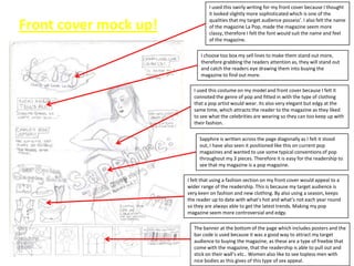
  • 1. I used this swirly writing for my front cover because I thought it looked slightly more sophisticated which is one of the Front cover mock up! qualities that my target audience possess’. I also felt the name of the magazine La Pop, made the magazine seem more classy, therefore I felt the font would suit the name and feel of the magazine. I choose too box my sell lines to make them stand out more, therefore grabbing the readers attention as, they will stand out and catch the readers eye drawing them into buying the magazine to find out more. I used this costume on my model and front cover because I felt it connoted the genre of pop and fitted in with the type of clothing that a pop artist would wear. Its also very elegant but edgy at the same time, which attracts the reader to the magazine as they liked to see what the celebrities are wearing so they can too keep up with their fashion. Sapphire is written across the page diagonally as I felt it stood out, I have also seen it positioned like this on current pop magazines and wanted to use some typical conventions of pop throughout my 3 pieces. Therefore it is easy for the readership to see that my magazine is a pop magazine. I felt that using a fashion section on my front cover would appeal to a wider range of the readership. This is because my target audience is very keen on fashion and new clothing. By also using a season, keeps the reader up to date with what’s hot and what’s not each year round so they are always able to get the latest trends. Making my pop magazine seem more controversial and edgy. The banner at the bottom of the page which includes posters and the bar code is used because it was a good way to attract my target audience to buying the magazine, as these are a type of freebie that come with the magazine, that the readership is able to pull out and stick on their wall’s etc.. Women also like to see topless men with nice bodies as this gives of this type of sex appeal.
  • 2. Front cover mock up colour! I used the red lips behind the masthead, as it makes the name of my magazine stand out more, it also carries on the symbiotic link, as I use this lips imagery throughout my three pieces. Her hair has been clipped back out of her face, this is to show her beauty and her fresh faced. What all of my target audience aspire to look like, this young, fresh faced and beautiful young woman. I choose to have my writing underneath the sell line black because, I did not want to use another colour and make my front cover look too taking or too eye sore. I felt that by using the black colour it would tone down the magazine slightly making it edgy but also subtle at the same time appealing to all of my target audience. I used a balloon to carry on the symbiotic link throughout my three pieces, it is also a pun to the sell line which is “I just keep rising up” and her pose shows her pushing the balloon down as if the balloon is trying to rise up. I used the colour blue for my sell lines because it is a bright colour that is used a lot on pop magazines. It also stands out against the yellow box that is around the lettering or against the background on my front cover. This star shape on the front cover, brings more attention to the banner and the posters it includes to draw the reader in. The use of this hot pink connotes the pop genre, it is also a running colour theme through my three pieces which carries a symbiotic link. The black then makes the writing stand out.
  • 3. This is a speech bubble with the worlds “Ooo La La” inside of it, this is a type of pun as it links in with the Contents page! name of the magazine which is “La Pop” is also adds a sense of classiness to the magazine, which ties in with my target audience personalities. My model is posing laying down in the balloons, this is to carry on a symbiotic link through my three pieces. The colourful background of balloons also connotes the genre of pop and again is a pun because balloons make the sound pop when they are burst. She is also wearing a tight dress to show of her amazing figure. The curly hair is a suggestion towards her personality, as she is very quirky and fun. I choose to use “What's popula” as my title for my contents page as it is a play on words, and also links into to the name of my magazine; it also suggests that in this magazine the reader is able to get all the latest and most popular gossip and music updates. I have decided to use a strip that looks like a photograph strip, because I felt it was a good idea and affect, and I have placed pictures of all of the celebs that will feature in my magazine. The numbers on each page have been written in this nice swirly font, this is to add to the classiness and the idea of ooo la la . At the bottom of every page in my magazine there is a status update, where we give our readers short and snappy bits of information about celebs and their untold secrets.
  • 4. Here is a pull out quote from my artists interview in the magazine, it also relates to the whole balloon theme as it Contents page colour! says “no one can bust my bubble” as if she is a balloon and she has worked hard to get to where she is and no one can bust that or change her . I choose to feature a editors letter, as it made my magazine seem more professional, and in a lot of current pop music magazines there are editors letters. This way the reader is able to get an overview of what the whole magazine is about and can get a feel of the magazine and its qualities. This also makes the magazine more friendly for the TA as its as if me the editor is talking to each one of the women in my TA personally. Here is all of my sell lines, these tell the reader what new stories, interviews, gigs and gossip is going to be included in this months issue of La Pop. Drawing the reader into buying the magazine even more as they want to read on and find out more about these celebs and stories that are to be included in the magazine, I have included an image of myself so my TA are able to see who I am and what I look like, so they can put a face to the name, again making the magazine more friendly. This puff draws the reader into buying the magazine because they like to see hot bodies of male celebs, the bright yellow also makes it stand out so it grabs the readers eye. At the bottom of the page I have include the number of the page so the reader can refer to it if they want to go back to a certain page they can find it, also the e- mail address in case they want to subscribe online.
  • 5. The name of the article is Double page spread mock up! here in bold! It is also a pull out quote from the interview between the editor and the new up and coming artist featured “Sapphire”. I have chosen to write my interview in columns to make it look more like a professional interview in a magazine. Giving the editors questions and Sapphires responses make it seem more fun and interesting rather than making it too text heavy and making the reader loose interest in the article. Here I have added pull out quote in puffs to make the article seem more fun and also to make sure these points stick in the readers mind. Also makes it less text heavy. Again I have used the same hot bods idea as it attracts my TA as this is what they like to see. The arrow also dirrects them to turn to the next page to see these images and posters and if they don’t read on On every other page or every page I use this status update I make sure that every page has a then they will miss out. Again this because it attracts the reader and they want to know these page number and the e-,ail address bright yellow is used to draw secrets about all of the different celebs. to draw them into signing up onling. attention to it.
  • 6. Double page spread colour! Sapphire, my new up and coming artist has her name above all of the images of her and bold so the reader is able to recognise her and know her name so it stays in their minds. Here are a lot of small feature images of Sapphire, these all carry on the imagery of balloons and keep a symbiotic link running through all three of my pieces. I have positioned my main image directly in the middle of the page so the reader is instantly drawn to her. This is also a good image for my balloon imagery with all of the balloons falling around her. Under some of the images there are small captions to explain the image or add a pun. I have consistently used the colours, blue, pink, black These feature images help to draw attention to specific points in the article, it and yellow through my three pieces to carry a symbiotic also helps to make the article less text heavy which is what you would usually link, so there is a clear resemblance between the three. expect to see in a pop magazine a lot of images mixed in with the text.