
Recommended
More Related Content
What's hot
What's hot (19)
Viewers also liked
Viewers also liked (20)
Similar to Double page spread analysis
Similar to Double page spread analysis (20)
Recently uploaded
Recently uploaded (20)
Double page spread analysis
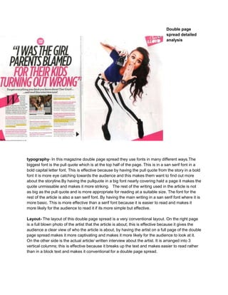
- 1. Double page spread detailed analysis typography- In this magazine double page spread they use fonts in many different ways.The biggest font is the pull quote which is at the top half of the page. This is in a san serif font in a bold capital letter font. This is effective because by having the pull quote from the story in a bold font it is more eye catching towards the audience and this makes them want to find out more about the storyline.By having the pullquote in a big font nearly covering hald a page it makes the quote unmissable and makes it more striking. The rest of the writing used in the article is not as big as the pull quote and is more appropriate for reading at a suitable size. The font for the rest of the article is also a san serif font. By having the main writing in a san serif font where it is more basic. This is more effective than a serif font because it is easier to read and makes it more likely for the audience to read it if its more simple but effective. Layout- The layout of this double page spread is a very conventional layout. On the right page is a full blown photo of the artist that the article is about; this is effective because it gives the audience a clear view of who the article is about, by having the artist on a full page of the double page spread makes it more captivating and makes it more likely for the audience to look at it. On the other side is the actual article/ written interview about the artist. It is arranged into 3 vertical columns; this is effective because it breaks up the text and makes easier to read rather than in a block text and makes it conventional for a double page spread.
- 2. colour- The main colours used in this magazine is a mixture of pink,black and white. The use of the white is used as the background; this is successful because it contrasts with the rest of the colours and makes them stand out more and look more lively and exciting. The black is used for some of the text; this contrasts well with the white background and makes it more bold appealing to the audience more. They also use parts of the double page spread in pink such as some of the pull quote and small parts of the background. This illustrates towards the audience that it is may be aimed more at the female audience rather than the males due to the use of pink giving it more femininity. It also gives the article more visual and striking features so it would make it more interesting. images- There is one main image on this article which is of the artist (Cher Lloyd). It is a long shot of the artist so you can see the full image of her; this is an effective shot type because it shows the specific target audience her whole image and allows them to aspire to her. Although this is a longshot it still shows her facial expressions clearly so it still shows the subject direct. The costume that she wears in this image is a very fun and interesting outfit consisting of striped jeans and crop top. This is effective for the article because it tells the audience what sort of person she is and contrasts with the rest of the colours situated around the image. She is language-The language used is very persuasive for example part of the opening of the article says “read this article now!!”. The use of the word now is a demanding word so by the use of it, makes the reader think it is really interesting so it gives them the urge to want to find out what’s so good about this article.Also the use of the exclamation marks connotes a sense of emergency so it exhibited to the audience that they must read it and that is important. conventions- One of the conventions of the double page spread is the pull quote;this is used in the article by saying “i was the girl parents blamed for their kids turning out wrong”. This is the quote from the interview and is used as the headline; it is considered as conventional because there are normally controversial or shocking. By them being controversial grasps the audiences attention more by shock tactics and makes them want to find out more about it. Another convention which is used in the double page spread is the direct address used through the image where cher lloyd is staring straight towards the person looking at the magazine. This is conventional because they try to achieve an engagement with the audience of the magazine. It also encourages the audience to buy the cover as they have a connection between the artist which is conveyed through eye contact.