2. The celebrity has a direct mode
A banner is used across the top
of address, looking straight into
of the cover to attract the
the camera, personalising the
The magazine breaks the three reader. A personal pronoun, ‘you’,
magazine.
colour rule and uses numerous is used to make it more personal
A burst is used in the centre of font styles to attract a younger to the reader.
the cover to show what the audience.
The masthead is written in a
double page spread ‘exclusive’ is bold font, using capital letters to
all about. It uses a short snippet stand out against the rest of the
of text to engage the reader and typography. It uses a sans serif
make them want to find out font because it is less formal,
more. therefore attracting a younger
audience. The masthead clearly
Colloquial language is used on conveys that the magazine is
the cover to convey that the about Pop music.
magazine is informal and makes it
more personal; this shows that its
A puff is used to quickly give the
target audience is a younger
reader information and attract
generation of teenagers aged
them. This particular one shows
around 13-16. The brackets seem
that as well as talking about less
to ‘speak’ to the reader, again
important things such as boys
personalising the magazine.
and clothes, the magazine
addresses serious issues.
This sell line uses white on
black which is a clever technique This image of Rihanna is placed
used in the magazine industry to at a slant to show quirkiness, the
help information stand out and use of a handwriting font portrays
attract the attention of the that the magazine is quite
reader. informal and the use of an ellipsis
draws the reader in.
There are numerous sell lines
The barcode, price and
across the cover but this one is A menu bar is placed at the bottom of the magazine, typically
date are all written at the
particularly engaging because it this would be found down the side of the cover, so this shows
bottom in smaller font,
uses a question mark. This makes that the magazine goes against convention. It names well
portraying that they are
the reader curious as to what the known celebrities, therefore attracting a wider audience and
less important.
answer is, therefore encourages uses the word ‘plus’ to highlight that there is a lot in the
them to buy the magazine. magazine, subconsciously making the reader feel like they are
getting more for their money.
3. The use of a sans serif
The contents page follows
handwriting font shows that the
the house style used on
magazine is for a more modern,
The information which was the front cover, showing
younger audience. The ellipsis is
included on the front cover of the continuity.
effective because it shows a
magazine is clearly labelled
continuation and that there is
with page numbers; this looks
more information to follow.
visually effective because it is
simple and it highlights the most
important information, which led
the reader to buy the magazine.
The contents of the
magazine is categorised
so the reader can easily
reach the pages they want
The use of a heart rather than the to read the most first.
word ‘love’ conveys the
informality of the magazine and
makes it more relatable to its
target audience. The use of a highlighter makes
the magazine relatable to the
readers because a highlighter is
something they will frequently
use. This particular style looks
casual and relaxed, portraying the
magazine as informal.
Clothes and makeup are also
featured in the magazine, which
instantly puts the readers of the
magazine into a certain social
group. The group which is Images are still used on the
interested in fashion, boys and contents page, which reflects the
most importantly, music (POP main purpose of the magazine
music). This is a typical and keeps continuity by using the
stereotype of girls. same band.
4. The image is quirky and fun, The majority of the double page
portraying that the interview is is covered with a picture of the
laid back and just general same celebrity used on the front
The text written in the corner of
questions about the celebrity. cover; this reflects that the focus
the page sums up in a sentence
This portrays that the double of this issue is Cher Lloyd. The
what the article is about and what
page spread is going to be celebrity is keeping a direct mode
it will be focusing on.
interesting. of address, making it more
personal.
The article is continued onto
the next page due to the fact
that the majority is covered
with an image.
A bordered pull quote is used
to show the most important or
interesting things which the
celebrity has said.
The heading of the article is
written in a much larger font than
the rest of the typography and it
is written in capital letters. This is
to show that the article is focused
on the fact that Cher Lloyd wants The double page spread sticks to
to make her career bigger and a clear colour scheme of purple,
how she is going to do so. pink, white and black. This shows
continuity and doesn’t look too
busy, keeping the focus on the
The questions which are being article itself.
asked are written in a separate
colour to the answers; this looks A banner is used across the
The page numbers are written
visually effective and shows the double page spread with small
clearly at the bottom of the page
clear distinction. snippets of text which tell the
so the readers can find them
audience how famous Cher Lloyd
easily.
is in different sectors.
5. In Conclusion…
After closely analysing the pages of the magazine which I will be needing to produce myself, the
features and conventions which I will need to stick to have become more apparent.
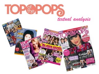
‘Top of the Pops’ has a particular house style which I feel is very effective for the style of
magazine, it is laid back and colourful, but not too busy. It is obviously aimed at girls, due to the
fact that it uses a lot of colours associated with girls and includes articles such as ‘We love boys’.
The magazine targets an audience of ages around 13-16, which is a similar age range as to what
I would like to focus on.
The front cover of ‘Top of the Pops’ is visually effective and aesthetically pleasing. It uses
positive colours which are bright and show connotations of happiness. The conventions of music
magazines are followed quite closely by ‘Top of the Pops’ which I think is very important when
trying to create a successful magazine. The cover features and mentions a lot of well known
celebrities; this will instantly draw the attention of numerous readers. The choice of celebrities is
important because they have to be popular and seen as currently ‘in’ by the target audience.
The contents page has been very helpful in thinking about how I want to design and create my
own because it has a lot of features which I think look good. The use of a handwriting font is
effective because it personalises the magazine and makes it individual to each reader. I like the
idea of putting a smaller image of the cover on the contents page and annotating it because it
looks quirky and connotes the sorts of activities the readers may partake in at school, such as
highlighting, drawing spider diagrams and categorising, therefore I will bear this in mind when
creating my own contents page. Using colloquial language is again something which I feel is
effective because it makes the reader feel at ease and makes the text flow a lot easier,
considering the age of the target audience.
I like the double page spread because it has a good amount of text in proportion to the image.
When reading the magazine, you don’t want there to be too much reading, but there has to be
the right amount otherwise the reader can get bored or feel the article is a waste of time. The
use of the bordered pull quote is good and something which I am considering using in my own
music magazine because it is something that I have come across when looking at a range of
magazines.
Overall, I think that ‘Top of the Pops’ has been a good use of inspiration and has made me start
to think of ideas for my own magazine.