SlideShare a Scribd company logo
1 of 4
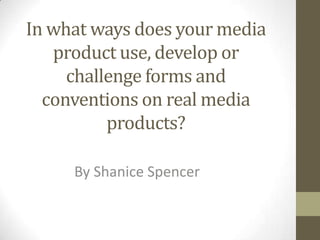
In what ways does your media
   product use, develop or
     challenge forms and
  conventions on real media
          products?

     By Shanice Spencer
The main image is a female and can
attract both genders. The main
image is very powerful with direct
                                                                  MY FRONT COVER
                                           My main image challenges the conventions of One word short and sweet masthead in block
contact therefore directly
                                           a Hip-hop magazine as stereotypically a male capital letters. My masthead over laps the main
connecting with the audience. I
                                           artist should be featured on the front cover. image as it needs to be easily read from a
ensured she wore simple clothing
                                                                                         distance. It’s grey so it don’t conflict with the
with gentle makeup with her hair        Cover lines attracting the                       image as black was too harsh. It’s the largest text
over her eye to give a sexual yet       reader as it shows what the                      as it’s the first thing that should be read on a
powerful persona hitting the            magazine has to offer.                           magazine.
conventions of most female hip-hop
artists. Her eye make up and lips are                                                              Strapline of magazine has a use of
very striking ensuring the attention                                                               rhetorical questions to immediately
is purely on her.                                                                                  engage with the audience. Also the
This cover line gives an insight                                                                   change of colour on the text is used
into what's inside, it also gives                                                                  to emphasise certain points such as
reference to who the artist is                                                                     ‘untold story’ which attracts the
on the front cover. It’s the                                                                       reader as its not been heard before.
second largest font size on the                                                                     Puff used to attract reader as it’s a
cover so its aim is to stand out                                                                    give- away so people are more
as people would know who                                                                            inclined to buy my magazine for
she is.                                                                                             freebies.
Cover lines alternate in colour so
each one is noticed. Its also bigger                                                                Artists featured inside magazine
than the text on the right as                                                                       used to interest reader. The names
people normally read from left to                                                                   of the artists alternate from pink to
right so this side of text will be                                                                  white so each artist can individually
read first. Gives information on                                                                    stand out. Also the black grow
the story's inside and initially                                                                    around the texts adds further
attract the readers interests.                                                                      emphasis to the artists to draw the
                                                                                                    reader in.
The bar code is used for purchasing
purposes. Also this offers the price,                                                              This is a scan code now frequently used
issue date and website link . Allows                                                               with new technology such as android
the reader to see if the magazines                                                                 and smart phones. When scanned can
old or new and be able to access                                                                   lead to a website or enables a person to
further information through the link.                                                              purchase the magazine.
MY CONTENTS PAGE
The title is the biggest type
face and is also the same
font and colour as my front
cover. This is also on the left             The volume number is
hand side as people tend to                 featured on my contents
read from left to right so it’s             page as I saw it featured in
the first thing they will see.              other hip-hop magazines
                                            also.
I divided the contents into two
categories, features and                    I used a very plain
fashion as I saw it was done                background which
on current hip hop magazines.               contrasted from a lighter
I put the headings in italics so            shade of grey to darker to
they stood out on the page. I               emphasise my main image.
also stuck to the colour                    Also to emphasise the
scheme of grey and the cover                change in meaning from the
lines are bold attracting the               natural look of my front
attention to them.                          cover main image, to the
Artist names are in capital                 seductive look of my
letters so people can see                   contents main image.
which page they'd actually
                                            I went out of my way to use
like to read depending
                                            small print as shown on many
who's featured in it.
                                            magazines including hip-hop
I only used one image for my                magazines. Allowing the
contents page as I felt it was              reader to know who did the
very strong and wanted most                 props and who was the
of my attention to fall on it.              fashion director in terms of
Her posture and the use of                  the main image.
props was to attract the
                                              I also did further small
reader, mainly to the
                                              print giving the reader
powerful legs to connote
                                              further information on
female dominance
                                              the main image including
challenging the conventions
                                              who the artist is, the
of a hip-hop magazine as it
                                              photographer, also when
usually focuses on patriarchy.
                                              and where it was taken.
MY DOUBLE PAGE SPREAD
   I had a main image of my model powerful doing a conventional                      The text colour
   female pose shown in most hip-hop magazines. Her stance is very                   alternates from black
   powerful and also influences the outfit choice of the black clothes               to burgundy. The black
   signifying power. One again challenging the forms and conventions                 connoting power and
   of a real hip-hop product as men are usually portrayed as                         the burgundy coming
   powerful.                                                                         through the outfit
                                                                                     choice.


I have several
small images of
the main model
moving, I
choose to use
action shots as it
shows that she's
enjoying herself
linking itself
with the quote. I
also think there
very effective
                                                                                  I grabbed a quote from
and would
                                                                                  the interview, as I
attract the
                                                                                  thought it would be the
reader by the
                                                                                  most attractive to the
layout.                    I made the text of the interview black and burgundy.   audience. As people are
                           I split the text into three clear columns to make it   fuelled by celebrity's
                           easier to read. I didn’t ask too many questions as     love affairs and
                           readers tend to get bored easily, so I asked enough    controversial topics
                           for them to have an insight into her life.             shown from the term ‘so
                                                                                  what’.

More Related Content

What's hot

Music magazine evaluation
Music magazine evaluationMusic magazine evaluation
Music magazine evaluationCoriClarkson
 
Music magazine evaluation
Music magazine evaluationMusic magazine evaluation
Music magazine evaluationCoriClarkson
 
Magazine contents page2
Magazine contents page2Magazine contents page2
Magazine contents page2UmaiyaKhawaja
 
As media foundation evalutation
As media foundation evalutationAs media foundation evalutation
As media foundation evalutationlaurahill15
 
Front cover analyses
Front cover analysesFront cover analyses
Front cover analysesAngelGordon
 
Magazine cover analysis main coursework
Magazine cover analysis   main courseworkMagazine cover analysis   main coursework
Magazine cover analysis main courseworksarah123ashcroft
 
DPS commentary
DPS commentaryDPS commentary
DPS commentaryErosV
 
Movie Magazine Cover & Poster analysis
Movie Magazine Cover & Poster analysis Movie Magazine Cover & Poster analysis
Movie Magazine Cover & Poster analysis Naomi Collins
 
Front Cover Research
Front Cover ResearchFront Cover Research
Front Cover Researchjessheap
 
Evaluation
EvaluationEvaluation
Evaluationdriss123
 
the making of my front cover
the making of my front coverthe making of my front cover
the making of my front coverErosV
 
Codes and conventions presentation
Codes and conventions presentationCodes and conventions presentation
Codes and conventions presentationdmayce
 
Front cover Plan
Front cover PlanFront cover Plan
Front cover PlanErosV
 

What's hot (18)

Music magazine evaluation
Music magazine evaluationMusic magazine evaluation
Music magazine evaluation
 
Music magazine evaluation
Music magazine evaluationMusic magazine evaluation
Music magazine evaluation
 
Magazine contents page2
Magazine contents page2Magazine contents page2
Magazine contents page2
 
As media foundation evalutation
As media foundation evalutationAs media foundation evalutation
As media foundation evalutation
 
Presentation 2
Presentation 2Presentation 2
Presentation 2
 
Front cover analyses
Front cover analysesFront cover analyses
Front cover analyses
 
Magazine cover analysis main coursework
Magazine cover analysis   main courseworkMagazine cover analysis   main coursework
Magazine cover analysis main coursework
 
Question 1
Question 1Question 1
Question 1
 
Conventions
ConventionsConventions
Conventions
 
DPS commentary
DPS commentaryDPS commentary
DPS commentary
 
Movie Magazine Cover & Poster analysis
Movie Magazine Cover & Poster analysis Movie Magazine Cover & Poster analysis
Movie Magazine Cover & Poster analysis
 
Front Cover Research
Front Cover ResearchFront Cover Research
Front Cover Research
 
Evaluation
EvaluationEvaluation
Evaluation
 
Media Evaluation
Media EvaluationMedia Evaluation
Media Evaluation
 
Evaluation
EvaluationEvaluation
Evaluation
 
the making of my front cover
the making of my front coverthe making of my front cover
the making of my front cover
 
Codes and conventions presentation
Codes and conventions presentationCodes and conventions presentation
Codes and conventions presentation
 
Front cover Plan
Front cover PlanFront cover Plan
Front cover Plan
 

Similar to Evaluation Q1

Analysis of my Final Products
Analysis of my Final ProductsAnalysis of my Final Products
Analysis of my Final Productskpnpensby
 
Statement of intent front page
Statement of intent  front pageStatement of intent  front page
Statement of intent front pageoliviaolives
 
Statement of intent front page
Statement of intent  front pageStatement of intent  front page
Statement of intent front pageoliviaolives
 
Evaluation powerpoint
Evaluation powerpointEvaluation powerpoint
Evaluation powerpointChloe Jones
 
Magazine evaluation
Magazine evaluationMagazine evaluation
Magazine evaluationwesternrose
 
Evaluation question 4
Evaluation  question 4Evaluation  question 4
Evaluation question 4CoriClarkson
 
Front cover analysis
Front cover analysisFront cover analysis
Front cover analysisTwist3dd
 
Front page statement of intent
Front page statement of intentFront page statement of intent
Front page statement of intentoliviaolives
 
Statement of intent front page
Statement of intent  front pageStatement of intent  front page
Statement of intent front pageoliviaolives
 
Double Page Spread Analysis
Double Page Spread AnalysisDouble Page Spread Analysis
Double Page Spread Analysisjohanna-asmedia
 
Evaluation-Q5
Evaluation-Q5Evaluation-Q5
Evaluation-Q5giran_11
 

Similar to Evaluation Q1 (20)

Conventions
ConventionsConventions
Conventions
 
Analysis of my Final Products
Analysis of my Final ProductsAnalysis of my Final Products
Analysis of my Final Products
 
Front Cover Analysis
Front Cover AnalysisFront Cover Analysis
Front Cover Analysis
 
Evaluation
EvaluationEvaluation
Evaluation
 
Statement of intent front page
Statement of intent  front pageStatement of intent  front page
Statement of intent front page
 
Statement of intent front page
Statement of intent  front pageStatement of intent  front page
Statement of intent front page
 
Q1
Q1Q1
Q1
 
Evaluation powerpoint
Evaluation powerpointEvaluation powerpoint
Evaluation powerpoint
 
Magazine evaluation
Magazine evaluationMagazine evaluation
Magazine evaluation
 
Evaluation question 4
Evaluation  question 4Evaluation  question 4
Evaluation question 4
 
Contents Page Analysis
Contents Page AnalysisContents Page Analysis
Contents Page Analysis
 
Front cover analysis
Front cover analysisFront cover analysis
Front cover analysis
 
Front page statement of intent
Front page statement of intentFront page statement of intent
Front page statement of intent
 
Statement of intent front page
Statement of intent  front pageStatement of intent  front page
Statement of intent front page
 
Double Page Spread Analysis
Double Page Spread AnalysisDouble Page Spread Analysis
Double Page Spread Analysis
 
Contents
ContentsContents
Contents
 
Contents
ContentsContents
Contents
 
Contents
ContentsContents
Contents
 
Evaluation-Q5
Evaluation-Q5Evaluation-Q5
Evaluation-Q5
 
Evaluation
EvaluationEvaluation
Evaluation
 

Evaluation Q1

  • 1. In what ways does your media product use, develop or challenge forms and conventions on real media products? By Shanice Spencer
  • 2. The main image is a female and can attract both genders. The main image is very powerful with direct MY FRONT COVER My main image challenges the conventions of One word short and sweet masthead in block contact therefore directly a Hip-hop magazine as stereotypically a male capital letters. My masthead over laps the main connecting with the audience. I artist should be featured on the front cover. image as it needs to be easily read from a ensured she wore simple clothing distance. It’s grey so it don’t conflict with the with gentle makeup with her hair Cover lines attracting the image as black was too harsh. It’s the largest text over her eye to give a sexual yet reader as it shows what the as it’s the first thing that should be read on a powerful persona hitting the magazine has to offer. magazine. conventions of most female hip-hop artists. Her eye make up and lips are Strapline of magazine has a use of very striking ensuring the attention rhetorical questions to immediately is purely on her. engage with the audience. Also the This cover line gives an insight change of colour on the text is used into what's inside, it also gives to emphasise certain points such as reference to who the artist is ‘untold story’ which attracts the on the front cover. It’s the reader as its not been heard before. second largest font size on the Puff used to attract reader as it’s a cover so its aim is to stand out give- away so people are more as people would know who inclined to buy my magazine for she is. freebies. Cover lines alternate in colour so each one is noticed. Its also bigger Artists featured inside magazine than the text on the right as used to interest reader. The names people normally read from left to of the artists alternate from pink to right so this side of text will be white so each artist can individually read first. Gives information on stand out. Also the black grow the story's inside and initially around the texts adds further attract the readers interests. emphasis to the artists to draw the reader in. The bar code is used for purchasing purposes. Also this offers the price, This is a scan code now frequently used issue date and website link . Allows with new technology such as android the reader to see if the magazines and smart phones. When scanned can old or new and be able to access lead to a website or enables a person to further information through the link. purchase the magazine.
  • 3. MY CONTENTS PAGE The title is the biggest type face and is also the same font and colour as my front cover. This is also on the left The volume number is hand side as people tend to featured on my contents read from left to right so it’s page as I saw it featured in the first thing they will see. other hip-hop magazines also. I divided the contents into two categories, features and I used a very plain fashion as I saw it was done background which on current hip hop magazines. contrasted from a lighter I put the headings in italics so shade of grey to darker to they stood out on the page. I emphasise my main image. also stuck to the colour Also to emphasise the scheme of grey and the cover change in meaning from the lines are bold attracting the natural look of my front attention to them. cover main image, to the Artist names are in capital seductive look of my letters so people can see contents main image. which page they'd actually I went out of my way to use like to read depending small print as shown on many who's featured in it. magazines including hip-hop I only used one image for my magazines. Allowing the contents page as I felt it was reader to know who did the very strong and wanted most props and who was the of my attention to fall on it. fashion director in terms of Her posture and the use of the main image. props was to attract the I also did further small reader, mainly to the print giving the reader powerful legs to connote further information on female dominance the main image including challenging the conventions who the artist is, the of a hip-hop magazine as it photographer, also when usually focuses on patriarchy. and where it was taken.
  • 4. MY DOUBLE PAGE SPREAD I had a main image of my model powerful doing a conventional The text colour female pose shown in most hip-hop magazines. Her stance is very alternates from black powerful and also influences the outfit choice of the black clothes to burgundy. The black signifying power. One again challenging the forms and conventions connoting power and of a real hip-hop product as men are usually portrayed as the burgundy coming powerful. through the outfit choice. I have several small images of the main model moving, I choose to use action shots as it shows that she's enjoying herself linking itself with the quote. I also think there very effective I grabbed a quote from and would the interview, as I attract the thought it would be the reader by the most attractive to the layout. I made the text of the interview black and burgundy. audience. As people are I split the text into three clear columns to make it fuelled by celebrity's easier to read. I didn’t ask too many questions as love affairs and readers tend to get bored easily, so I asked enough controversial topics for them to have an insight into her life. shown from the term ‘so what’.