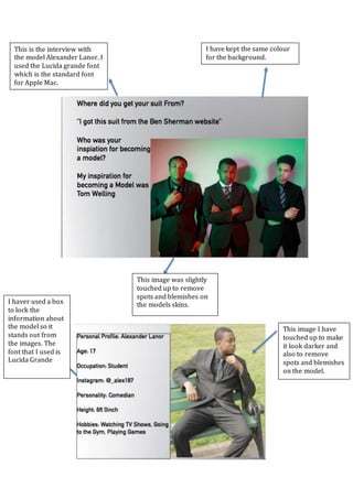
1. I haver used a box
to lock the
information about
the model so it
stands out from
the images. The
font that I used is
Lucida Grande
This is the interview with
the model Alexander Lanor. I
used the Lucida grande font
which is the standard font
for Apple Mac.
I have kept the same colour
for the background.
This image was slightly
touched up to remove
spots and blemishes on
the models skins.
This image I have
touched up to make
it look darker and
also to remove
spots and blemishes
on the model.
2. The font that I used in this magazine is
called Beyond the Mountains and other
such as cover lines and sub-headers. I feel
like this font looks stylish.
This is the same
colour scheme that
is used throughout
the whole magazine
with the white
turning grey
background and the
ret is black and
white which makes
them stand out
some more.
For the price I
used a standard
font with a bar
code that I found
on the internet.
On this image I have taken out the
background to make the image suit
the page better as it didn’t mix well
with the background that I have
chosen.
3. I chose these
images for the
magazine as it
shows off the
model more in
some other shots
I used the Beyond the
mountains font to
make it look stylish.