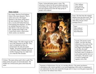
1. Genre: Action/adventure genre is clear. The
adventure is shown by the exotic plants and trees
surrounding the image and the action is shown by
the man running away from the large group of
people with weapons.
Title: Indiana
Jones and the
Kingdom of the
Crystal Skull
Poster Analysis
Key image: Harrison Ford (Indiana
Jones) is the main character. This is
easily seen as he is the largest
character in the frame which draws
the most attention to him. There is
also a second, full bodied Harrison
Ford running from attackers. As there
are multiple Harrison Fords, it is
clear that he is the main part of the
film. Another main image is the
Crystal Skull which is dead centre
which catches our attention.
Other images: The other images are the
rest of the characters in the film. They
aren’t as important so they are
positioned to the side and scaled
smaller. The group of people running at
a full body image of Indiana Jones are
another image giving very slight clues
as to what the film includes.
Colours: The main colour used in this is gold. This
helps portray the genre of action/adventure. The
borders are a forest/exotic green which does the
same.
Fonts: The font from the original
Indiana Jones has been used. This
is for parents that have seen the
older films and get a brief
nostalgia from it.
Stars:
Shia LaBoeuf
Harrison Ford
Kate Blanchett
Layout: The layout is quite
simple. You have the main
characters in the centre of the
image, Indiana Jones being
the largest as the biggest star
in the film, the main
prop/object is dead centre of
the frame, there is a border of
exotic plants and the title is at
the bottom. The poster is just
a crowd of images put
together with a title.
Summary of effectiveness: For me, it is not that effective. The poster just throws
information at the viewer and there is too much happening in the scene to comprehend. I
can understand why they did created this though and it is easy to see the genre (especially
if you know the Indiana Jones films).