👙 Kolkata Call Girls Sonagachi 💫💫7001035870 Model escorts Service
Analysis of film posters
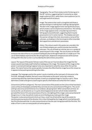
1. Analysis of film poster
Typography:The serif fontrelatestothe filmbeingsetin
the 20th
century,suggestingthatitisaimedat an older
target audience (25+),ratherthana teenaudience (asitis
not brightandfull of colour).
Image:The camera shot usedisa longshotandshowsa
womansittingona rockingchair cradling a decayingdoll.
The doll inthe image appearstobe staringdirectlyatyou,
whichcreatesa sense of paranoiaand distress.The setting
of the image appearstobe a moulderingroomthatis
fallingapartaroundthe doll,suggestingthatitmaybe
possessedorevil insome manner. The shadow castover
the womansittinginthe chair alsocreatesa sense of the
unknown,asshadowsinthe horror genre oftenresemble
dark apparitionsanddemonicpossession.
Colour:The coloursusedinthisposterare verydark,the
use of blackand greyare usedtoconnote fearand the
unknown.The use of blackcan also be seenasa symbol of
potential grief inthisimage.The use of colouronthe doll
enhancesthe ideaof fearas itis predominantlygreydue tothe agedmaterialsitismade up of.The
use of darkshadowsrepresentsthe ideaof oppression,depressionandpossessionof the woman
sittingwithinthe chairasshe is surrounded bythe dark entitiesaroundher.
Layout:The layoutof the posterfollowsroute of the eye asit hastextabove the image that the
viewerwouldmostlikelyreadfirstbefore lookingoverthe image.The locationof the image onthe
posteriscentralisedmakingitappeartobe veryimportantto whatthe story of the filmwill be
about.The lackof textonthe postergreatlyincreasesthe effectthatthe image hasonthe vieweras
it appearsto be pushingeverythingtothe sides.
Language:The language used onthe posterisquite simplisticasthe mainpart of relevance isthe
filmtitle.Althoughsimplistic,the textisveryinformative asthe word‘conjuring’relatesto
summoningadevil by supernatural power,aswell asusingblackmagicto conjure a spirit.These
definitionsrelate tothe genre aswell asgive specificinformationastowhat the filmisabout.
Conventions(of formandgenre): The mainconventionsof the posterare the coloursthat have been
used;as theyare black/greyandwhat theyconnote are veryconventional of the genre. The use of
settingisalsoveryconventional asitisa rundown,decayingroom.Otherconventionsof mise-en-
scene are the use of costume as it isquite oldandappearsto be torn whichrelatestoboththe
periodof the horror filmandconventionsof horror,the lightingof the image isalsoconventional of
the genre as it islow-keywhichcreatesaneerie feelingasyoulookuponthe image.
The posteris alsoconventional toformasit hasa small line of textatthe top of the posterto
mentionpreviousworksof the director;thisisthenfollowedbythe image whichisjustbelow with
the filmtitle beneaththat.Itisalsoconventional asithasthe cast listingsbeneaththe filmtitle.This
orderof formis seenon manypostersof variousgenres.
2. Analysis of film poster
Typography:the serif fontsonthisposterrelate tofilmbeingset
arounda dark andominousstory,itdoes thisthroughthe fontstyle.
The style of fontappearsto be brokenandfadedwhichagainrelates
to the filmas itis about‘the possession’.The style of fontalso
suggeststhatthe filmisaimedat an olderaudience.
Image:the image shownonthe posteris veryconventionalforhorror
filmsasit showsa keyplotwithoutrevealingeverything.The imageis
a close up of a youngwomanwithherheadheldbackas a fleshtorn;
greyhand pushesoutof her mouthand dragson her face inan
attemptto escape.The costume she iswearingappearstobe a gown
that patientswouldwearineitherhospital orpsychiatrichospital.
The lightingof the image isverylow-keywhichsuggeststhatthe film
will have adark, eerie feeltoitwhichisconventional of the horror
genre.
Colour:the colourof the posterrelatestothe conventionsof the
horror genre.The backgroundof the image isverygrey andthe
foregroundisalsoquite dark,these relate tothe darknessand
obscurityof the worldof possession.The use of darkcoloursinthe
posteralsohelpsportraya sense of fearwhichishighlyconventional
of the horror genre.
Layout:the layoutof the posterisconventional toformof manyhorror posters.The posterfollows
route of the eye as the textat the top wouldbe readfirstand thenthe eyeswouldgoacrossthe
image whichhasbeenmade verylarge andcentral on the poster,by makingthe image central on
the posterwhat ishappeningismade muchmore important.Followingthe image isthe title of the
filmwhichisconventionallylocatedbeneaththe image andonthe lowerhalf of the page.The title is
thenfollowedbythe castinglist.
Language:the language usedonthe posteris veryhauntingwhichfollowsconventionsof horror
posters.Byincludingtextsuchas‘basedona true story’createsa much largerfeelingof fearasit is
basedupontrue eventsandtherefore the realismof the filmismuchgreater.The title of the filmis
alsoveryunnervingas‘the possession’connotes the ideaof horrorand evil andprovidesthe
audience withaclearideaof what the filmisabout.
Conventions:the posterisveryconventional toformaseverythingfollowsthe stereotypical lookof a
filmposter.The posterisalsoveryconventionalto the genre asthe coloursusedare dark and
ominous.The image usedonthe posterisveryhorrificasit isa handtryingto pull outof a woman’s
mouthwhichissomethingverysupernatural anddemonic.Othermise-en-scene elementsare also
conventional to genre suchasthe use of lightinginthe image,byusinglow-keylightinganeerie
feelingiscreatedwhichisassociatedwithhorrorfilmsi.e.‘the shining’.The shottype isalso
conventional of the horrorgenre asthe close-updrawsfocustothe maincharacter of the filmand
showsclearlywhatishappeningtoher.
3. Analysis of film poster
Typography:the use of sans serif textacrossa
lotof the cover(masthead,coverstoryetc.)
suggeststhatthe magazine isaimedat an older
audience.The use of serif fontforthe pull
quote howeversuggeststhatthe filmthatis
beingadvertisedonthe coverhas a much
darkerand sinisterfeeltoit,as itis a quote
fromthe film.The use of colouron the fonts
alsoconnotesa sinisterfeelingasthe
backgroundisblack,whichconnotes evil and
darknesswhilstthe redconnoteslust(most
likelyforkilling) andpower.The connotations
are conventionalof the horrorgenre as the
antagonistsinthe filmsoftensuggestthese
feelings.
Image:the image shownonthe magazine
coveris very conventionalof the horrorgenre.
The image showsa frenziedmanbreaking
througha door inwhat appearsto be an
attemptto getto someone/something.The use
of a close upincreasesthe feelingof fearasthe
man’sface clearlyshowsthathe will notstop
until he has finishedwhathasbeenstarted.The image thathasbeenusedishighlyconventional of
the horror genre forthese reasons.
Colour:the use of colouron the magazine coverhelptostimulate fear,thisisbecause of the use of a
blackbackgroundwhichconnotesthe conventionsof horrorsuchas darknessandevil whilstthe red
textconnotespowerandblood.The colourof the image on the coveris quite fadedwhichrelatesto
the age of the filmandagainthe fact that the target audience isanoldergeneration.The colours
usedinthe image are predominantlydarki.e.greyandblackwhichare conventional colourstobe
seeninhorror.
Layout:the layoutof the magazine isveryconventional,itfollowsroute of the eye whichisused
conventionallyonmagazine covers.The layoutof textisalsoveryconventionalasitdoesn’tcover
the image whichhasbeencentralisedonthe covershowingitsimportance tothe storieswithin.The
coverstory isalsolocatedto the bottomleftof the image showingthatthe image isof great
importance aseverythingonthe coversavoidscoveringamajorityof the image.The use of a pull
quote isplacedina way that offersintrigue asitisplacedtothe lefthandside of the man’sface.
Language:the use of language onthe magazine coverisveryevocative,forexample the language
that isusedfor the pull quote asit says‘I’mjust gonnabashyour brainsin’whichisconventional
speechfromthe horror genre of films.The title of the filmisalsoquite unnervingas‘the shining’
normallyreferstobeingexceptional indoingsomethingforthe goodof others,whichinthe case of
thisfilmisthe directopposite.The use of language isconventional forthe horrorgenre.
Conventions:the magazine coverishighlyconventional of bothformandgenre.The conventionsto
formfollowthe ideal lookof amagazine,forexample the mastheadisatthe top of the cover,cover
storyaround the centre and mainimage inthe centre of the cover.However,manymagazine covers
conventionallyhave muchmore textthanwhatcan be seenonthiscover.The magazine coverisalso
conventional of the horrorgenre asit followsthe conventional suchasblackand reds.The image is
4. Analysis of film poster
alsohighlyconventional of the genre asitmakesgooduse of mise-en-scene andbydoingsothe
feelingof fearisheightenedgreatly.
Typography:the style of textonthe cover ispredominantly
sans serif relatingtothe audience of the magazine whichisan
olderaudience.The use of colouronthe fontsis conventional
for advertisingafilmof the horrorgenre.The use of black,
white andredwhenusedtogetherconnote the ideasof
power,dominance anddarkness.
Image:the image on the magazine ishighlyconventional of
the horror genre as itshowsa an surroundedbyshadow
lookingoutontothe worldwithredeyes,mostlikelylooking
for hisnextvictimasHannibal isknownforkilling.The use of
mise-en-scene inthe image isalsohighlyconventionalof the
horror genre as the use of low-keylightingcreatesafeelingof
oppression.The make-upinthe image isalsoconventional of
the genre as it showsHannibal tobe darkerand by usingred
contacts he alsoappearsdemonicallycrazed.
Colour:the use of colouron the magazine coverisvery
conventional of the genre asthe coloursused,suchas black,
connote deathandsin.The colourblackis alsocast across Hannibal’sface Ithe form of a shadow
whichshowshimto be a man of mysteryandinterest.Othercoloursusedonthe coversuchas red
helptoconnote ideassuchas bloodshedandpowerwhichare alsoconventional andstereotypical
ideasof antagonistsinhorrorfilms.
Layout:the layoutof the magazine isveryconventional asitfollowsroute of the eye andthe main
image onthe coverisnot obscuredbytext.The size of the image isalsoconventional formagazine
coversas it coversa large portionof the screenandisveryoverpoweringwhichisconventional of
the genre.
Language:the language usedonthe magazine coverisconventional toformandgenre as itmainly
relatestothe mainstory withinwhilstshowingfocustothe story onthe cover.The language isalso
quite discomfortingdue totextsuchas ‘what’scooking?’asitcreatesan unnervingfeeling,by
relatingtothe story of Hannibal Lectorwho wouldnotonlymurderpeople butalsocookandthen
eat partsof hisvictims’bodies.
Conventions:the magazine coverisconventional tobothformandgenre as ithas the main parts
that create a magazine coversuch as the masthead,coverstoryand main image.The magazine
coveralsousesroute of the eye to itsadvantage as itshowsfocuson the image.It isalso
conventional togenre due tothe coloursthathave beenusedandthe use of mise-en-scene create
an eerie feelingasitfeelslike the antagonistisstaringatyou withhisredeye whilsthisbodyis
shroudedbyshadow.