Call Girls Electronic City Just Call 👗 7737669865 👗 Top Class Call Girl Servi...
Contents analysis 2
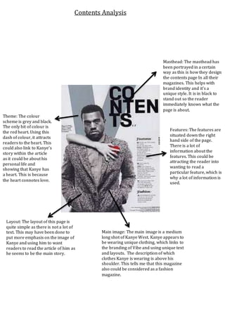
1. Masthead: The masthead has
been portrayed in a certain
way as this is how they design
the contents page In all their
magazines. This helps with
brand identity and it’s a
unique style. It is in black to
stand out so the reader
immediately knows what the
page is about.
Features: The features are
situated down the right
hand side of the page.
There is a lot of
information about the
features. This could be
attracting the reader into
wanting to read a
particular feature, which is
why a lot of information is
used.
Main image: The main image is a medium
long shot of Kanye West. Kanye appears to
be wearing unique clothing, which links to
the branding of Vibe and using unique text
and layouts. The description of which
clothes Kanye is wearing is above his
shoulder. This tells me that this magazine
also could be considered as a fashion
magazine.
Theme: The colour
scheme is grey and black.
The only bit of colour is
the red heart. Using this
dash of colour, it attracts
readers to the heart. This
could also link to Kanye’s
story within the article
as it could be about his
personal life and
showing that Kanye has
a heart. This is because
the heart connotes love.
Layout: The layout of this page is
quite simple as there is not a lot of
text. This may have been done to
put more emphasis on the image of
Kanye and using him to want
readers to read the article of him as
he seems to be the main story.
Contents Analysis