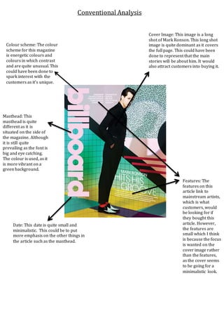
1. Date: This date is quite small and
minimalistic. This could be to put
more emphasis on the other things in
the article such as the masthead.
Cover Image: This image is a long
shot of Mark Ronson. This long shot
image is quite dominant as it covers
the full page. This could have been
done to represent that the main
stories will be about him. It would
also attract customers into buying it.
Masthead: This
masthead is quite
different as it is
situated on the side of
the magazine. Although
it is still quite
prevailing as the font is
big and eye catching.
The colour is used, as it
is more vibrant on a
green background.
Features: The
features on this
article link to
mainstream artists,
which is what
customers, would
be looking for if
they bought this
article. However,
the features are
small which I think
is because the focus
is wanted on the
cover image rather
than the features,
as the cover seems
to be going for a
minimalistic look.
Conventional Analysis
Colour scheme: The colour
scheme for this magazine
is energetic colours and
colours in which contrast
and are quite unusual. This
could have been done to
spark interest with the
customers as it’s unique.