
Recommended
More Related Content
What's hot
What's hot (20)
Viewers also liked
Viewers also liked (19)
Similar to Jazz and Hip Hop Magazine Covers Compared
Similar to Jazz and Hip Hop Magazine Covers Compared (20)
More from trishamedia
Recently uploaded
Recently uploaded (20)
Jazz and Hip Hop Magazine Covers Compared
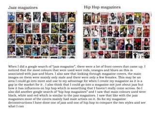
- 1. When I did a google search of “jazz magazine”, there were a lot of front covers that came up. I noticed that the most colours that were used were reds, oranges and blues as this is associated with jazz and blues. I also saw that looking through magazine covers, the main images on them were mainly only male and there were only a few females. This may be an area I could go into more and use to my advantage for when I create my magazine as it is a gap in the market for it . I also think that I could go into a magazine not just about jazz but how it has influences on hip hop which is something that I haven't really come across. So I also did another google search of “hip hop magazines” and I saw that main colours used were black, white and red which is similar to the jazz magazines. I saw that like with the jazz magazines most of the covers mainly had male artists on it. So for my magazine deconstructions I have done one of jazz and one of hip hop to compare the two styles and see what I can Jazz magazines Hip Hop magazines
- 2. Masthead: the fact that the masthead has been cut shows the status of the magazine and the fact that the audience would know that it is called “ downbeat”. It shows that the magazine doesn't want much attention to the name of the magazine as it wants the reader to focus more on the image on the magazine. Anchor: this is the main heading on the front covers of magazines that relates to the main image. In this case the anchor is “Freddie Hubbard” as he is the main image on the cover and it is used to show fans of him that he is in the magazine. It also lets people know who he is if they don’t already. Puff words: these are words that are used to entice the reader to get the magazine and keep n reading. Things like “complete results inside” make the reader want to see more of what the magazine has to offer. Colour scheme: the colour that has been used in the magazine consists of a deep red that is almost like mahogany. This is used to show sophistication as it is a classy colour and jazz is also associated as a mature music type. The yellow green colour that has been used is because the it is the colour to the main image’s blazer and tie so it all blends well together. Angle of gaze: the angles of gaze that has been used for the main image on this cover is directly forward. This is because it makes the reader enticed as it feels as if he is looking direct to the reader which makes then want to pick it up and read it more. And the overall image is also relevant to the magazine as the main artist has a trumpet in his hands which makes it obvious to the reader that it is jazz magazine Fonts : on this cover there too many fonts used and all the different fonts that were used are quite similar in the way that they are elegant and sophisticated reflecting the genre of music which is jazz. Were there are different fonts for example where it says “redefining” it shows the emphasise put on that particular word
- 3. Masthead: on this magazine cover the colour of the masthead has been matched with what Kayne West is wearing. The masthead has also been cut out by the main image which shows that the magazine wants the reader to focus on the main image of the artist more rather tan the name of the magazine. It also shows how well known the magazine as readers still know it is called “vibe” Anchor: the anchor is the main headline which connects to the main image of the magazine. And in this case it is where it say “Kayne West” and this is used so people know who the person on the cover is if they don’t already. Fonts : the fonts that have been used on this cover are very simple and easy to read. They are also quite bold and stern which is matches with hip hop music as that is what you think f when you think of hip hop. There haven't been many fonts used but the ones the have been used are fairly similar which makes the magazine look sleek and things that are more important like “Kanye West” have been enlarged and tilted to stand out to the reader. Puff words: puff words are used to make the magazine seem interesting and appealing to the readers. Words like “exclusive” and “greatest” have been used to make the reader think that the magazine is different from others out there and so they will more likely to read it. Colour scheme: when looking at other hip hop and vibe magazines in particular the colours that have been used are different as the main colour the are usually used are red, black and white. But the colours that have been used are very bright and stand out which would make it easily seen on a shelf. There are two feature colours of pink and blue. The blue has been used as the Kayne West is wearing a jacket with a blue collar and the pink complements it. Angle of gaze: the angle of gaze of the main image is straight forward and it is a head and shoulders shot. The angle of gaze is like this so that it feels like he is looking towards the reader which engages them to pick the magazine up and keep on reading.