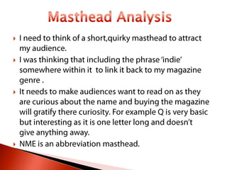
3. I choose the name indiecisive as the name is a
play on words and means it uses a different
technique compared to other magazines. I did
not want to create an abbreviation masthead but
a masthead of two parts to play around with for
my front cover ,for example Rolling Stones.
Indie refers to the music of genre I have chosen
to focus on. I wanted and felt I needed to include
it somewhere in my masthead to let my readers
know the content of the magazine and attract my
target audience. I think that my magazine name
is quirky but will sell well because of that factor.
4. I used the break of the word to my advantage. I
bevelled the Indie and used a thin black outer
glow to make it stand out . I got the dark outer
glow convention from ‘NME’s masthead. For the
‘cisive’ part I used lower case letters to make the
indie part eye catching but a lighter outer glow
to not make it blend into dark blue of the indie.
Blue was one on the conventions I needed to use
as it was a popular colour from my questionnaire
results. Blue is a colour commonly used in
magazines but I do not really like it and will not
be using it as a colour of my masthead in mine.
Bevelled will not suit my other ideas for my front
cover and will contrast with the sky line.
5. For this masthead I used deep red and black font.
Indie once again is in capitals highlighting the
fact it is an important factor in the magazine. It is
in Arial to keep it plain and simple but still
effective. I added a shadow to it which is
positioned going towards right of the text .
Cisive is positioned on the lower right of indie
overlapping the I and E slightly. A convention
used in music magazines like Rolling stones and
Kerrang is the main artist image overlapping the
masthead , instead I have overlapped the
masthead with each other.
6. I have used a deep red colour font for indie as
red is one of the conventions I needed to use.
Once again I used a small outer glow and
tracking of -30 to bring letters closer together.
For this one I rotated ‘cisive’ 90 degrees anti
clockwise so it fits next to the indie. I made it
the same height to fit along the length of the e in
‘indie’ by setting a smaller tracking. It is in lower
case once again showing it is less important. This
masthead is uses common conventions by using
a black outer glow to highlight the main words. I
like the rotation of cisive as it looks different and
might attract readers if they like variety.
7. My Chosen Masthead
For this masthead I used capitals for the ‘cisive’ part
in the title. I used red to compliment it and I used a -
50 tracking to make sure that it fit perfectly
underneath the indie to create a more statement
masthead . I gave a small outer glow to both the indie
and ‘cisive’ to help stand out on the on the front
cover. Indie is black and in lower case letters with
tracking of -25 to bring the letters closer together so
the title is compact . I really like this masthead as I
think it looks professional as it uses quite basic fonts
(Arial for both ) but will hopefully attract the readers
eye on a shelf. It uses common masthead colours and
popular audience colours .
8. A convention that is sometimes used for
music magazine is a slogan . Slogans are
memorable and catchy for an audience.
I was thinking of incorporating my masthead
in my slogan as the best slogans have the
name included . One idea was :
Indecisive ? Choose indiecisive !