BDSM⚡Call Girls in Sector 150 Noida Escorts >༒8448380779 Escort Service
Question 1
1. Question 1
In what ways does your media product use, develop or challenge forms
and conventions of real media products?
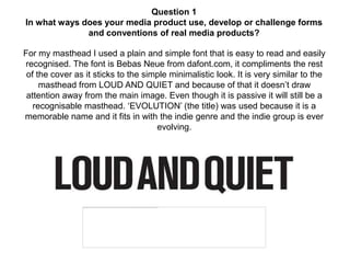
For my masthead I used a plain and simple font that is easy to read and easily
recognised. The font is Bebas Neue from dafont.com, it compliments the rest
of the cover as it sticks to the simple minimalistic look. It is very similar to the
masthead from LOUD AND QUIET and because of that it doesn’t draw
attention away from the main image. Even though it is passive it will still be a
recognisable masthead. ‘EVOLUTION’ (the title) was used because it is a
memorable name and it fits in with the indie genre and the indie group is ever
evolving.
2. Layout
My layout is very similar to the masthead as it is simplistic and minimalistic, this trends
throughout my magazine. I have conformed to the black and white theme for my text as it
is one of the best colour schemes for text and it is the most common. For my main body
of text I have used Incised901 BT which is clear font and it makes my magazine have a
level of maturity as it is not a ‘silly’ font. The Bebas Neue font that I used for my masthead
has also featured throughout my magazine, I used it for page numbers and the page title
on my double page spread but on my contents it was used for everything because it
makes the contents stand out from the rest of the magazine. I have kept it to two fonts
throughout my magazine so it has a consistency and it keeps my simple fashion of my
magazine. My double page spread has stayed to a very conventional format with a full
picture on one side and text on the other.
In terms of my images they have stayed very conventional as well, being with a white
background and where they have been positioned in my magazine. Although these are
conventional they still draw the interest to the page with the model choices and the
clothing. I used all mid shots in my magazine as there isn't a background to include and it
gives the most detail in what the models are wearing. This style is indie as it shows the
indie clothing.
3.
4. My models have been chosen because they have the ‘indie’ look because of the hair
style. The clothes were chosen because these represent my target audience and my
band well as they are seen to be ‘indie’ as well. I used no props in my images as
they will take attention away from the models. I chose my colour scheme because of
it simplicity and it works well with my target audience, it also compliments my images
and therefore my band. The colour scheme of mainly black and white is used by
many magazines as it is an easy and clear way to present a magazine.