Seven basic quality tools
•
4 likes•134 views

This document provides an overview of seven common quality control tools: cause and effect diagrams, check sheets, Pareto diagrams, histograms, scatter diagrams, control charts, and graphs. It describes the purpose and use of each tool, including how cause and effect diagrams show relationships between effects and causes, how check sheets collect quality data, how Pareto diagrams identify the most important issues, and how control charts monitor process changes over time. The document emphasizes that these tools can help improve quality by identifying issues and minimizing rejections and losses.

Recommended
More Related Content
What's hot
What's hot (20)
Similar to Seven basic quality tools
Similar to Seven basic quality tools (20)
Recently uploaded
Recently uploaded (20)
Seven basic quality tools
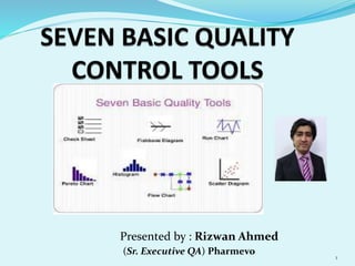
- 1. 1 Presented by : Rizwan Ahmed (Sr. Executive QA) Pharmevo
- 2. INTRODUCTION These tools are related to numerical data processing. These seven Quality control tools are simple statistical tools used for problem solving. These tools were introduced in Japan by Quality Gurus such as Deming and Juran. Kaoru Ishikawa has given the importance of these tools as they can be used to solve 95% of all problems. 2
- 3. TYPES OF QUALITY CONTROL TOOLS 1. Cause & Effect Diagram 2. Check sheet 3. Pareto diagram 4. Histogram 5. Scatter Diagram 6. Control charts 7. Graphs 3
- 4. GRAPHS A diagram showing the relation between variable quantities, typically of two variables, each measured along one of a pair of axes at right angles. It is mostly used in order to show any type of data for proper understanding and their analysis in terms of Lines and shapes. They are prepared very easily in no time. There are generally 3 types of graphs. 1. Line graph 2. Bar graph 3. Pie chart 4
- 5. 0 500,000 1,000,000 1,500,000 2,000,000 2,500,000 3,000,000 3,500,000 4,000,000 JAN FEB MAR APR MAY JUN PACKING OUTPUT (JAN - JUN 2016) MONTH OUTPUT ( Packs) JAN 3,261,514 FEB 3,249,554 MAR 3,086,629 APR 3,604,806 MAY 3,045,987 JUN 2,415,406 5
- 6. CHECK SHEETS The Check sheets are actually the special types of forms , format or documents which is designed in such a way to collect Quality related data as a rough means for assessing a process. It is a Data collection tool. Information collected is both comprehensive and relevant. Data which is collected using check sheets needs to be meaningfully classified. Some example of check sheets are the daily maintenance check sheets, attendance records, production log books, etc. 6
- 7. TOTALNO. OFSPOONS 24/08/2015 25/08/2015 26/08/2015 27/08/2015 28/08/2015 29/08/2015 1 Blackembeddedparticles 55 46 50 35 20 15 221 7.36 2 Roughsurface 23 36 14 10 10 6 99 3.3 3 Colorvariation 1 46 17 15 9 3 118 3.93 4 Broken 5 12 7 2 0 1 27 0.9 5 Edgedspoon 33 42 45 51 23 11 205 6.83 6 Dustynature 13 27 15 12 5 2 74 2.46 % PLASTICSPOONSSORTING NO.OFSPOONSSORTED/DAY=500 3000 TOTALDATESS.NO TYPESOFDEFECTS 7
- 8. PARETO DIAGRAMS This technique is named after an Italian Economist Vilfred Pareto. He was the first person to observe that a large portion of wealth was in the hands of a few people i.e. 10 to 20 percent. He observed that such distribution pattern was common in most fields. This tool is also called 80/20 rule or Pareto Principle. It can be described as 80 percent of the problems or defects come from 20 percent of the causes. This tool is used in the quality improvements and facilitates decision making priority wise. 8
- 9. 60 35 15 10 5 48 76 88 96 100 0 10 20 30 40 50 60 70 80 90 100 0 10 20 30 40 50 60 70 City area coding missing Missing Batch# Mfg & Exp Unstable Granules in Suspension Tablets missing in blisters MC missing in consignment Numbers cp S.No Complaints Numbers Cumulative count Cumulative % 1 City area coding missing 60 60 48 2 Missing Batch# Mfg & Exp 35 95 76 3 Tablet missing in Blisters 10 105 84 4 Unstable Granules in Suspension 15 120 96 5 MC missing in consignment 5 125 100 JAN - JUNE 2016 9
- 10. CAUSE AND EFFECT A Cause and Effect diagram is a tool that shows the relationship between the result or an effect and its possible causes. This tool was developed by the Dr. Kaoru Ishikawa in Japan and due to this it is also known as Ishikawa Diagram or Fish bone diagram. The bones of the fish are representated by Men, Machine, Material, Method & Environment. 5 W’s and 1 H i.e. When, Where, What, Why and How are the questions required to ask during brainstorming session for investigation. 10
- 11. 11
- 12. HISTOGRAM This type of tool reveals the history of the process. It is also called Frequency Distribution Diagram. It is a type of Bar chart which shows the distribution pattern of observations grouped in convenient class intervals and arranged in the order of Magnitude. Normally there is Bell shaped curve. The other types of curve are Bi-modal shape, Cliff - like shape, Saw-toothed shape and Skewed shape. The width of the class interval can be found as W = Largest value in data – smallest value in the data / total number of classes. 12
- 13. 0 5 10 15 20 25 281-284 286-290 291-295 296-300 301-305 306-310 311-315 316-320 FREQUENCY BINS Frequency LCL UCL Mean Value = 302.12 Std. Deviation = 3.5 Cp = 1.4 Cpl = 1.63 Cpu = 1.22 Cpk (min) = 1.22 13
- 14. SCATTER DIAGRAM This Quality control tool is used to study the relationship between the two variables. A relationship may or may not exist between the two variables. One is the Dependent variable which is on the Y-axis and other is independent variable which is on the X- axis. TYPES OF CORELATION: +VE CORELATION –VE CORELATION NO CORELATION 14
- 15. TABLET WEIGHT (mg) HARDNESS (N) 299 3.86 302 3.84 300 3.85 304 3.89 301 3.82 296 3.81 306 3.86 300 3.84 294 3.81 304 3.87 300 3.8 299 3.82 302 3.86 304 3.91 306 3.83 301 3.85 296 3.81 304 3.74 306 3.81 300 3.85 LOWPLAT 75mg TABLET 3.72 3.74 3.76 3.78 3.8 3.82 3.84 3.86 3.88 3.9 3.92 292 294 296 298 300 302 304 306 308 Hardness(N) weight( mg) Series1 15
- 16. CONTROL CHARTS The control chart is a graph used to study how a process changes over time. Data are plotted in time order. A control chart always has a central line for the average, an upper line for the upper control limit and a lower line for the lower control limit. Basically, a control chart is a run chart. The purpose of a control chart is to detect any unwanted changes in your process. It is also called as process-behaviour charts. 16
- 18. CONCLUSION The main aim of this particular presentation is to provide the introduction of seven Quality control tools and their use in order to improve the quality level of manufacturing processes and associated products by the application of these tools in our daily lives. Also to minimize rate of rejections and losses and thus help in smooth flow of processes. 18
- 19. 19