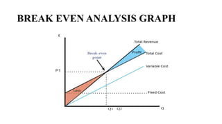
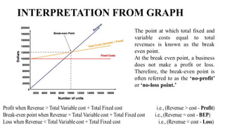
BREAK EVEN ANALYSIS GRAPH
Step 1
• Plot the quantity of shirts sold on the X axis.
• Plot the revenue and costs on the Y axis.
Step 2
• Draw the fixed cost line on the graph
Step 3
• Add the total cost line to the graph. Total costs are fixed costs plus variable
costs.
Step 4
• Add the total revenue curve to the graph
Step 5
• Identify the break-even point (BEP) on the graph. The BEP is the level of
output/sales when total revenue equals total cost.
MARGIN OF SAFETY
Margin of safety represents the strength of the business. It enables a
business to know what is the exact amount it has gained or lost and
whether they are over or below the break even point.
Margin of safety (in dollars) = Sales (Actual) – Sales (BE)
INTERPRETATION FROM GRAPH

BREAK EVEN ANALYSIS GRAPH WITH EXPLANATION

  • 1.
  • 2.
    Step 1 • Plotthe quantity of shirts sold on the X axis. • Plot the revenue and costs on the Y axis. Step 2 • Draw the fixed cost line on the graph Step 3 • Add the total cost line to the graph. Total costs are fixed costs plus variable costs. Step 4 • Add the total revenue curve to the graph Step 5 • Identify the break-even point (BEP) on the graph. The BEP is the level of output/sales when total revenue equals total cost.
  • 3.
    MARGIN OF SAFETY Marginof safety represents the strength of the business. It enables a business to know what is the exact amount it has gained or lost and whether they are over or below the break even point. Margin of safety (in dollars) = Sales (Actual) – Sales (BE)
  • 4.